Loading…


KnowledgeBase
Support Reporting: Track Ticket Volume, Backlog & Resolution with Ticket Reports (Step-by-Step)
What this article covers#
To run a support team well you need answers to a few simple questions: How many tickets are coming in? How many are still open? Which channel brings the most work? Who is handling what? How many tickets did we resolve this month?
In AiEngage CRM you answer these with ticket reports, built in the Report Builder under Analytics & Reports. This guide walks you through building them step by step, and shows where to find the matching numbers for chats in Inbox Reporting.
| Question | Report you’ll build | Part |
|---|---|---|
| How many tickets do we have in each status? | Tickets grouped by Status with a record count | 2 |
| How urgent is our open work? | Status × Priority table | 3 |
| How many new tickets came in this week? | Filter on Created Date | 4 |
| Which channel brings the most tickets? Who handles them? | Grouped by Source, and by Assigned To × Status | 5 |
| How many tickets did we close, and who closed them? | Filter on Closed Time, grouped by agent | 6 |
| How do I keep and share the report? | Save and Export | 7 |
| What about chats in the Team Inbox? | Inbox Reporting | 8 |
ℹ️
About resolution time. Ticket reports don’t have a ready-made average resolution time column yet. Instead, you measure resolution by counting tickets that reach Resolved or Closed, and by filtering on Closed Time and Created Date to see how many tickets your team finishes in a given period. Part 6 shows how.
Before you begin#
Access to Reports. Your profile needs the Reports feature (View, and Manage to save). See Ticket Permissions and Understanding Profile Permissions.
Ticket access. Reports show only the tickets you’re allowed to see. A manager with View: All on Tickets sees the whole team’s numbers.
New to the Report Builder? Read Report Builder: Build a Tabular Report first.
Part 1 — Start a new ticket report#
Step 1: Open the Home menu#
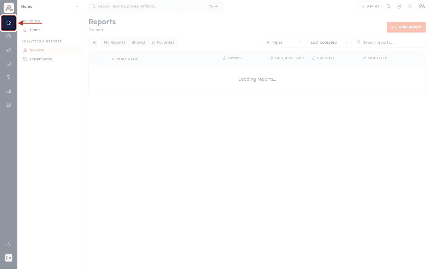
What this screenshot shows. The Home (house) icon at the top of the dark icon bar on the left is ringed.
Click it to open the Home menu. It has an OVERVIEW section and an ANALYTICS & REPORTS section with Reports and Dashboards.
Don’t confuse it with the bar-chart icon further down — that one opens Ads & Analytics (advertising), not ticket reports.
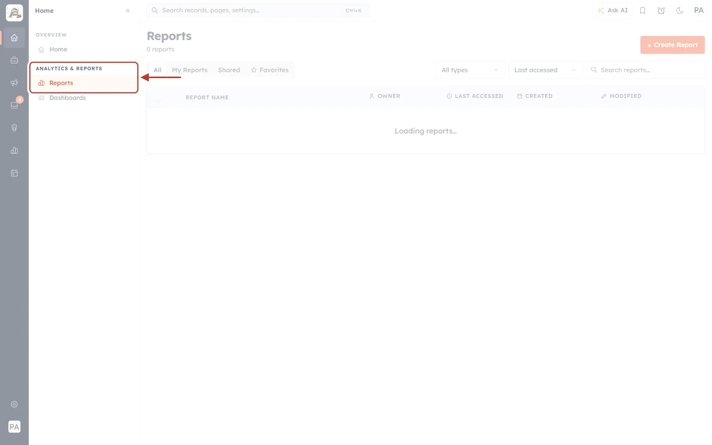
What this screenshot shows. Reports, under the ANALYTICS & REPORTS heading, is ringed.
Click Reports to see every saved report.
Dashboards (just below) is where you can pin reports as charts — see Dashboards & Report Components.
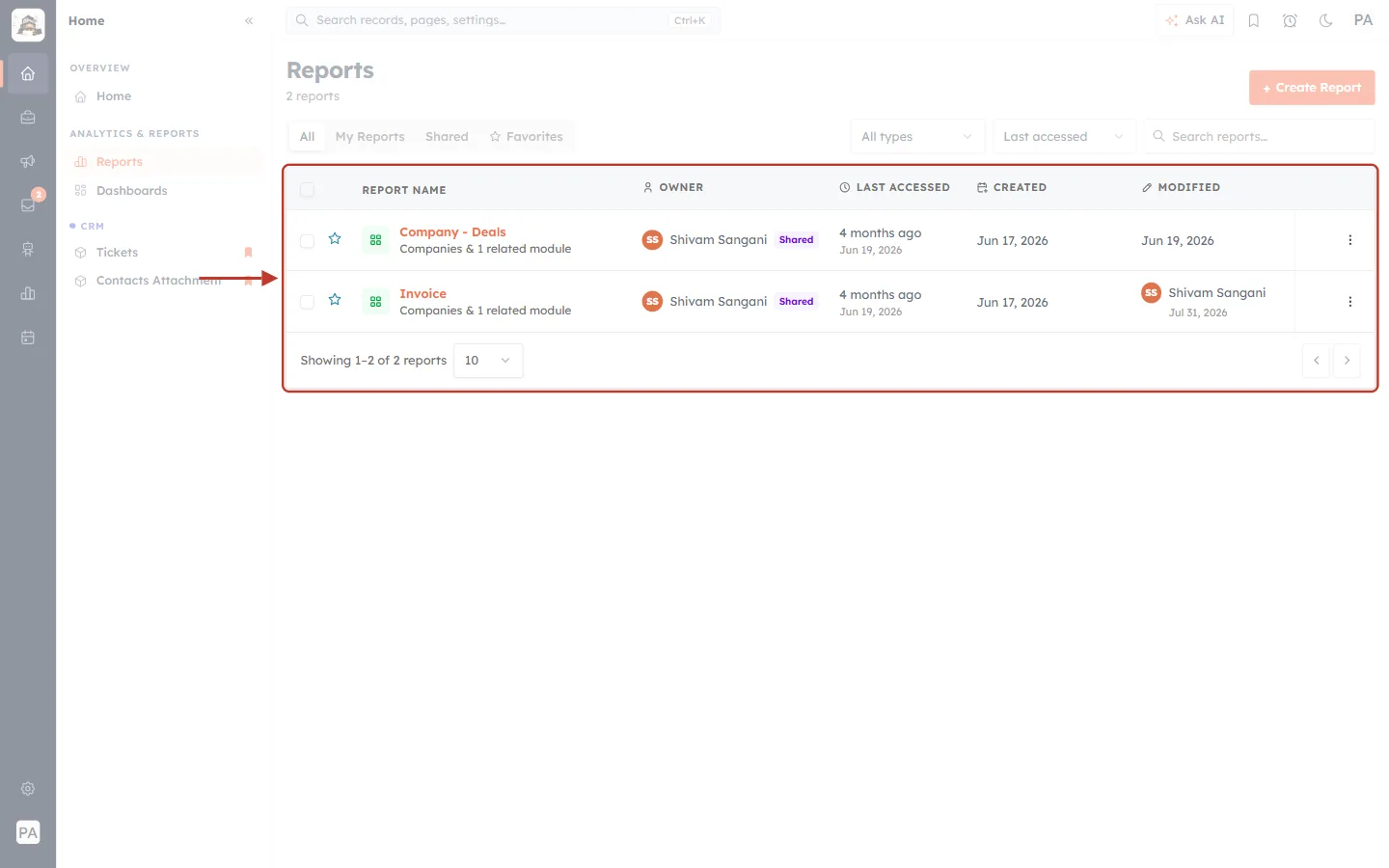
What this screenshot shows. The list of saved reports is ringed.
REPORT NAME — the report and the module it uses (for example Companies & 1 related module). The star marks a favourite.
OWNER — who created it. Shared means other people can see it.
LAST ACCESSED, CREATED and MODIFIED — when it was last opened and changed.
Use the tabs All, My Reports, Shared and Favorites, the All types filter and Search reports… to find a report.
Step 2: Click Create Report#
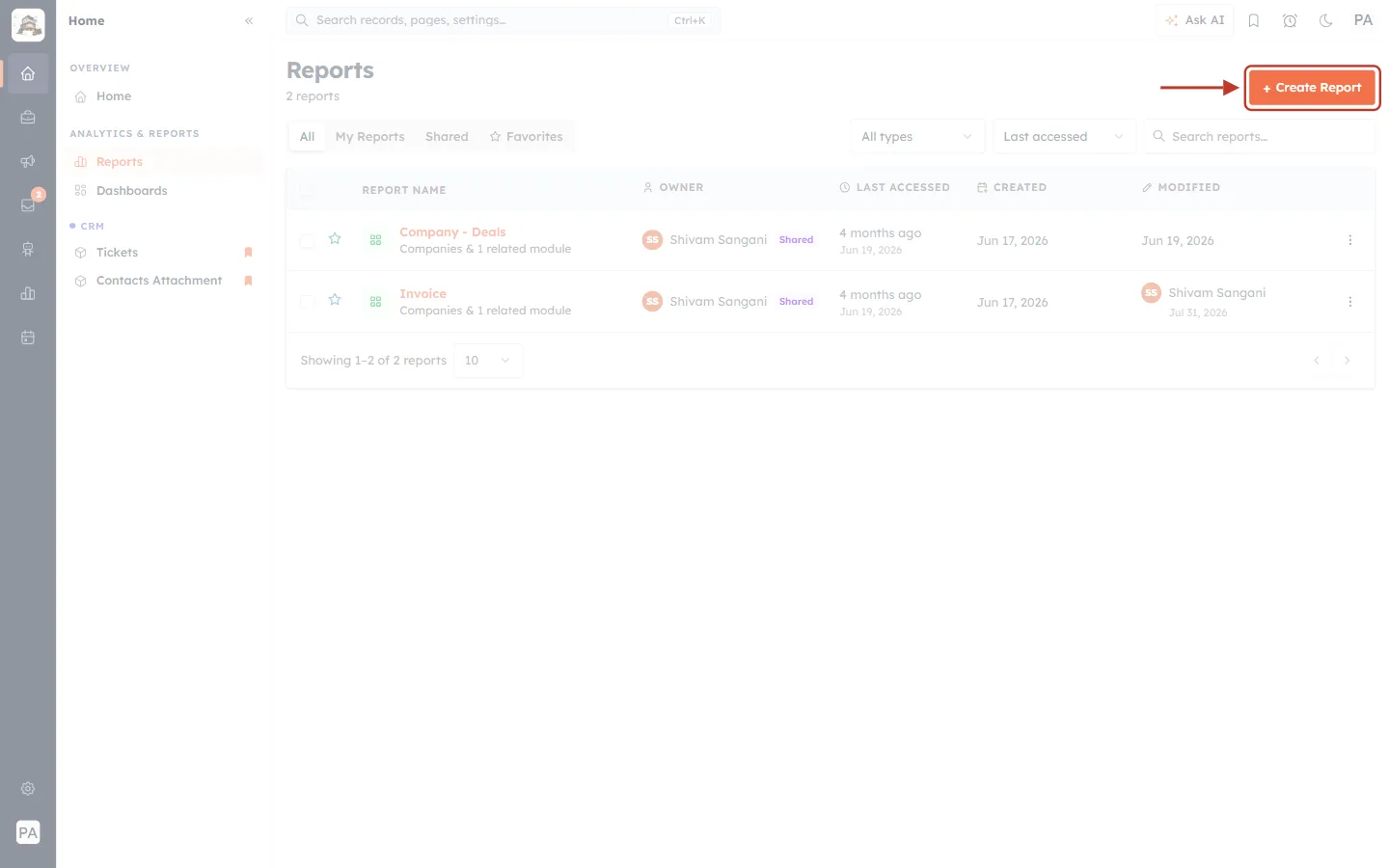
What this screenshot shows. The orange + Create Report button at the top right of the page is ringed.
Click it to start a new report.
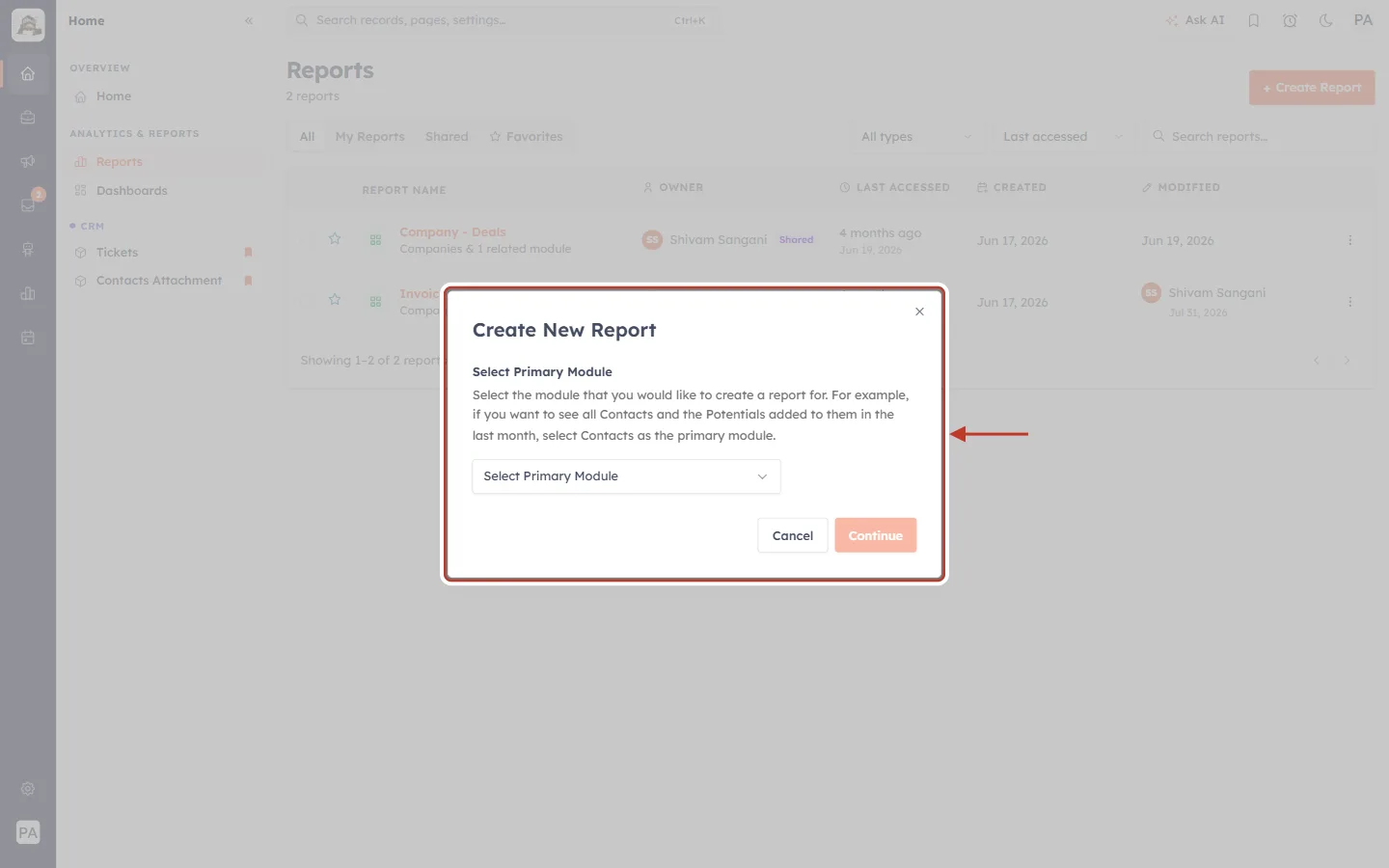
What this screenshot shows. The Create New Report dialog is ringed.
Select Primary Module — the module that holds the data you want to count. For support reports, this is Tickets.
Every report is built on exactly one primary module.
Step 3: Choose Tickets as the primary module#
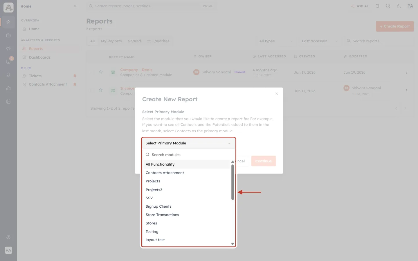
What this screenshot shows. The Select Primary Module drop-down is open and ringed.
Type Tickets in Search modules, or scroll the list.
Click Tickets.
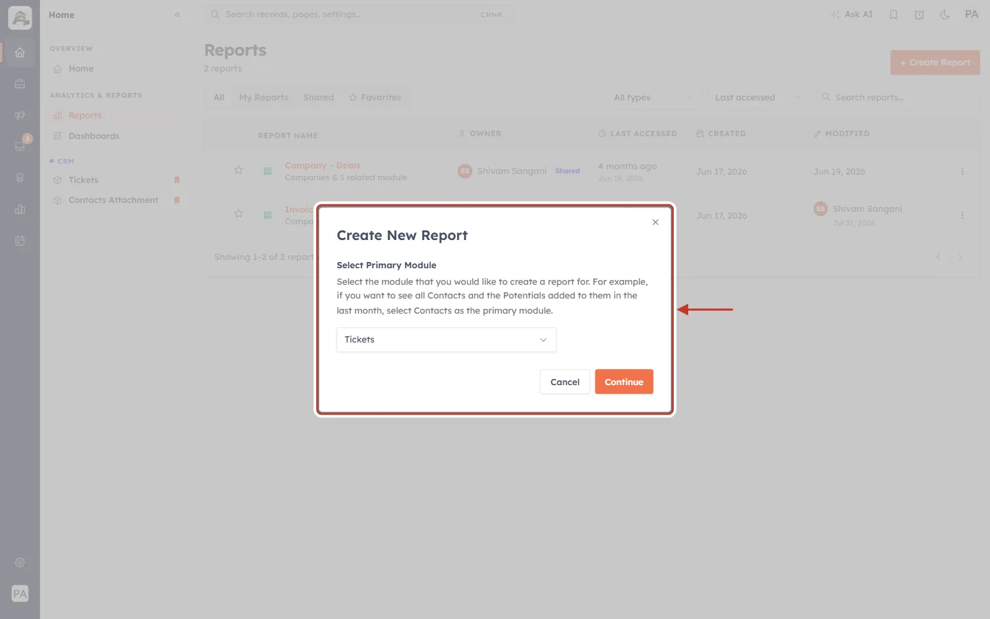
What this screenshot shows. The dialog with Tickets selected is ringed.
Click Continue.
Cancel closes the dialog without creating anything.
Step 4: Skip related modules#
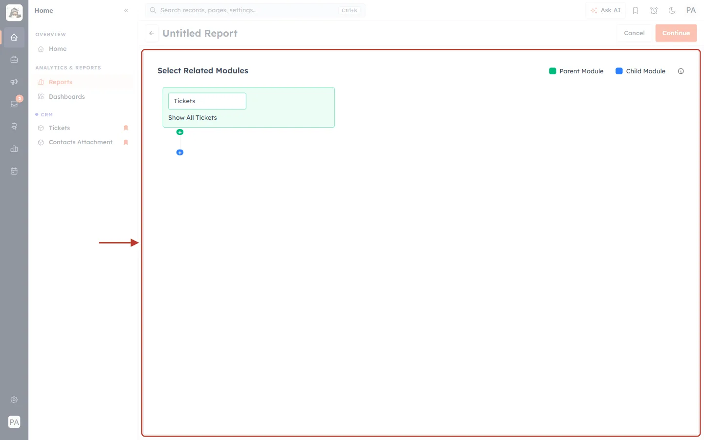
What this screenshot shows. The Select Related Modules step is ringed. The green box is the parent module — Tickets, with Show All Tickets.
The green + adds a parent module and the blue + adds a child module. You don’t need either for the reports in this guide.
The legend on the right explains the colours: green Parent Module, blue Child Module.
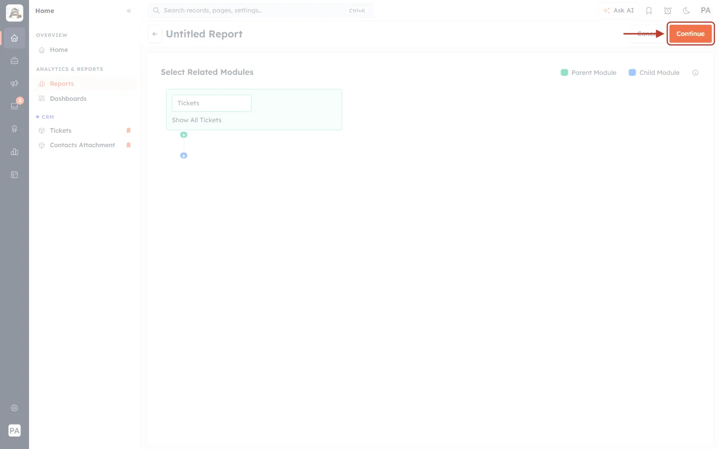
What this screenshot shows. The orange Continue button at the top right is ringed.
Click it to open the builder.
Step 5: Get to know the builder#
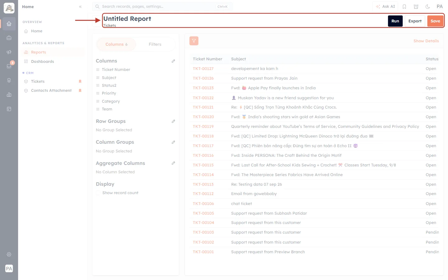
What this screenshot shows. The header of the builder is ringed.
Untitled Report and Tickets — the report’s name (you set it when you save) and its module.
Run — run the report on all your current data.
Export — download the results.
Save — keep the report so you can open it again later.
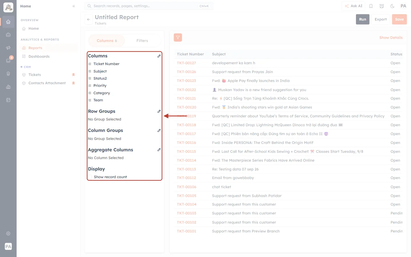
What this screenshot shows. The settings panel on the left is ringed. It has two tabs, Columns and Filters.
Columns — the ticket fields shown for each ticket (a new report starts with Ticket Number, Subject, Status, Priority, Category and Team).
Row Groups — group tickets into rows, for example one row per status.
Column Groups — split each row into columns, for example one column per priority.
Aggregate Columns — calculations on number fields.
Display → Show record count — show how many tickets are in each group. This is the number you’ll use most.
The pencil icon next to each heading opens its picker.
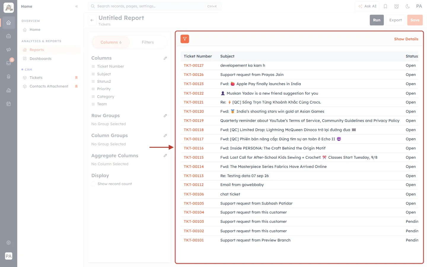
What this screenshot shows. The preview on the right is ringed. It lists tickets with the columns you chose.
It updates as you change the settings, so you can see the effect straight away.
Click a column heading to sort by it.
ℹ️
In some accounts the Status field is labelled Status2. It’s the same field — an administrator can rename it in the Tickets field builder.
Part 2 — Count tickets by status#
Step 6: Choose useful columns#
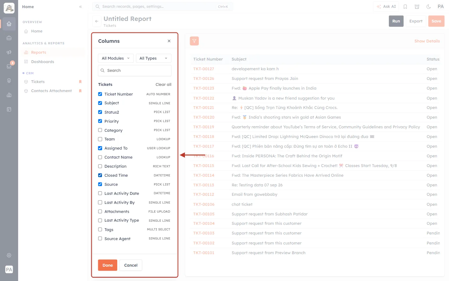
What this screenshot shows. The Columns picker (opened with the pencil next to Columns) is ringed.
Tick the fields you want to see for each ticket. For support reporting, a good set is Ticket Number, Subject, Status, Priority, Assigned To, Closed Time and Source.
Untick fields you don’t need (here Category and Team).
Each field shows its type on the right — PICK LIST, USER LOOKUP, DATETIME and so on.
Use All Modules, All Types and Search to find a field, then click Done.
Step 7: Group the rows by status#
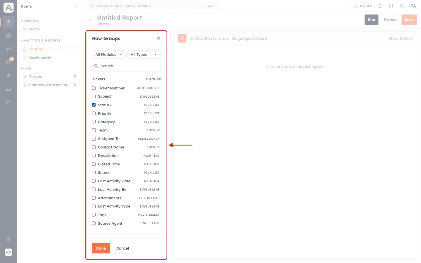
What this screenshot shows. The Row Groups picker is ringed, with Status2 ticked.
Click the pencil next to Row Groups, tick Status and click Done.
Each status (Open, Pending, In Progress, Resolved, Closed) becomes its own group of rows.
Step 8: Show the record count#
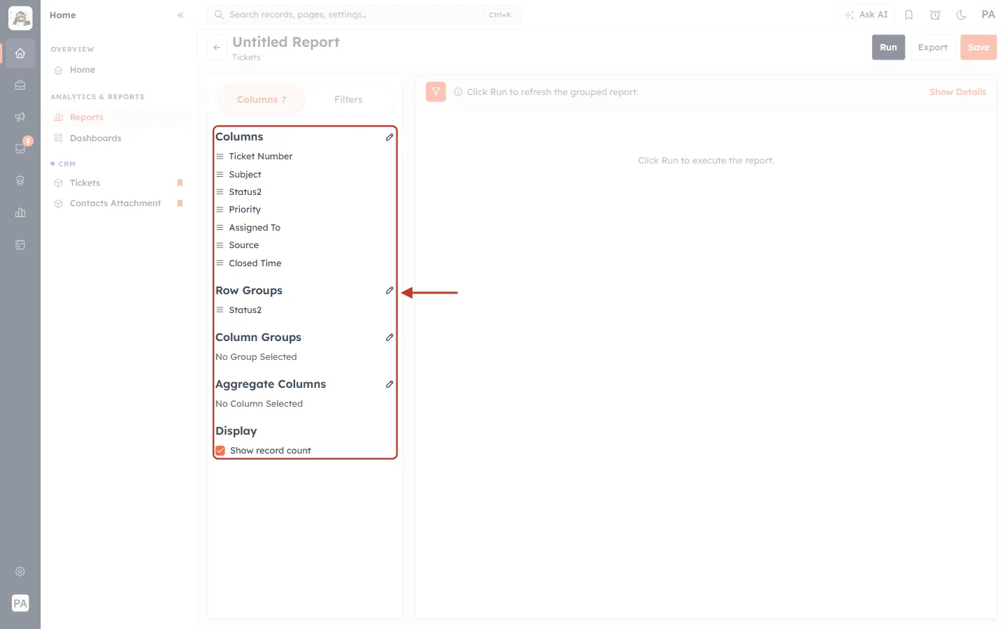
What this screenshot shows. The settings panel is ringed after the changes: seven columns, Row Groups: Status2 and Show record count ticked.
Show record count adds a Record Count column — the number of tickets in each group.
After changing groups, the preview says Click Run to refresh the grouped report.
Step 9: Run the report#
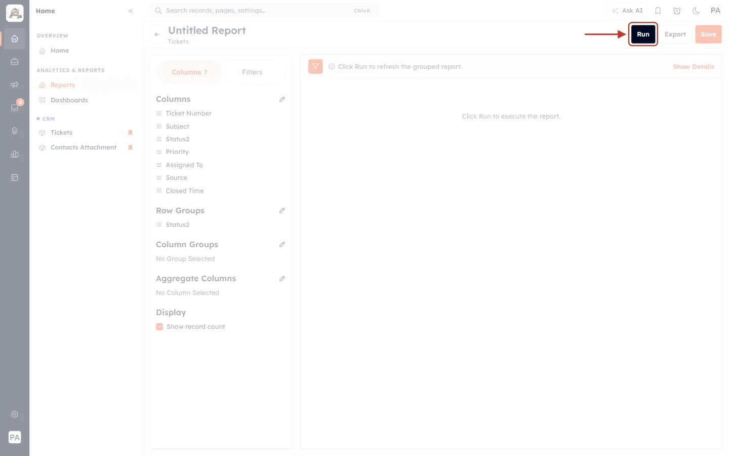
What this screenshot shows. The dark Run button at the top right is ringed.
Click it. The preview shows Running… for a few seconds, then the results.
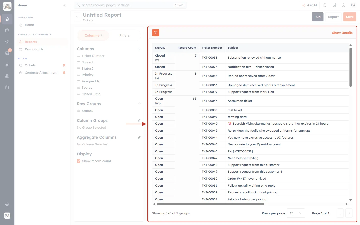
What this screenshot shows. The results are ringed: tickets grouped by Status, with a Record Count for each group.
The first column shows the status and, in brackets, how many tickets it holds — for example Closed (2), In Progress (3) and Open (65).
Record Count repeats that number so you can read it at a glance.
Under each group you see the tickets themselves, with the columns you chose.
At the bottom: Showing 1–5 of 5 groups, with Rows per page and page buttons.
✅
This is your backlog report: the Open, Pending and In Progress groups are the tickets still waiting for your team.
Part 3 — See how urgent your workload is#
Step 10: Add Priority as a column group#
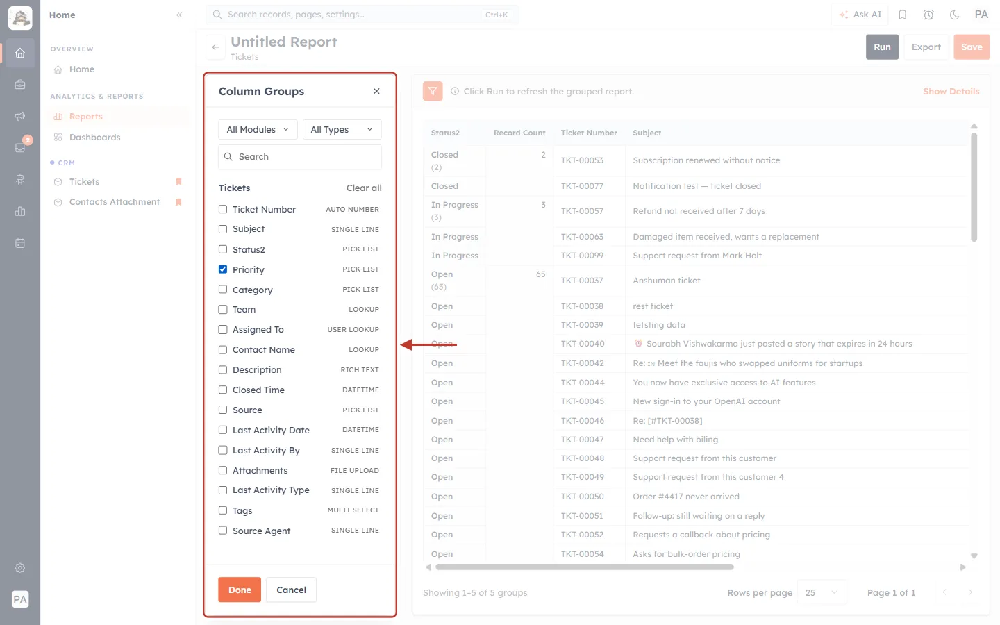
What this screenshot shows. The Column Groups picker is ringed, with Priority ticked.
Click the pencil next to Column Groups, tick Priority, click Done and then Run.
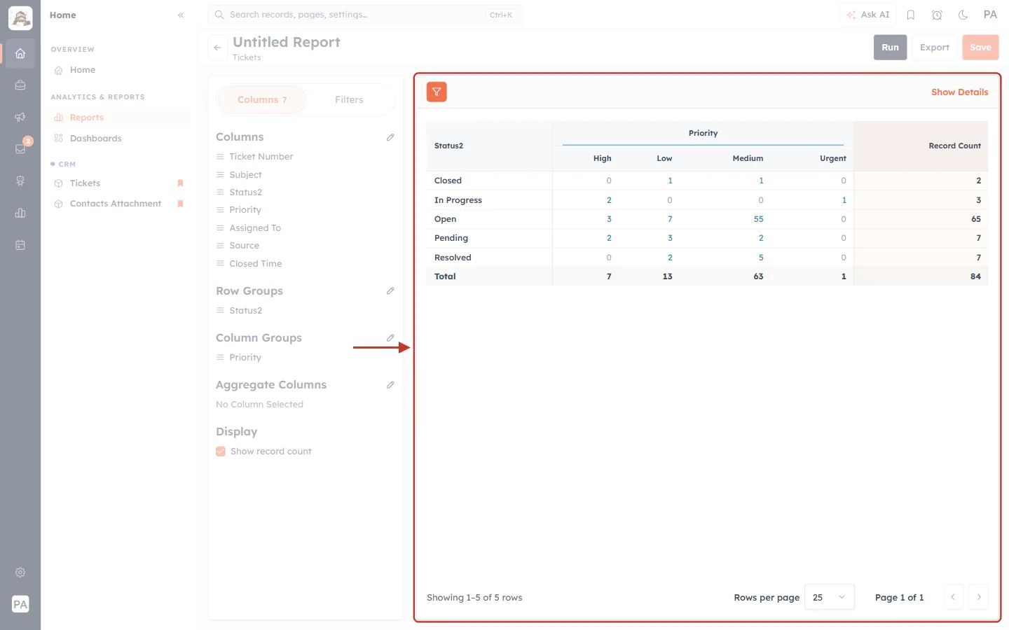
What this screenshot shows. The result is ringed: a table with one row per status and one column per priority.
Each cell is the number of tickets with that status and priority — for example Open / Medium: 55 and In Progress / Urgent: 1.
Record Count on the right is the total for each status.
The Total row adds up each priority — here 7 High, 13 Low, 63 Medium and 1 Urgent, 84 tickets in all.
Use it to check that urgent and high-priority tickets aren’t sitting in Open or Pending.
Part 4 — Count new tickets in a period (ticket volume)#
Step 11: Open the Filters tab#
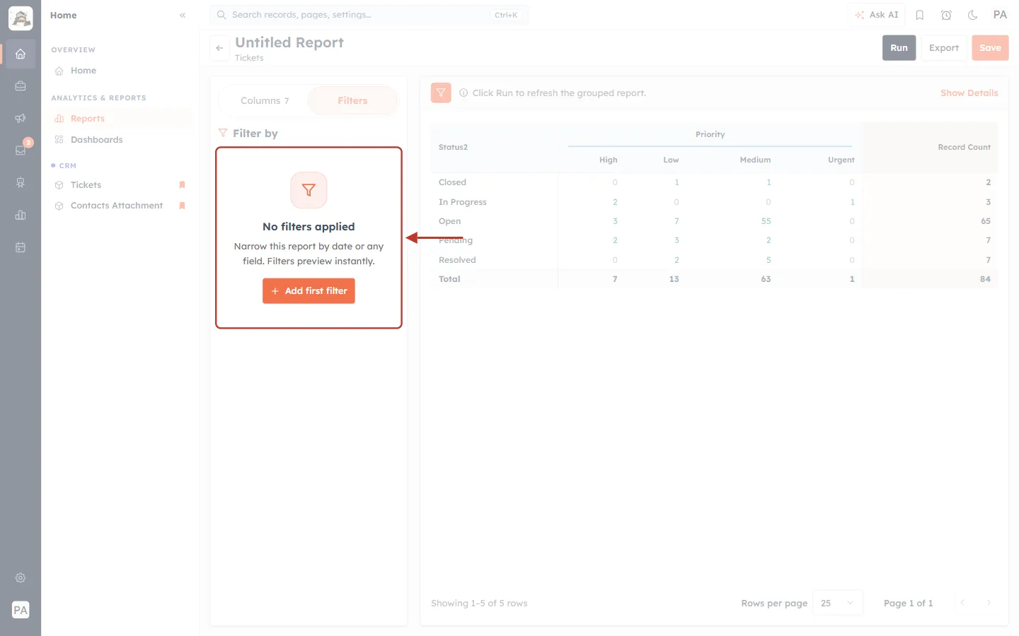
What this screenshot shows. The Filters tab is ringed: No filters applied — Narrow this report by date or any field. Filters preview instantly.
Click Add first filter.
Step 12: Choose Created Date#
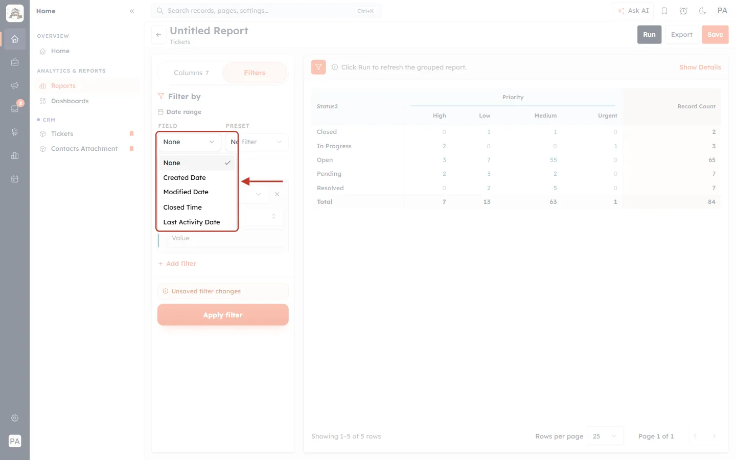
What this screenshot shows. Under Date range, the FIELD drop-down is open and ringed.
Created Date — when the ticket was created. Use it to count new tickets (incoming volume).
Modified Date — when the ticket was last changed.
Closed Time — when the ticket was closed. Use it to count closed tickets (Part 6).
Last Activity Date — the last reply, note or other activity.
Step 13: Pick a period#
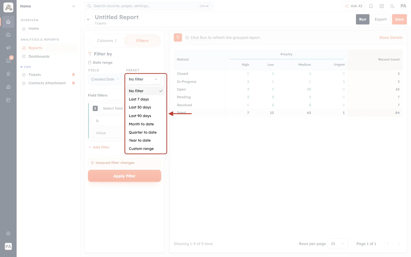
What this screenshot shows. The PRESET drop-down is open and ringed.
Choose a ready-made period: Last 7 days, Last 30 days, Last 90 days, Month to date, Quarter to date or Year to date.
Custom range lets you pick your own start and end dates.
No filter removes the date limit.
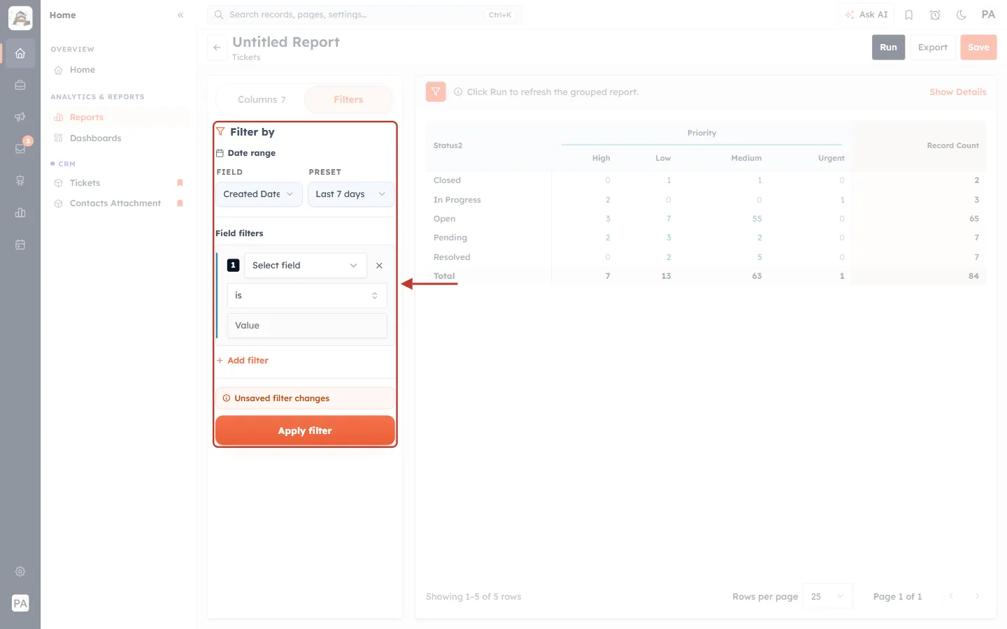
What this screenshot shows. The filter panel is ringed with Created Date and Last 7 days chosen.
Field filters below let you add conditions on any field, for example Priority is Urgent or Source is Email. Click + Add filter for more than one.
Unsaved filter changes reminds you that the filter isn’t active yet.
Click Apply filter.
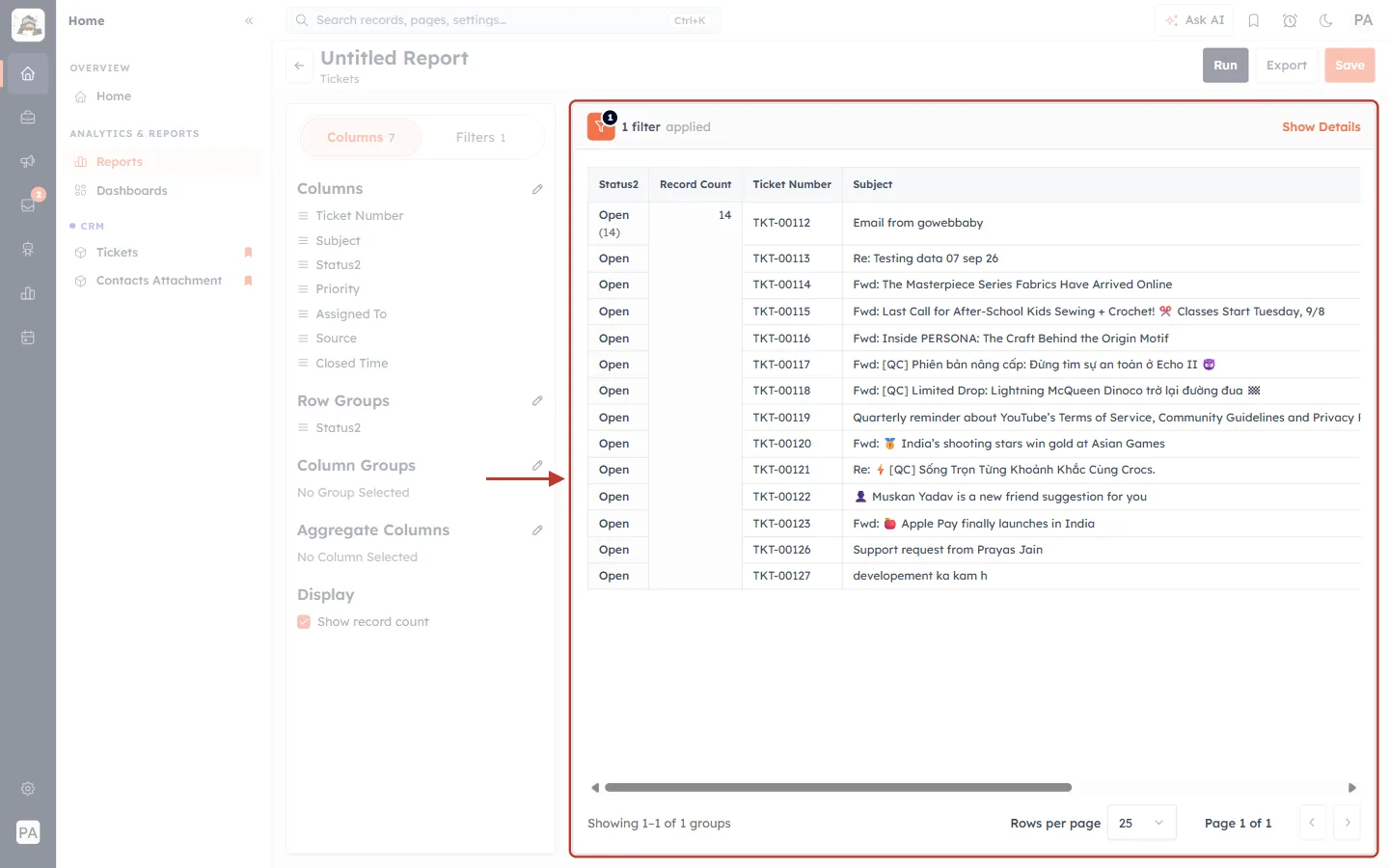
What this screenshot shows. The result is ringed. The top of the preview says 1 filter applied.
Only tickets created in the last 7 days are counted — here Open (14).
Compare it with the same report for the previous period to see whether ticket volume is going up or down.
To remove the filter, open Filters again and click Clear all.
Part 5 — Volume by channel and by agent#
Step 14: Group by Source to see where tickets come from#
Change the row group from Status to Source (untick Status and tick Source in the Row Groups picker), then click Run.
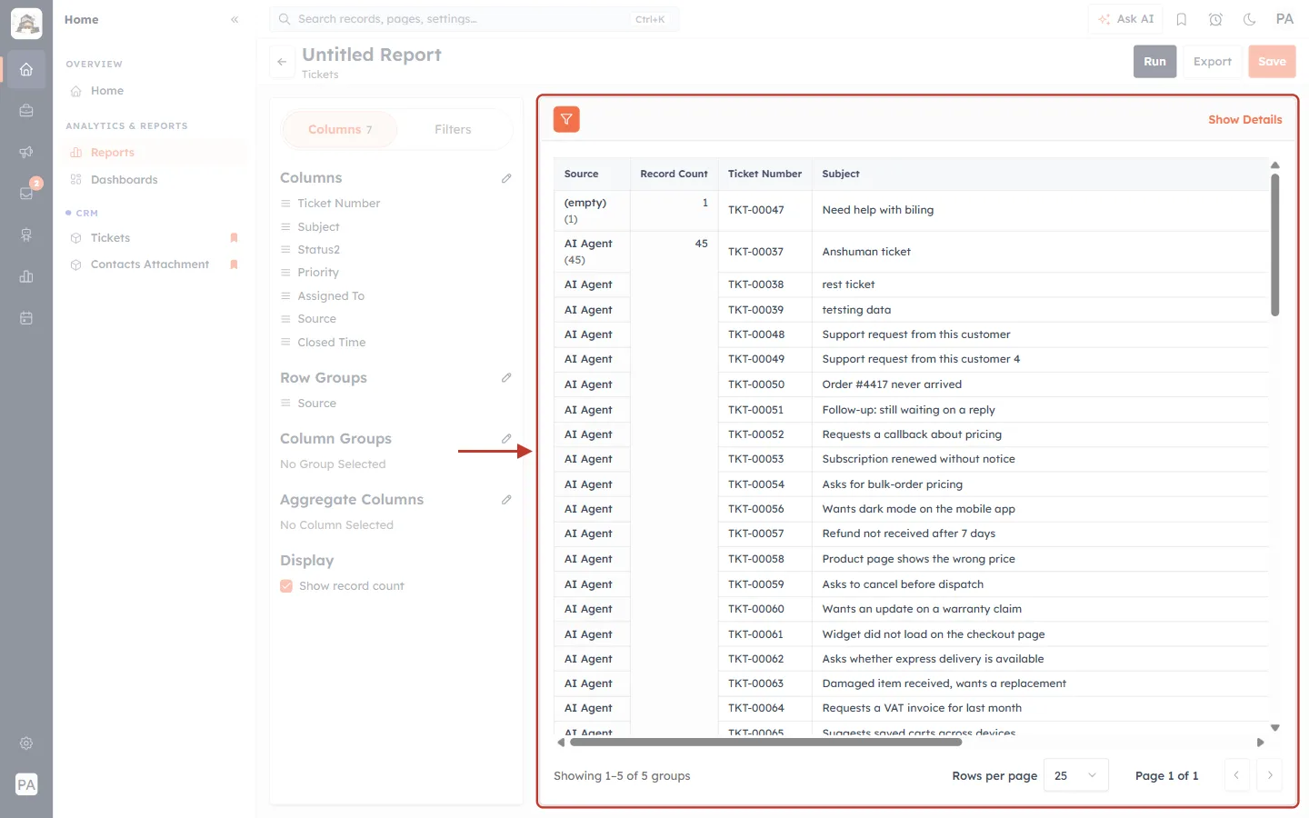
What this screenshot shows. The result grouped by Source is ringed.
Each group is a channel the ticket came from — for example AI Agent (45) for tickets raised from AI agent chats, and (empty) for tickets with no source.
The Source field has four values: AI Agent, Email, WhatsApp and Manual (created by an agent with New ticket).
Use it to plan staffing for the channels that bring the most work.
Step 15: Group by agent and status to see workload#
Set Row Groups to Assigned To and Column Groups to Status, then click Run.
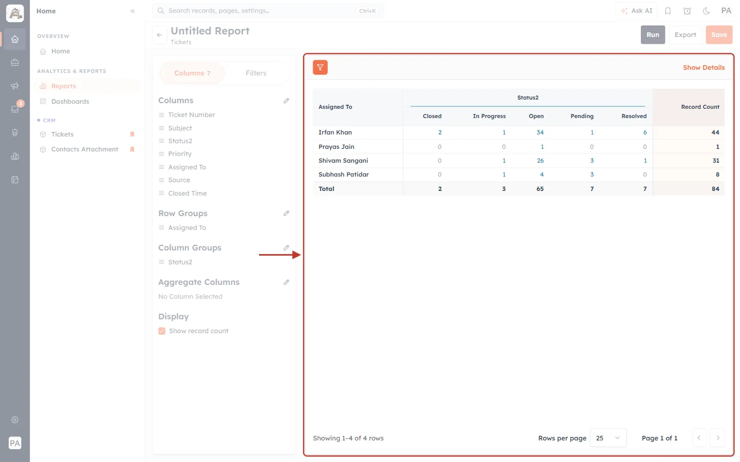
What this screenshot shows. The result is ringed: one row per agent, one column per status.
You can see each agent’s open workload — for example Irfan Khan: 34 Open, 6 Resolved, 2 Closed.
Record Count is each agent’s total, and the Total row is the team’s total for each status.
A high Open number next to a low Resolved number can mean an agent needs help or that tickets should be reassigned.
Part 6 — Track resolution: how many tickets you close#
Two numbers tell you how well your team keeps up: how many tickets are Resolved or Closed (Parts 2 and 5), and how many were closed in a given period.
Step 16: Filter on Closed Time#
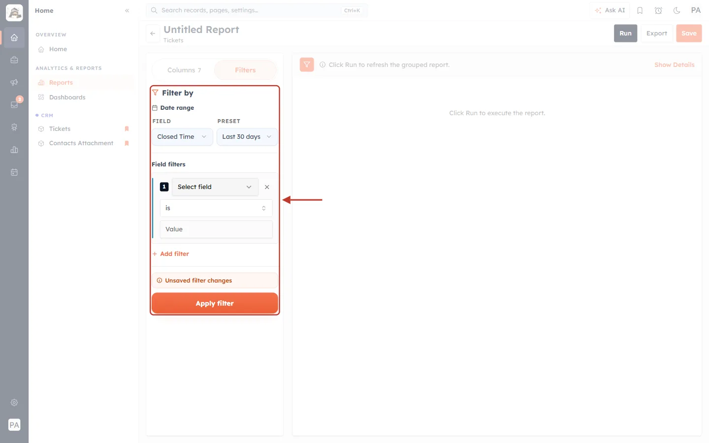
What this screenshot shows. The filter panel is ringed with FIELD: Closed Time and PRESET: Last 30 days.
Group the report by Assigned To with Show record count ticked.
Click Apply filter, then Run.
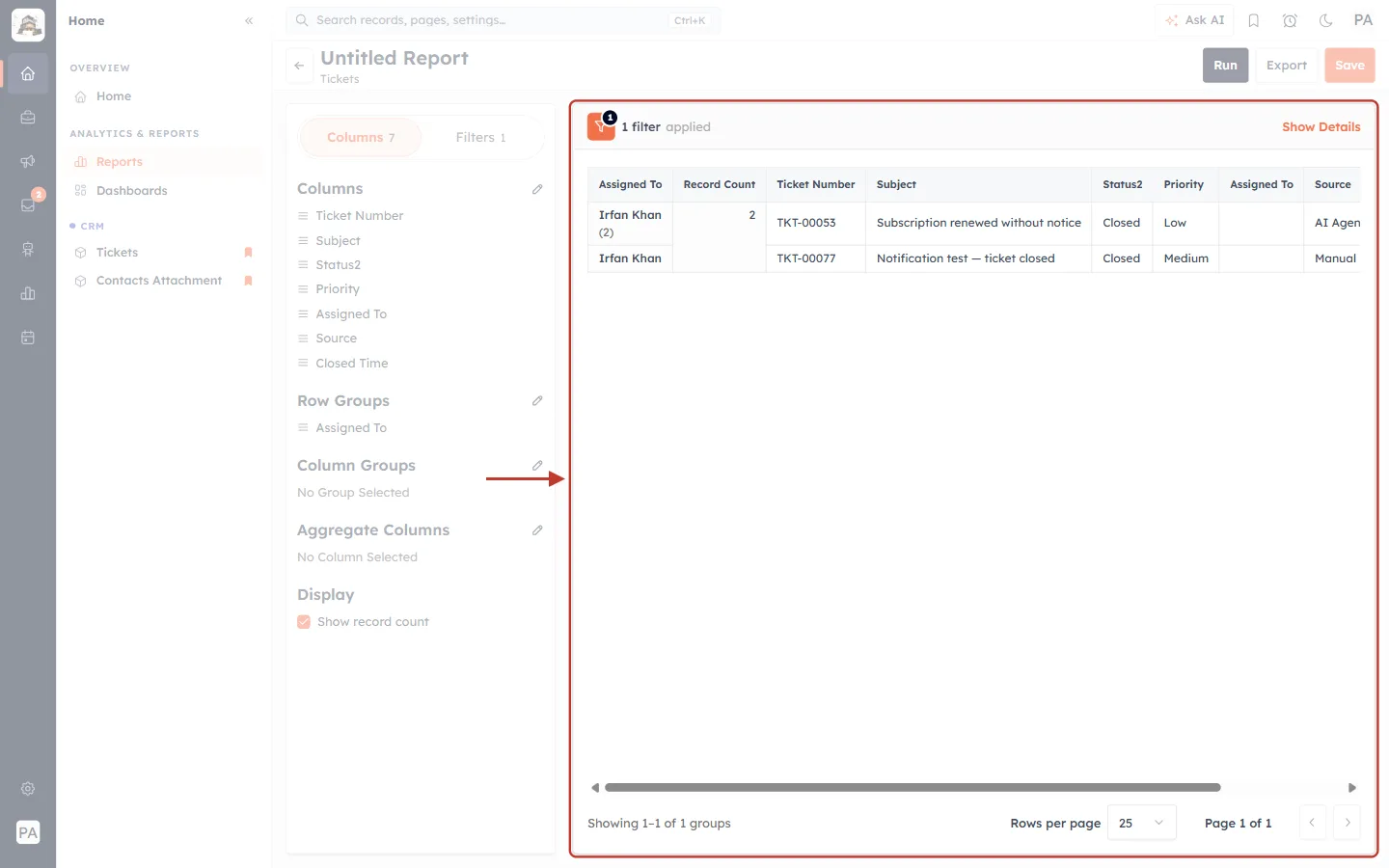
What this screenshot shows. The result is ringed: tickets closed in the last 30 days, grouped by agent.
Each group shows how many tickets were closed in the period — here 2.
The Closed Time column shows exactly when each ticket was closed.
Run it every week or month to see whether your team closes as many tickets as come in (compare with the Created Date report in Part 4).
⚠️
Closed Time is recorded when a ticket’s status is set to Closed. Tickets that are only marked Resolved don’t have a Closed Time, so they don’t appear in this report. If your team uses Resolved as the final step, count them with the Status report in Part 2 instead — or close tickets once the customer confirms.
Step 17: Get a feel for resolution speed#
Because there is no average-resolution-time column, use these simple checks:
Created this week, still open: filter on Created Date → Last 7 days and group by Status. A high Open count means new tickets aren’t being picked up quickly.
Older tickets still open: filter on Created Date → Custom range (for example more than 30 days ago) and add the field filter Status is Open. These are tickets taking too long to resolve.
Closed vs. created: compare the number of tickets created in a period with the number closed in the same period. If you close fewer than you receive, the backlog grows.
Per ticket: add Closed Time as a column and compare it with when the ticket was opened in the ticket’s timeline.
Part 7 — Save, share and export the report#
Step 18: Save the report#
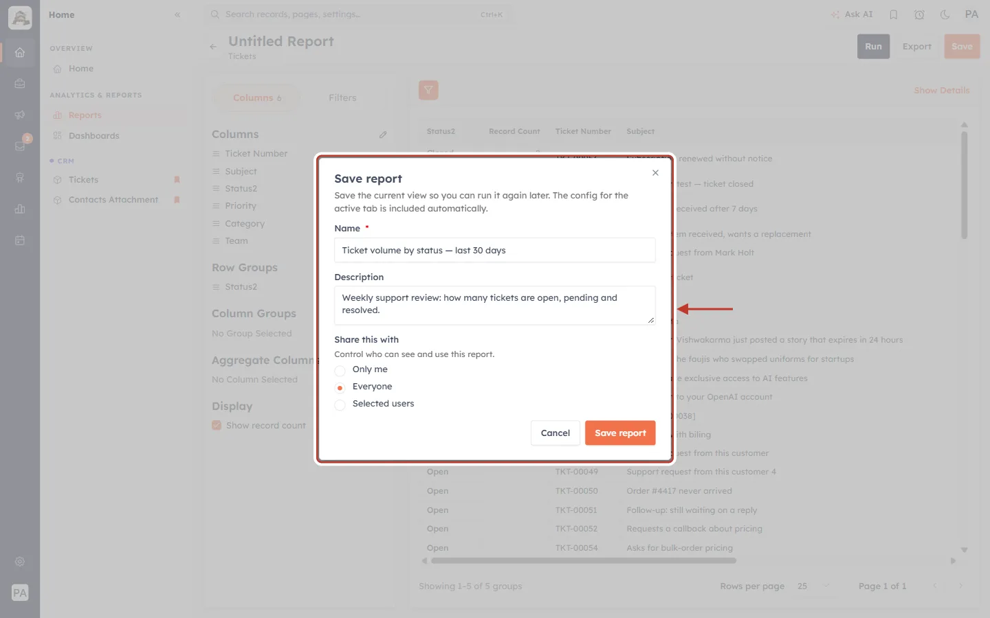
What this screenshot shows. The Save report dialog (opened with Save) is ringed: Save the current view so you can run it again later.
Name (required) — a clear name, for example Ticket volume by status — last 30 days.
Description — what the report is for, for example Weekly support review: how many tickets are open, pending and resolved.
Share this with — Only me, Everyone or Selected users. Choose Everyone or Selected users so your support leads can open it.
Click Save report. A saved report always runs on the latest data when you open it.
Step 19: Export the results#
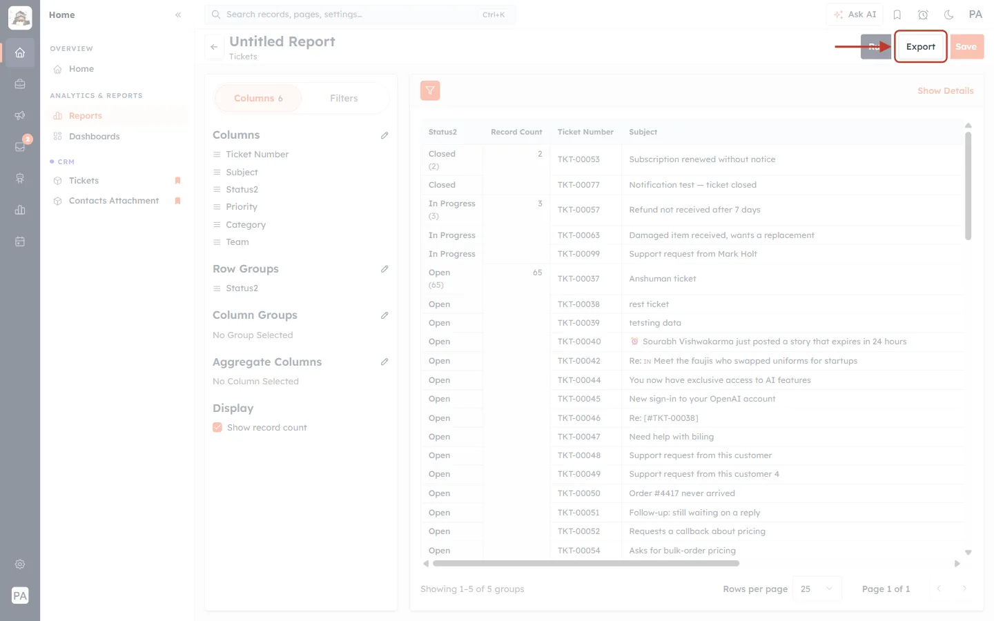
What this screenshot shows. The Export button in the header is ringed.
Click it to download the report results, for example to share with someone outside the CRM or to make your own chart.
See Exporting Reports for the formats and options.
✅
To watch these numbers every day, add the saved report to a dashboard as a chart or KPI — see Dashboards & Report Components and Report Types: KPI, Comparator, Matrix & Funnel.
Part 8 — Chat volume in Inbox Reporting#
Many tickets start as chats. To see the volume and status of the conversations themselves, open the Team Inbox icon in the left bar and click Reporting.
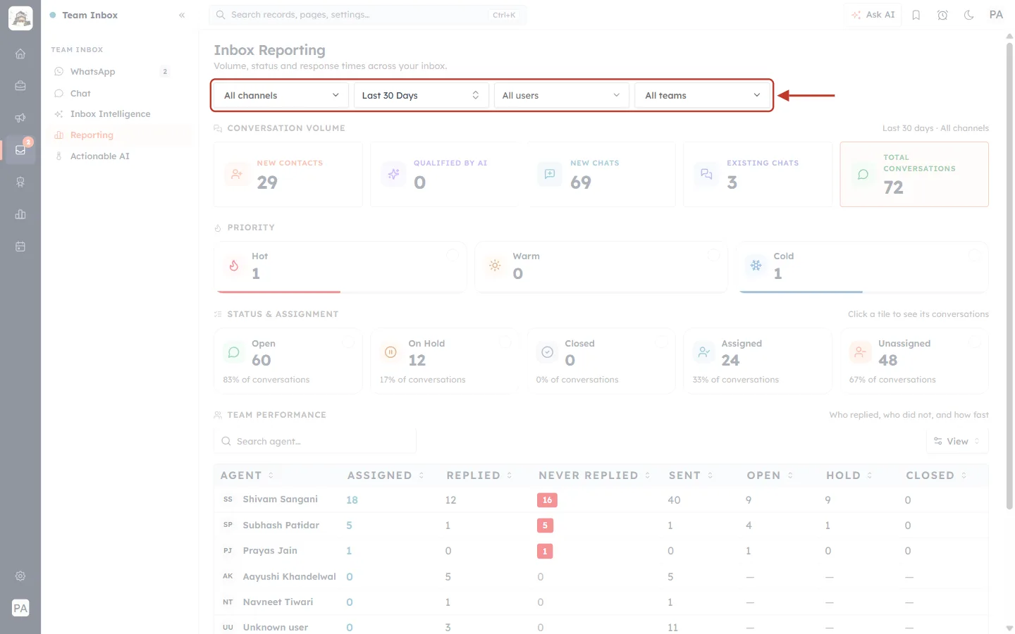
What this screenshot shows. The filters at the top of Inbox Reporting are ringed (Volume, status and response times across your inbox).
All channels — limit the numbers to one channel.
Last 30 Days — the period: Any Time, Today, Yesterday, Last 7 Days, Last 30 Days, Current/Last Week, Month, Quarter or Year.
All users and All teams — limit the numbers to one agent or team.

What this screenshot shows. The CONVERSATION VOLUME tiles are ringed (Last 30 days · All channels).
New contacts — people who contacted you for the first time.
Qualified by AI — conversations the AI agent qualified.
New chats and Existing chats — new conversations versus ones that continued.
Total conversations — all conversations in the period.
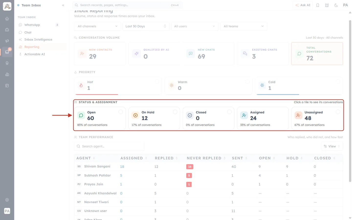
What this screenshot shows. The STATUS & ASSIGNMENT tiles are ringed (Click a tile to see its conversations).
Open, On Hold and Closed — how many conversations are in each state, and their share of the total.
Assigned and Unassigned — how many conversations have an owner. A high Unassigned number means chats are waiting for someone to pick them up.
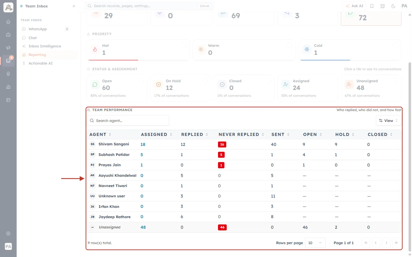
What this screenshot shows. The TEAM PERFORMANCE table is ringed (Who replied, who did not, and how fast).
ASSIGNED — conversations assigned to the agent.
REPLIED and NEVER REPLIED — conversations they answered, and assigned ones still without a reply (highlighted in red).
SENT — messages sent.
OPEN, HOLD and CLOSED — the state of their conversations.
Use View to choose columns and Search agent… to find someone. More detail: Team Inbox Reporting.
Good practice#
Save a small set of reports and review them on a fixed day each week: backlog by status, status × priority, new tickets last 7 days, closed last 7 days, and workload by agent.
Compare like with like — the same period, the same filters, week after week.
Close tickets when they’re done so they get a Closed Time and appear in your resolution numbers.
Keep Source and Assigned To filled in — reports are only as good as the data on the tickets.
Share reports with your leads instead of exporting copies, so everyone sees the same live numbers.
Troubleshooting#
I can’t see Reports. Your profile doesn’t include the Reports feature. Ask an administrator.
The numbers are lower than I expect. Reports only include tickets you’re allowed to see. Check your Tickets View level, and that no filter is applied (1 filter applied at the top of the results).
My grouped report didn’t change. After changing groups or filters, click Run — the preview says Click Run to refresh the grouped report.
Resolved tickets are missing from my Closed Time report. Only Closed tickets have a Closed Time. Count Resolved tickets with a Status report.
There is an (empty) group. Some tickets have no value in the field you grouped by (for example no Source or no assignee).
Frequently asked questions#
Can I see the average time to resolve a ticket? Not as a ready-made figure. Use the Created Date and Closed Time filters described in Part 6 to track how quickly tickets are being closed.
Can I report on CSAT or first response time for tickets? These aren’t fields on tickets today, so they can’t be added to a ticket report. For chats, Inbox Reporting shows who replied and who didn’t.
Do saved reports update automatically? Yes. A saved report runs on the latest data every time you open it.
Can I chart these numbers? Yes — add the saved report to a dashboard component.
Previous and next#
Previous: Ticket Permissions: Control Who Can See, Edit and Reply to Support Tickets (Step-by-Step)
Next: Customer & Support FAQ & Troubleshooting: Fix Common Ticket, Email, Chat and Permission Problems
Related#
Was this article helpful?
Ready to implement this?
OpenAI Engage and apply what you just learned to your own workspace.
Open AI Engage CRM