Loading…


KnowledgeBase
Introduction to the Knowledge Base (Help Center): Write, Organise and Publish Help Articles for Your Customers
Introduction#
Your customers ask the same questions again and again: how do I sign in, where is my invoice, how do I connect my email. The Knowledge Base in AiEngage CRM lets you answer those questions once, in a help center that your customers can open and search at any time, without waiting for your team.
You write and organise everything inside the CRM. The Knowledge Base then publishes it as a public website with its own home page, search box, collection pages and article pages. You choose the name, logo, colours and theme, and you can serve it on your own address, for example help.yourcompany.com.
This article is a guided tour. We open the Knowledge Base, walk through every part of the screen, look at collections, the article editor, the import options and the help-center settings, and finish with the pages your customers will see. The later articles in this collection go deeper into each part.
ℹ️
The screenshots use a sample help center for a business called YourCompany, with sample articles and authors. Your own Knowledge Base shows your articles, your collections and your team’s names.
Part | What it is for | Where you find it |
|---|---|---|
Articles | Write, edit, publish and track every help article | Knowledge Base → Articles |
Collections | Group articles into topics and sub-topics and set their order | Knowledge Base → Collections, or Manage Collections |
Import | Bring existing articles in from a CSV/Excel file or from another help-center website | Import button on the Articles page |
Settings | Publish the help center and set its address, branding, hero, footer, SEO, call-to-action and custom domain | Knowledge Base → Settings |
Public help center | The website your customers read and search | Your help-center address or your own domain |
Before you begin#
Who can use it. Admins can always open the Knowledge Base. Everyone else needs the Knowledge Base permission (“Create and manage help-center categories and articles”). An admin turns it on in Setup → Profiles, in the profile’s Feature Permissions under Marketing. It is off by default. See Create a Permission Profile Step by Step.
Nothing is public until you say so. New articles start as Draft, and the whole help center is only visible to the public while Make my help center public is on (Step 12).
Drafts stay hidden. A draft article, or any collection set to Draft, never appears on the public site. You can prepare everything first and publish when it is ready.
Step 1: Open the Knowledge Base#
The Knowledge Base has its own icon, an open book, in the navigation rail on the far left of the CRM. Point at the rail to see the labels, then click Knowledge Base. It opens straight on the list of articles.
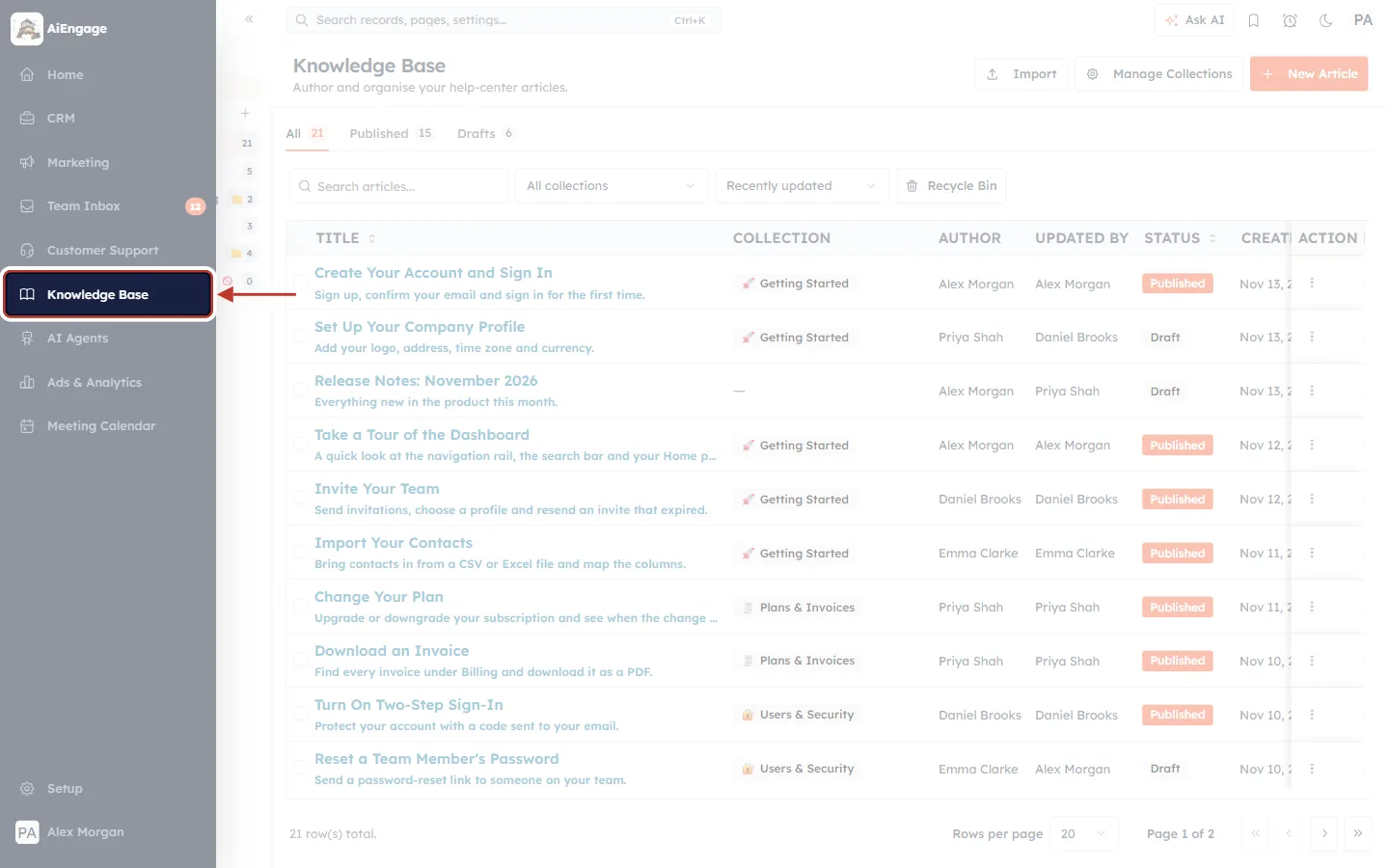
What this screenshot shows. The left navigation rail opened out, with Knowledge Base ringed and an arrow pointing to it.
The rail: the dark strip on the far left. When you point at it, it widens and shows each area’s name: Home, CRM, Marketing, Team Inbox, Customer Support, Knowledge Base, AI Agents, Ads & Analytics and Meeting Calendar.
Knowledge Base (ringed): the open-book icon. Click it to open the Articles page. If you don’t see it, you don’t have the Knowledge Base permission yet (see Before you begin).
Setup and your name sit at the bottom of the rail, as on every page.
Behind the rail you can already see the Articles page that opens, with the sample articles.
Step 2: Get to know the side panel#
Next to the rail, the Knowledge Base has its own side panel. It is the quickest way to move between your articles, your collections and the help-center settings.
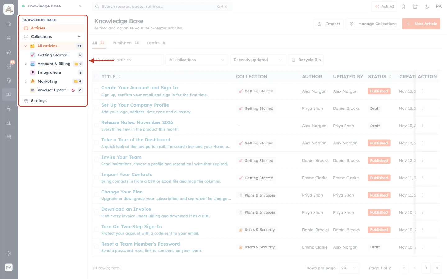
What this screenshot shows. The Knowledge Base side panel, ringed from the KNOWLEDGE BASE heading down to Settings.
Articles: opens the full list of articles (highlighted in orange because it is the page we are on).
Collections: opens the page where you manage collections. The + beside it creates a new collection straight away.
All articles with a count (21 here): every article in the Knowledge Base, including ones that are not in any collection. The arrow in front of it opens or closes the tree below.
The collection tree: each top-level collection with its icon and a count. A plain number is the number of articles in it (Getting Started 5, Integrations 3). A folder with a number means it holds sub-collections (Account & Billing has 2, Marketing has 4); click the arrow in front of it to show them.
The red “no entry” sign next to Product Updates means that collection is a Draft, so it is hidden from the public site.
Settings: pinned at the bottom of the panel. It opens the Help Center Settings (Step 12).
Step 3: The Articles page and its three main buttons#
The Articles page is titled Knowledge Base with the line “Author and organise your help-center articles.” Three buttons sit at the top right.
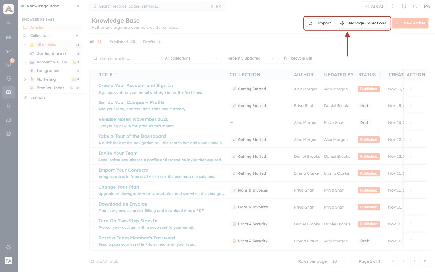
What this screenshot shows. The top of the Articles page with the three buttons ringed: Import, Manage Collections and New Article.
Import: opens a menu to bring articles in from a file or from a website, and to see past imports (Step 11).
Manage Collections: opens the Collections page (Step 9). It is the same page as Collections in the side panel.
New Article (orange): opens a blank article form (Step 10).
On the left you can see the page title Knowledge Base and its description.
Step 4: Switch between all, published and draft articles#
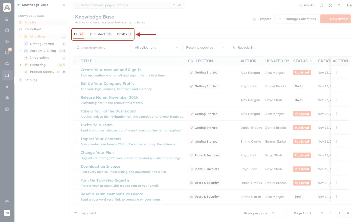
What this screenshot shows. The three tabs under the page title, ringed: All 21, Published 15 and Drafts 6.
All: every article, whatever its status. The orange underline shows the tab you are on.
Published: only articles your customers can read on the help center.
Drafts: articles you are still working on. They are not visible to customers.
The small number in each tab is a live count, so you can see at a glance how many articles are still waiting to be published.
Step 5: Search, filter, sort and open the Recycle Bin#
The row of controls under the tabs helps you find an article quickly, even when you have hundreds.
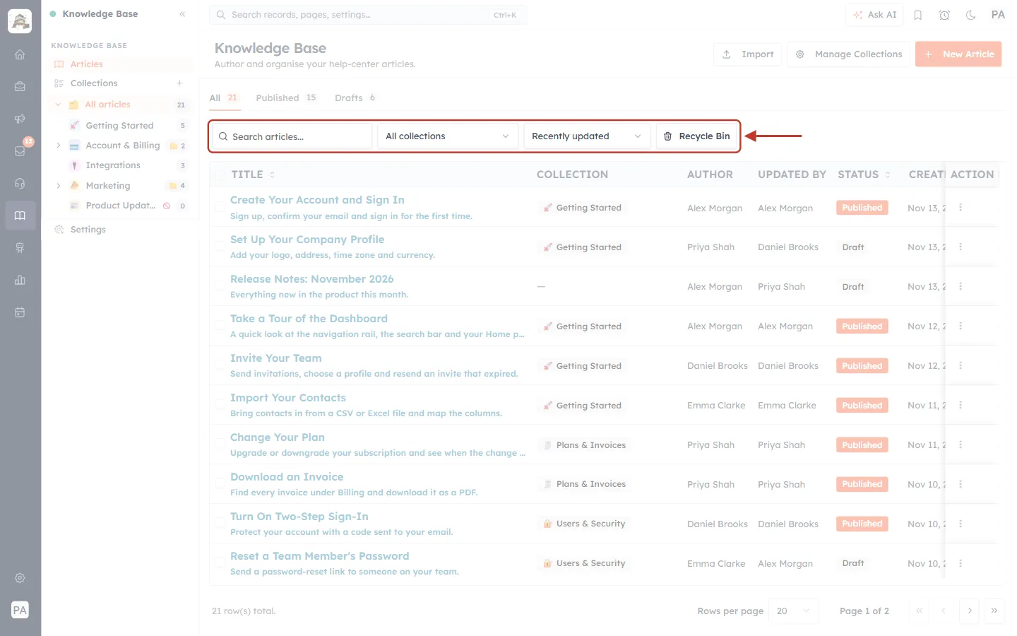
What this screenshot shows. The toolbar above the article list, ringed from the search box to the Recycle Bin button.
Search articles…: type part of a title to narrow the list.
All collections: shows the articles of one collection only.
Recently updated: the sort order of the list.
Recycle Bin: shows the articles you have deleted, so you can restore them.
Click All collections to pick a collection:
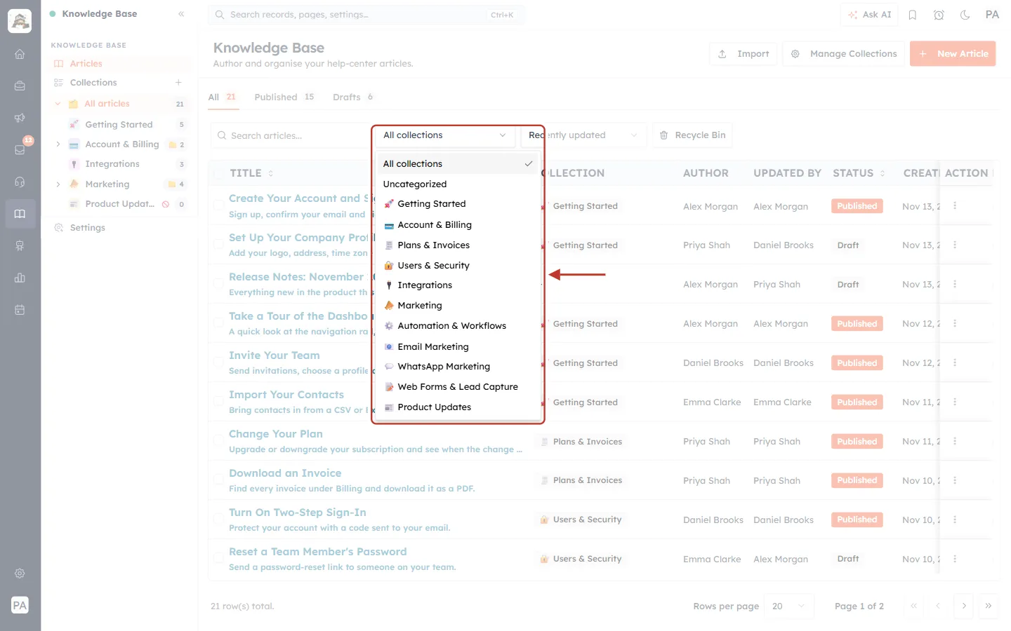
What this screenshot shows. The collection filter opened, listing All collections, Uncategorized and every collection.
All collections: removes the filter.
Uncategorized: articles that are not in any collection yet, such as the “Release Notes: November 2026” draft. Uncategorized articles do not appear on any collection page of the public site, so it is a good place to check before you publish.
Then every collection and sub-collection, each with its icon: Getting Started, Account & Billing, Plans & Invoices, Users & Security, Integrations, Marketing, Automation & Workflows, Email Marketing, WhatsApp Marketing, Web Forms & Lead Capture and Product Updates.
Click Recently updated to change the order:
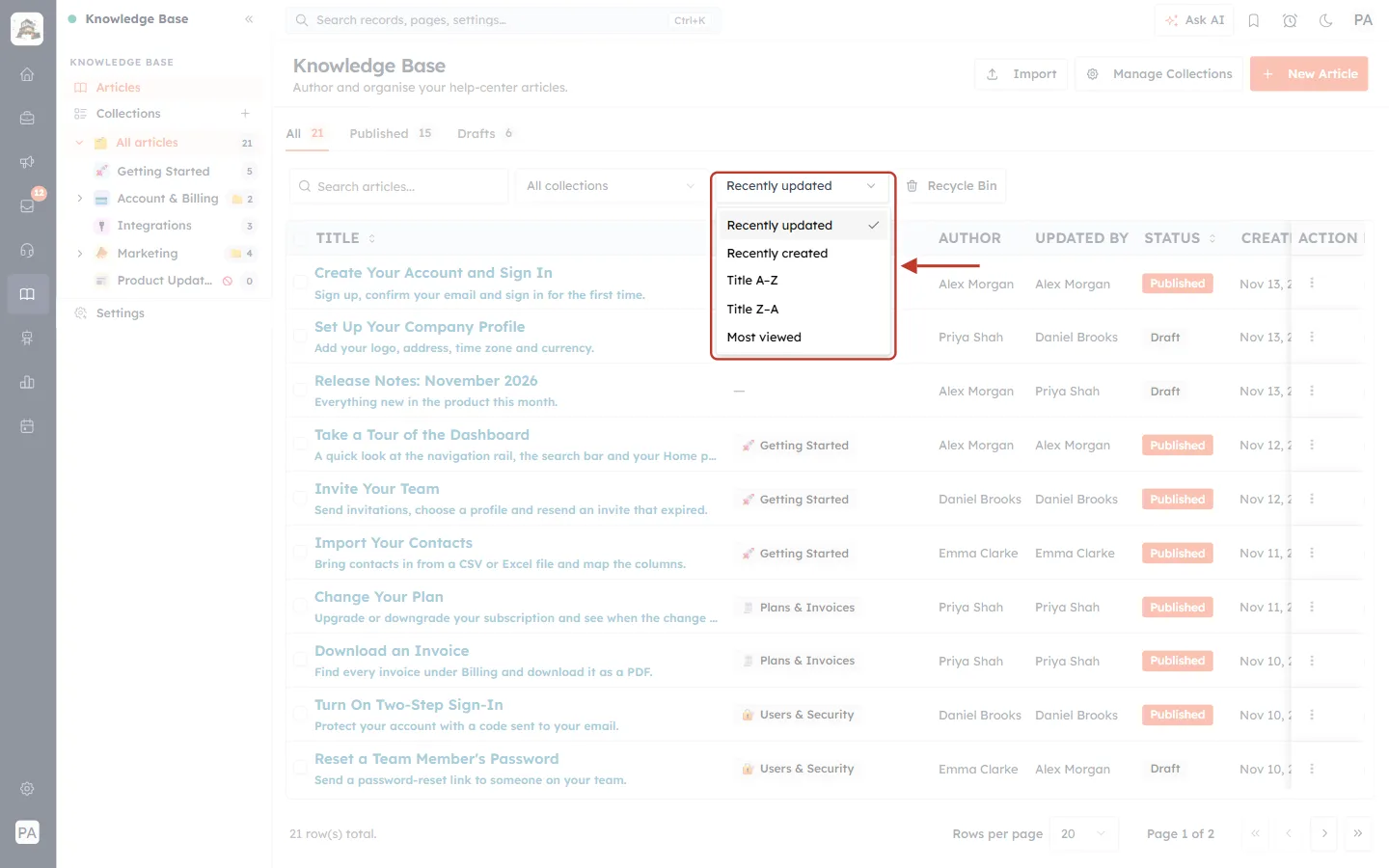
What this screenshot shows. The sort menu opened, with five options.
Recently updated (the default): the articles you changed last are at the top.
Recently created: the newest articles first.
Title A–Z and Title Z–A: alphabetical order.
Most viewed: the articles your customers read most. Use it to see which answers matter most and keep them up to date.
Step 6: Read the article list#
Each row of the list is one article. The columns tell you where the article lives, who wrote it, whether customers can see it and how well it is doing.
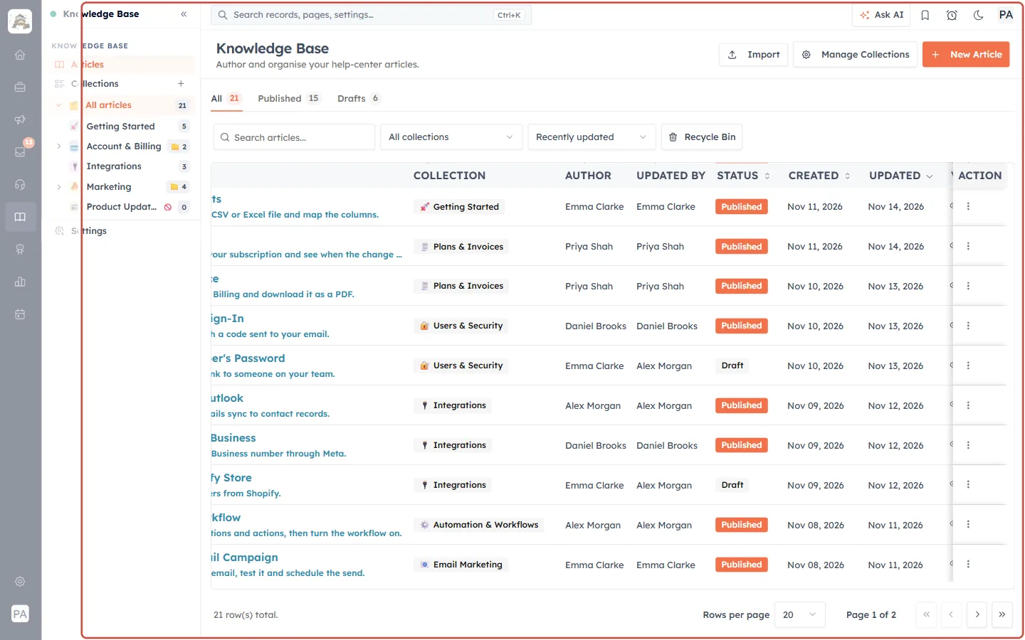
What this screenshot shows. The article list ringed, with the column headings along the top.
TITLE: the article’s title in orange, with its excerpt (the short summary) underneath. Click the title to open the article for editing. The arrows beside the heading sort by title.
COLLECTION: the collection the article belongs to, with the collection’s icon. A dash (—) means it is uncategorized.
AUTHOR: the name shown as the article’s author.
UPDATED BY: the person who last saved the article. In the example, Priya Shah wrote “Set Up Your Company Profile” and Daniel Brooks changed it last.
STATUS: an orange Published badge, or a grey Draft badge.
CREATED and UPDATED: the dates the article was created and last saved. Further to the right are the Views and Feedback columns (next figure), and the ACTION column with the ⋮ menu (Step 7).
At the bottom: the total number of rows (“21 row(s) total.”), Rows per page and the page arrows.
To see the Views and Feedback columns, scroll the list to the right. On a smaller screen, click the « at the top of the side panel first to give the list more room.
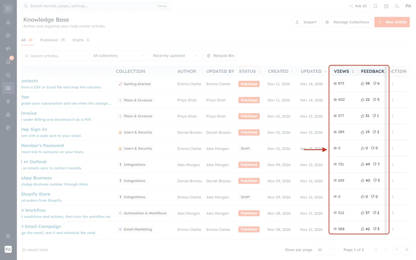
What this screenshot shows. The list scrolled to the right with the side panel closed. The VIEWS and FEEDBACK columns are ringed.
VIEWS (eye icon): how many times the article has been opened on your help center. “Import Your Contacts” has 873 views. Drafts show 0 because customers cannot open them.
FEEDBACK: the thumbs-up and thumbs-down counts from the Was this article helpful? question at the bottom of every article (Step 13). “Import Your Contacts” has 58 Yes and 6 No.
An article with many views and a lot of thumbs-down votes is a good one to rewrite first.
The ACTION column stays pinned on the right while you scroll.
Step 7: Use the article actions#
Every row has a ⋮ button in the ACTION column. Click it to see what you can do with that article.
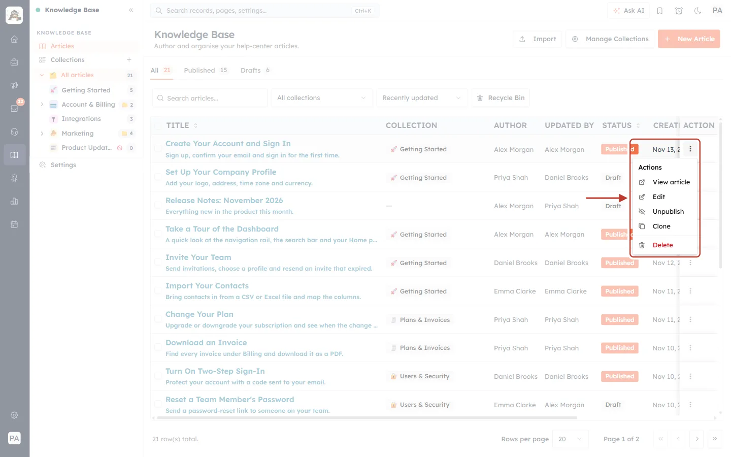
What this screenshot shows. The ⋮ menu of the published article “Create Your Account and Sign In”, ringed.
View article: opens the article on your help center, so you see it exactly as a customer does.
Edit: opens the article form. Clicking the title in the list does the same.
Unpublish: turns a published article back into a draft and takes it off the public site straight away. On a draft article this item reads Publish, and it makes the article live. A message confirms “Article published” or “Article unpublished”.
Clone: makes a copy of the article as a new draft (“Article cloned as a draft”). Handy when two articles are almost the same.
Delete (red): moves the article to the Recycle Bin (“Article moved to recycle bin”). It disappears from the help center, and you can restore it from the Recycle Bin later.
✅
Deleting is safe: the article waits in the Recycle Bin until you restore it or delete it forever from there. Only “Delete article forever?” removes it for good.
Step 8: Open one collection and set the article order#
Click a collection in the side panel tree to see only its articles. The list changes to a simple list that you can rearrange by dragging.
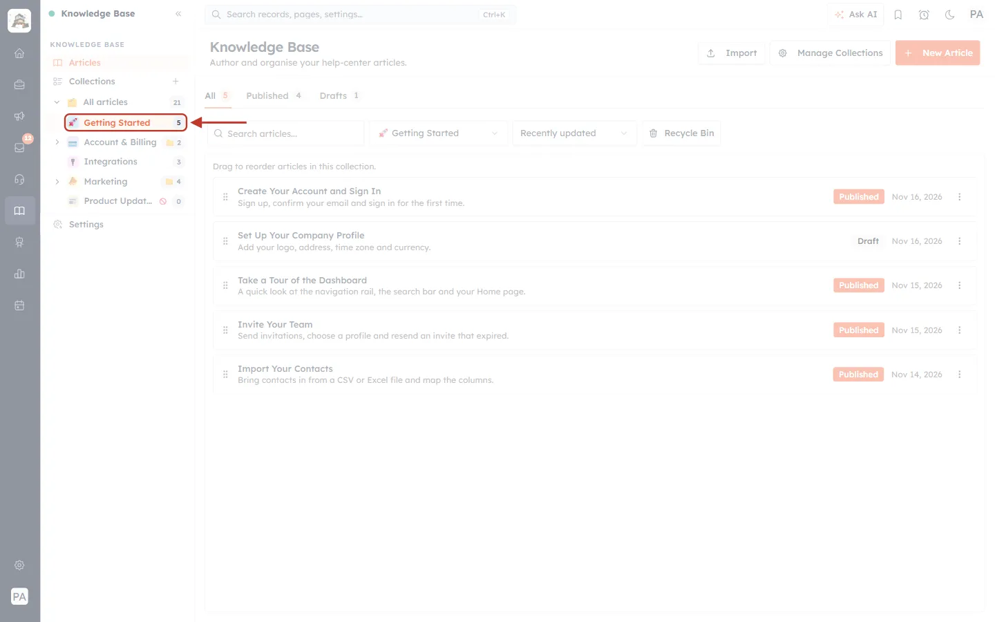
What this screenshot shows. Getting Started selected in the side panel (ringed) and the page showing only its five articles.
Getting Started is highlighted in the tree, and the collection filter above the list now reads Getting Started.
The tabs count only this collection: All 5, Published 4, Drafts 1.
“Drag to reorder articles in this collection.” Each row has a ⠿ handle on the left. Drag a row up or down to change the order.
This order is the order customers see on the collection page, and it also decides each article’s automatic Previous and Next links (Step 10).
Each row still shows its status badge, its last update date and the ⋮ actions menu.
Step 9: Organise articles into collections#
Collections are the topics of your help center. They become the cards on your help-center home page, so a good set of collections helps customers find answers without searching. Click Manage Collections (or Collections in the side panel).
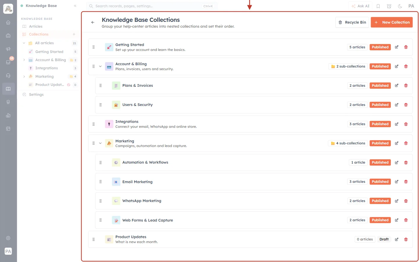
What this screenshot shows. The Knowledge Base Collections page, ringed.
Title: “Group your help-center articles into nested collections and set their order.” The ← arrow takes you back to the articles.
Each row is a collection with its icon, name and description, for example Getting Started — Set up your account and learn the basics.
Sub-collections are indented under their parent. Account & Billing holds Plans & Invoices and Users & Security; Marketing holds four. The arrow in front of a parent opens or closes it.
The count on the right: “5 articles” for a collection with articles, “2 sub-collections” for one that holds other collections.
Status: Published (orange) or Draft (grey). Product Updates is a draft, so it is hidden from customers.
Pencil edits a collection; the red bin deletes it. The ⠿ handle on the left lets you drag collections into a new order.
Recycle Bin and New Collection at the top right.
Click New Collection (or the + beside Collections in the side panel) to add one:
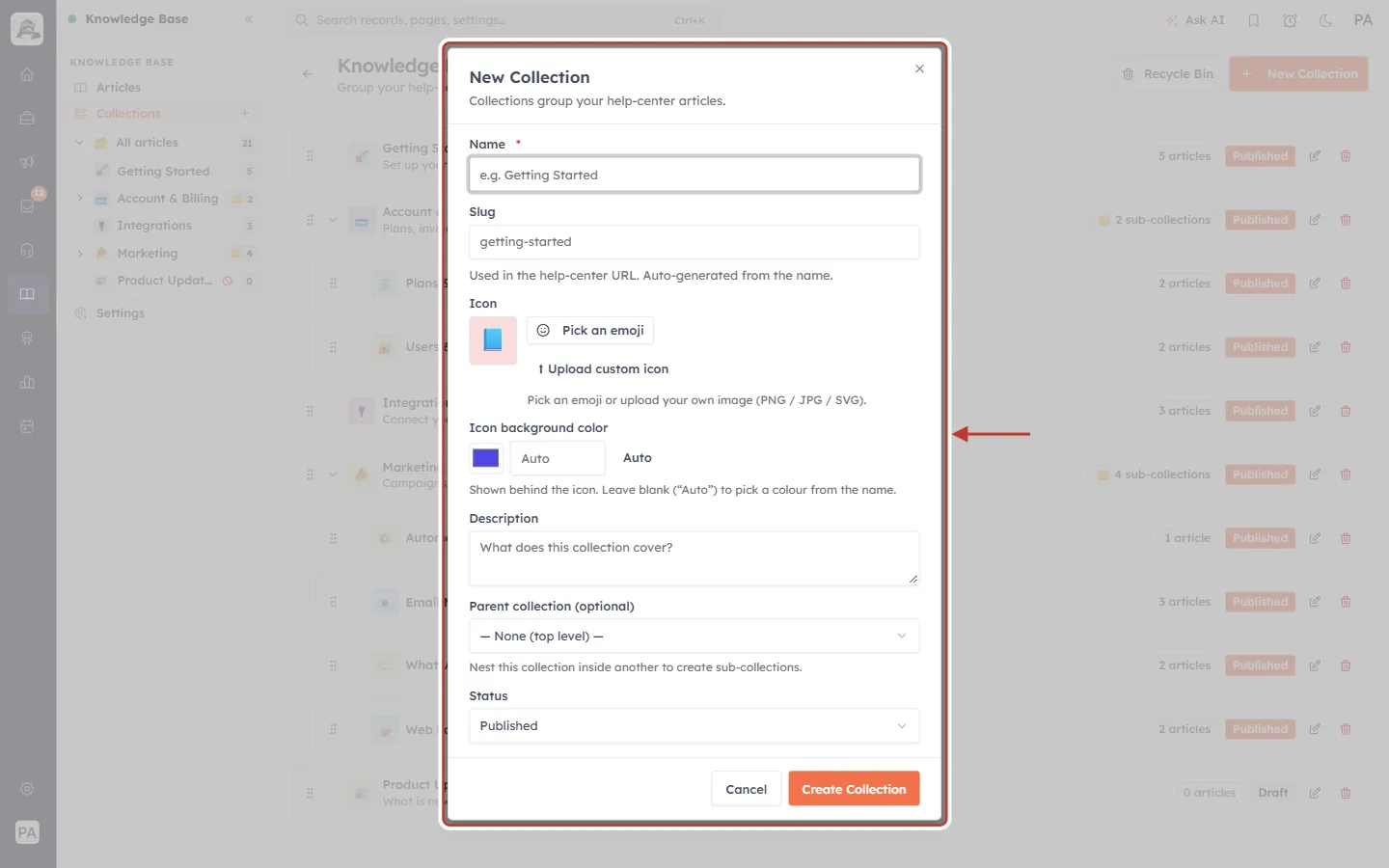
What this screenshot shows. The New Collection dialog, ringed.
Name (required): the topic name customers will see, for example “Getting Started”.
Slug: the collection’s part of the web address (getting-started). It is filled in from the name; change it only if you need a different address.
Icon: click Pick an emoji, or Upload custom icon for your own PNG, JPG or SVG image.
Icon background color: the colour behind the icon. Leave it on Auto and a colour is picked from the name.
Description: one line that tells customers what the collection covers. It appears on the help-center home page card.
Parent collection (optional): leave it on “— None (top level) —” for a main topic, or pick a collection to make this one a sub-collection. “Nest this collection inside another to create sub-collections.”
Status: Published or Draft. Then click Create Collection, or Cancel.
Step 10: Write an article#
Click New Article. The form has four parts: the article details, the content, the article navigation and the search-engine settings. Click Create Article at the top right when you are done.
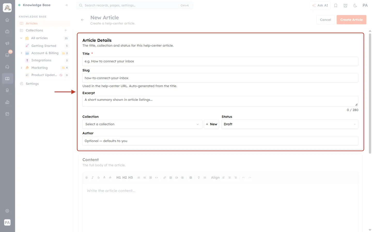
What this screenshot shows. The Article Details section, ringed: “The title, collection and status for this help-center article.”
Title (required): the question or task the article answers, for example “How to connect your inbox”.
Slug: the article’s web address, made from the title automatically. “Used in the help-center URL. Auto-generated from the title.”
Excerpt: a short summary, up to 280 characters. It appears under the title in lists and search results, so make it a helpful one-line answer.
Collection: choose where the article lives. + New beside it creates a collection without leaving the form.
Status: Draft (the default) keeps the article hidden; Published puts it on the help center as soon as you create it.
Author: optional. Leave it empty and your own name is used.
At the top: Cancel and Create Article.
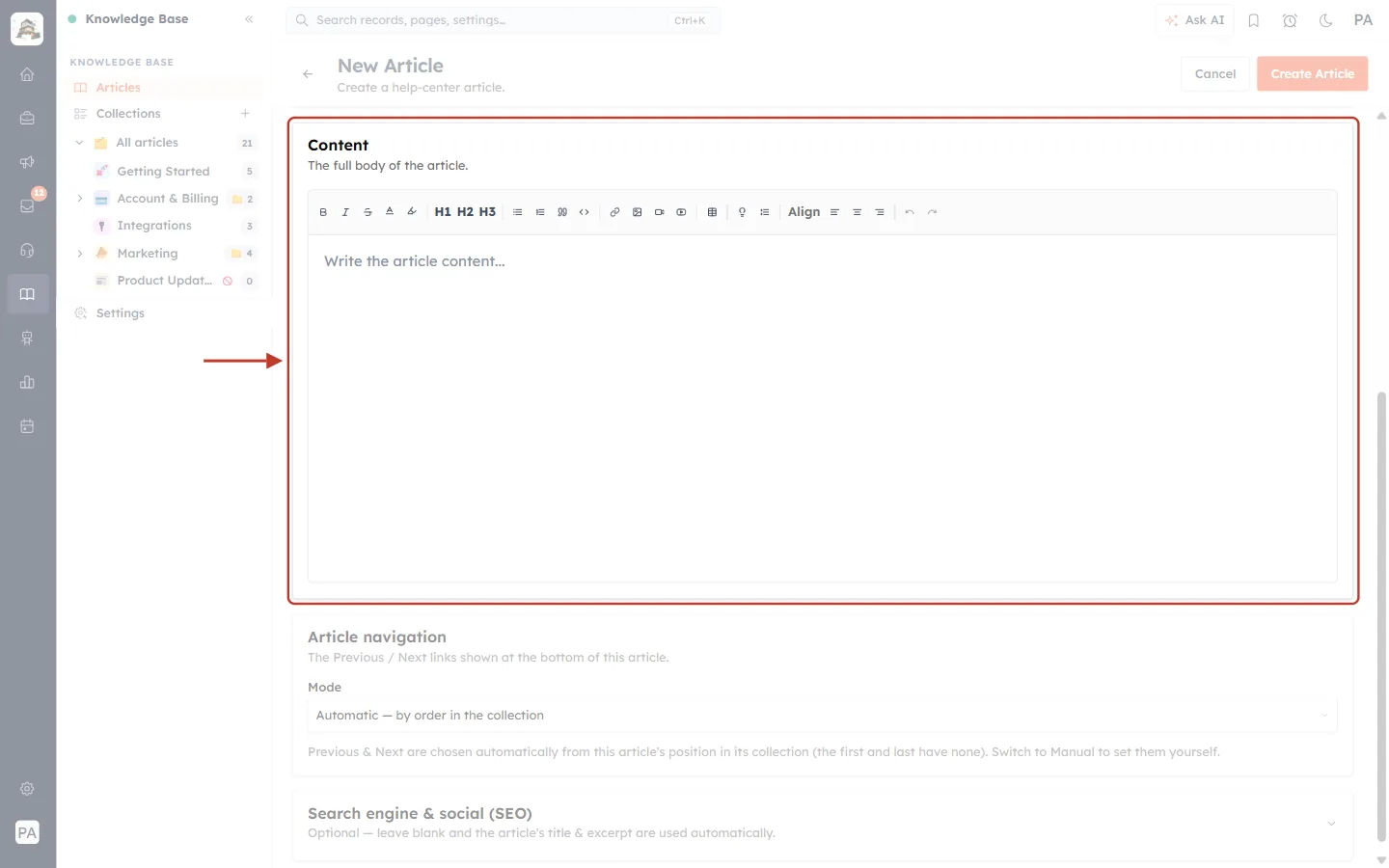
What this screenshot shows. The Content section, ringed: “The full body of the article.”
The writing area (“Write the article content…”) is where the article itself goes.
Text tools, from the left: Bold, Italic, Strikethrough, Text color and Highlight text.
H1 H2 H3: headings. Use H2 for each step or section; the help center turns your headings into the On this page list beside the article (Step 13).
Lists and blocks: Bullet list, Numbered list, Blockquote and Code block.
Media: Add / edit link, Insert image, Insert video and Embed YouTube.
Layout: Insert table, Callout box (a coloured note like the ones in this article), Collapsible section, then Align left, centre and right, and Undo / Redo.
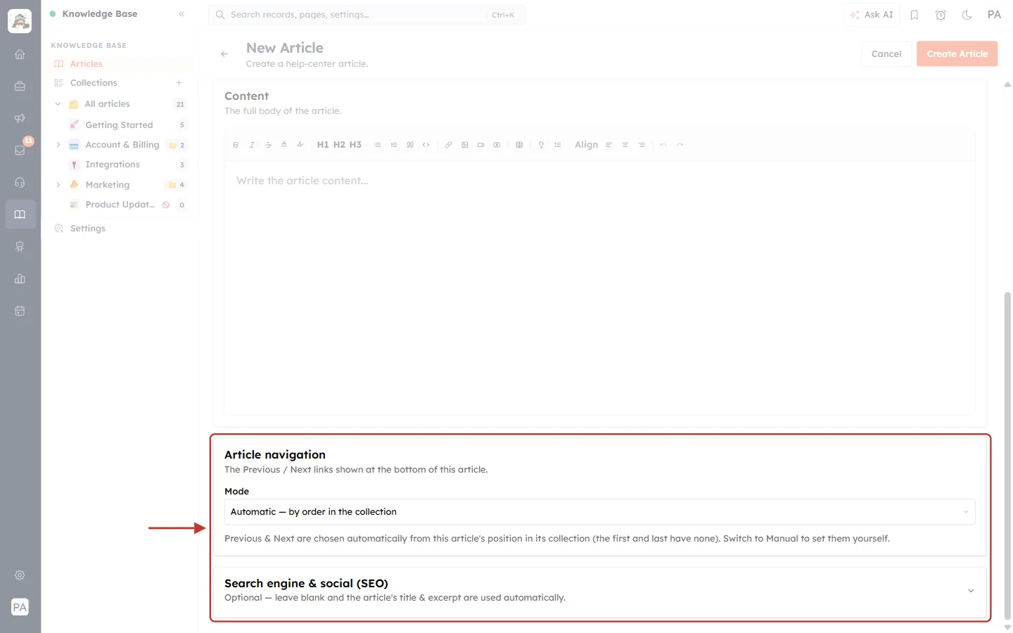
What this screenshot shows. The Article navigation and Search engine & social (SEO) sections, ringed.
Article navigation: “The Previous / Next links shown at the bottom of this article.”
Mode — Automatic — by order in the collection (the default): “Previous & Next are chosen automatically from this article’s position in its collection (the first and last have none).” That position is the drag order from Step 8.
Manual — pick specific articles: choose the Previous and Next articles yourself, for example to lead the reader to a different collection.
Search engine & social (SEO): click it to open optional fields for how the article looks in Google and when shared. “Optional — leave blank and the article’s title & excerpt are used automatically.”
Step 11: Import articles you already have#
If your help articles already live somewhere else, you don’t have to copy them one by one. Click Import on the Articles page.
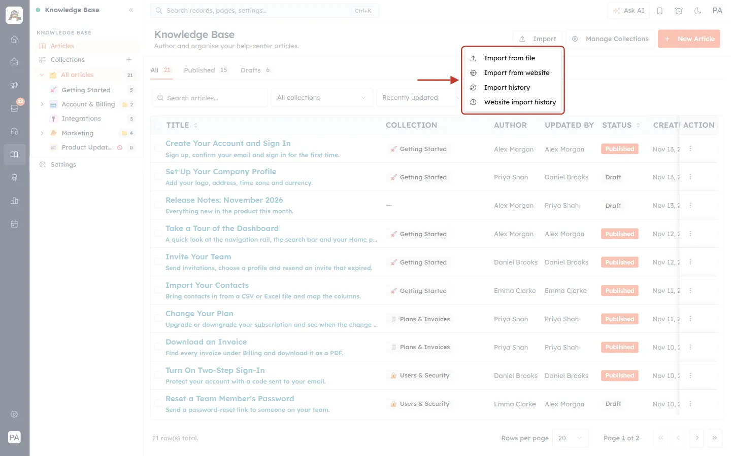
What this screenshot shows. The Import menu opened, ringed.
Import from file: upload a CSV or Excel file (CSV, XLSX or XLS, up to 50 MB). “Each row becomes an article — collections are matched by name and created if missing, and articles import as drafts for you to review.” The import has three steps, Upload & Settings → Map Fields → Review, and the first page offers a Download sample CSV so you can see the expected columns.
Import from website: “Crawl your existing help center and import its articles as drafts.” Paste the Help center URL of your current public help center and click Crawl website. Advanced options are there if you need them.
Import history: your past file imports and their results.
Website import history: your past website crawls and their results.
ℹ️
Imported articles always arrive as Drafts. Read them, fix anything that came across wrongly, then publish them from the ⋮ menu or by changing their status.
Step 12: Set up and publish your help center#
Click Settings at the bottom of the side panel. The Help Center Settings page (“Branding, hero, footer, SEO and the public address for your help center.”) controls how your help center looks and where it lives. Work down the page, then click Save Settings.
Publish: the address and the on/off switch#
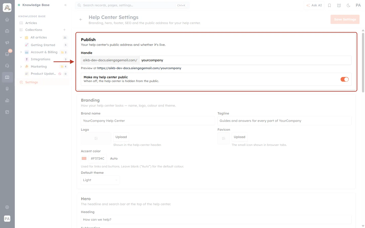
What this screenshot shows. The Publish section, ringed: “Your help center’s public address and whether it’s live.”
Handle: the last part of your help center’s built-in address. Here the handle is yourcompany, so the address is the help-center host followed by /yourcompany.
Preview at: the full built-in address of your help center. It keeps working even after you connect your own domain.
Make my help center public: the master switch. “When off, the help center is hidden from the public.” Turn it on (orange) when you are ready for customers to see it.
Branding: name, logo, colour and theme#
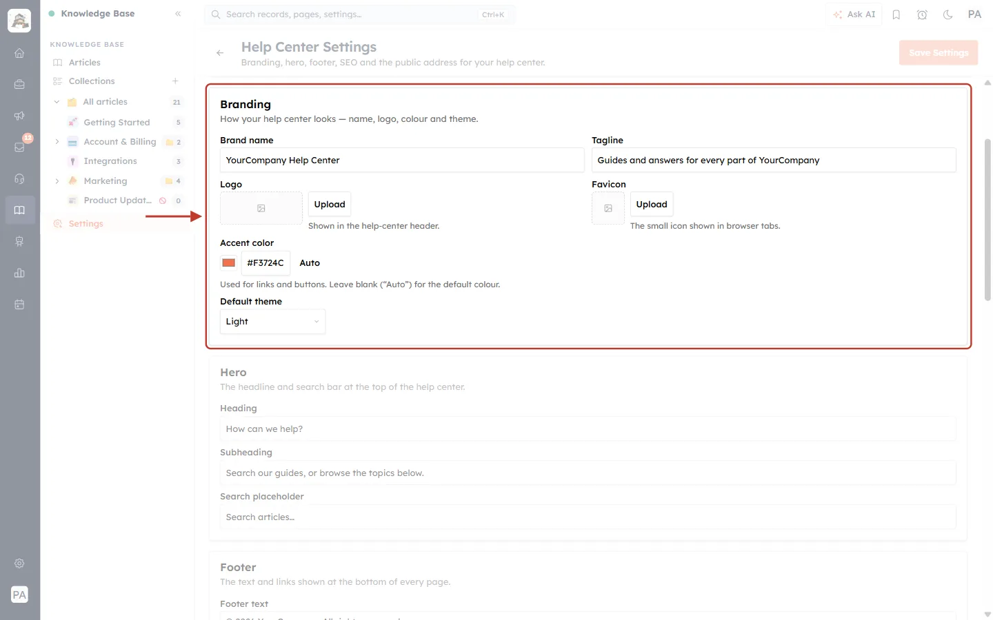
What this screenshot shows. The Branding section, ringed: “How your help center looks — name, logo, colour and theme.”
Brand name: shown at the top left of every help-center page (“YourCompany Help Center”).
Tagline: a short line about your help center.
Logo: click Upload. “Shown in the help-center header.”
Favicon: “The small icon shown in browser tabs.”
Accent color: “Used for links and buttons. Leave blank (“Auto”) for the default colour.” Here it is set to orange, #F3724C.
Default theme: Light or Dark. Customers can still switch theme themselves on the help center.
Hero and Footer: the top and bottom of every page#
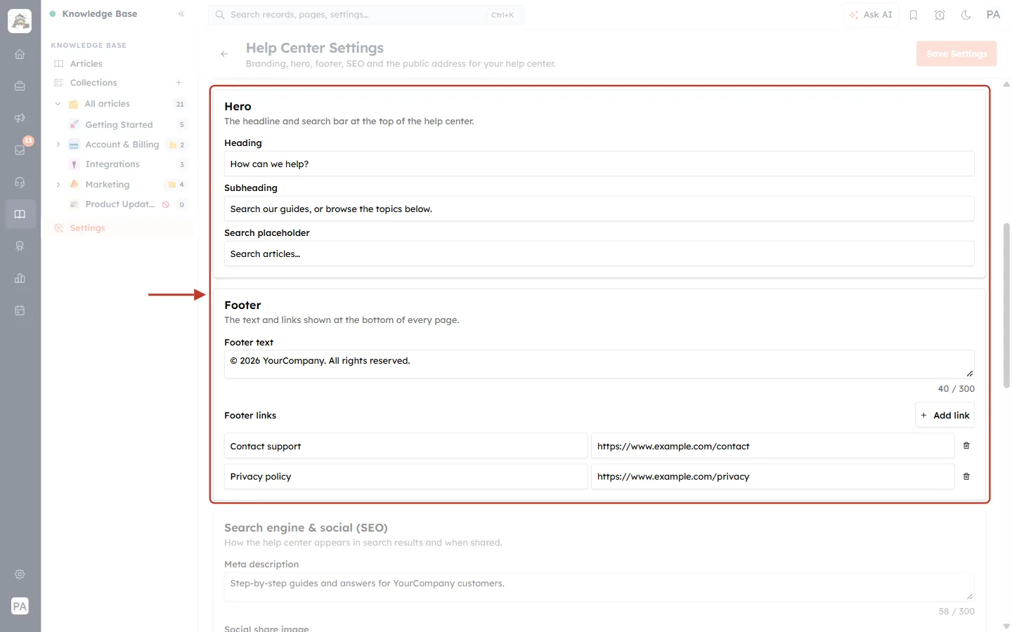
What this screenshot shows. The Hero and Footer sections, ringed together.
Hero: “The headline and search bar at the top of the help center.” Set the Heading (“How can we help?”), the Subheading (“Search our guides, or browse the topics below.”) and the Search placeholder, the grey hint inside the search box (“Search articles…”).
Footer: “The text and links shown at the bottom of every page.”
Footer text: up to 300 characters, for example “© 2026 YourCompany. All rights reserved.”
Footer links: click + Add link and enter a label and a web address for each link. You can add up to 6. Here: Contact support and Privacy policy. The bin removes a link.
Below the footer, Search engine & social (SEO) holds the Meta description (up to 300 characters) that search engines show under your help center’s name, and a Social share image (1200×630) shown when someone shares a link to it.
Article call-to-action: a banner under every article#
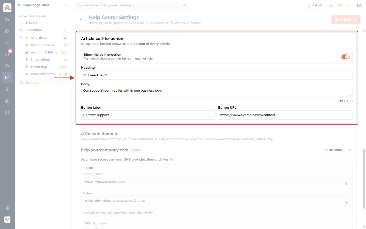
What this screenshot shows. The Article call-to-action section, ringed: “An optional banner shown at the bottom of every article.”
Show the call-to-action: “Turn on to show a banner beneath each article.” It is on here.
Heading: the banner’s title, for example “Still need help?”.
Body: up to 400 characters, for example “Our support team replies within one business day.”
Button label and Button URL: the banner’s button, here Contact support linking to your contact page.
A good call-to-action gives customers who didn’t find their answer a clear next step.
Custom domain: use your own web address#
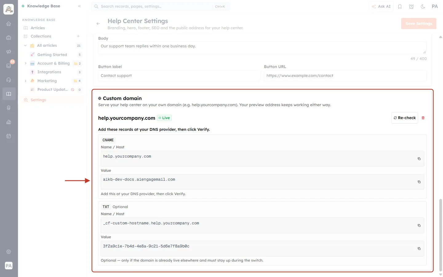
What this screenshot shows. The Custom domain section, ringed: “Serve your help center on your own domain (e.g. help.yourcompany.com). Your preview address keeps working either way.”
help.yourcompany.com with a green Live badge: the domain is connected and working.
“Add these records at your DNS provider, then click Verify.” Your DNS provider is wherever you manage your domain (for example GoDaddy, Cloudflare or Namecheap).
CNAME (required): Name / Host is your help-center domain, and Value is the help-center host it points to. Use the copy icons to copy each value exactly.
TXT (Optional): “only if the domain is already live elsewhere and must stay up during the switch.”
Re-check checks the records again, for example after you change them. The red bin disconnects the domain.
⚠️
DNS changes can take from a few minutes to a few hours to reach everyone. If the domain is not live yet, wait a while and click Re-check. Meanwhile the Preview at address keeps working.
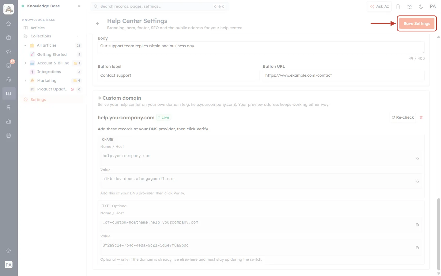
What this screenshot shows. The top of the Help Center Settings page with Save Settings ringed.
Save Settings stays pale until you change something. Once you edit a field it becomes active; click it to save your changes.
It stays at the top of the page while you scroll, so you can save from any section.
The ← arrow next to the title takes you back to your articles.
Step 13: See what your customers see#
Open your help center at its Preview at address or on your own domain, or use View article in the ⋮ menu of any published article. This is the website your customers use.
The home page#
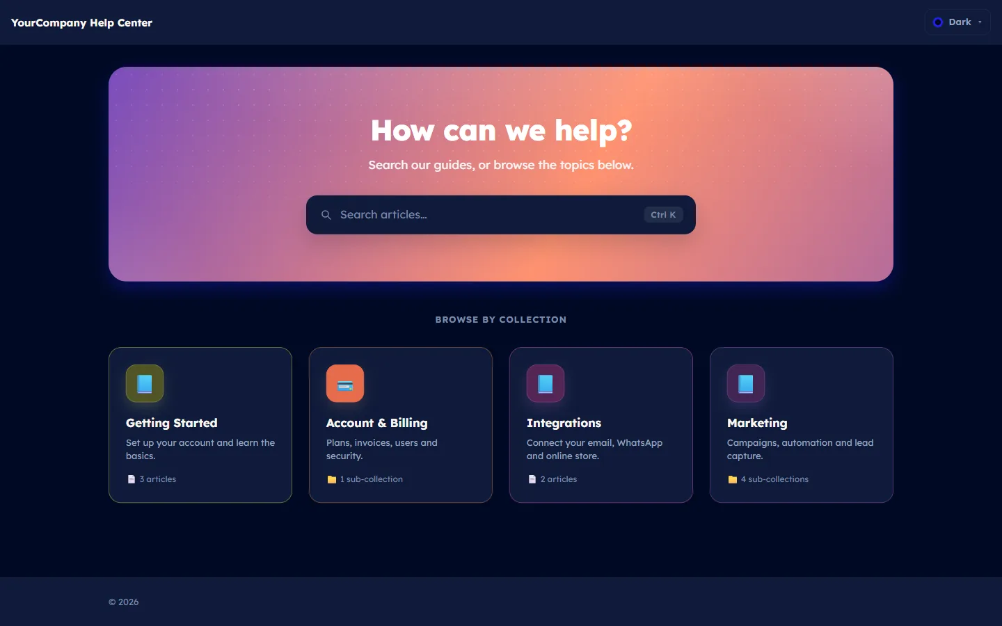
What this screenshot shows. The whole home page of a help center that uses the Dark theme.
Top bar: the brand name (“YourCompany Help Center”), your logo if you uploaded one, and the theme menu (Dark ▾) where customers can switch between light and dark.
Hero: your heading, subheading and the big search box, all set in the Hero section of Settings.
BROWSE BY COLLECTION: one card for each published top-level collection.
Footer at the bottom with your footer text and links.
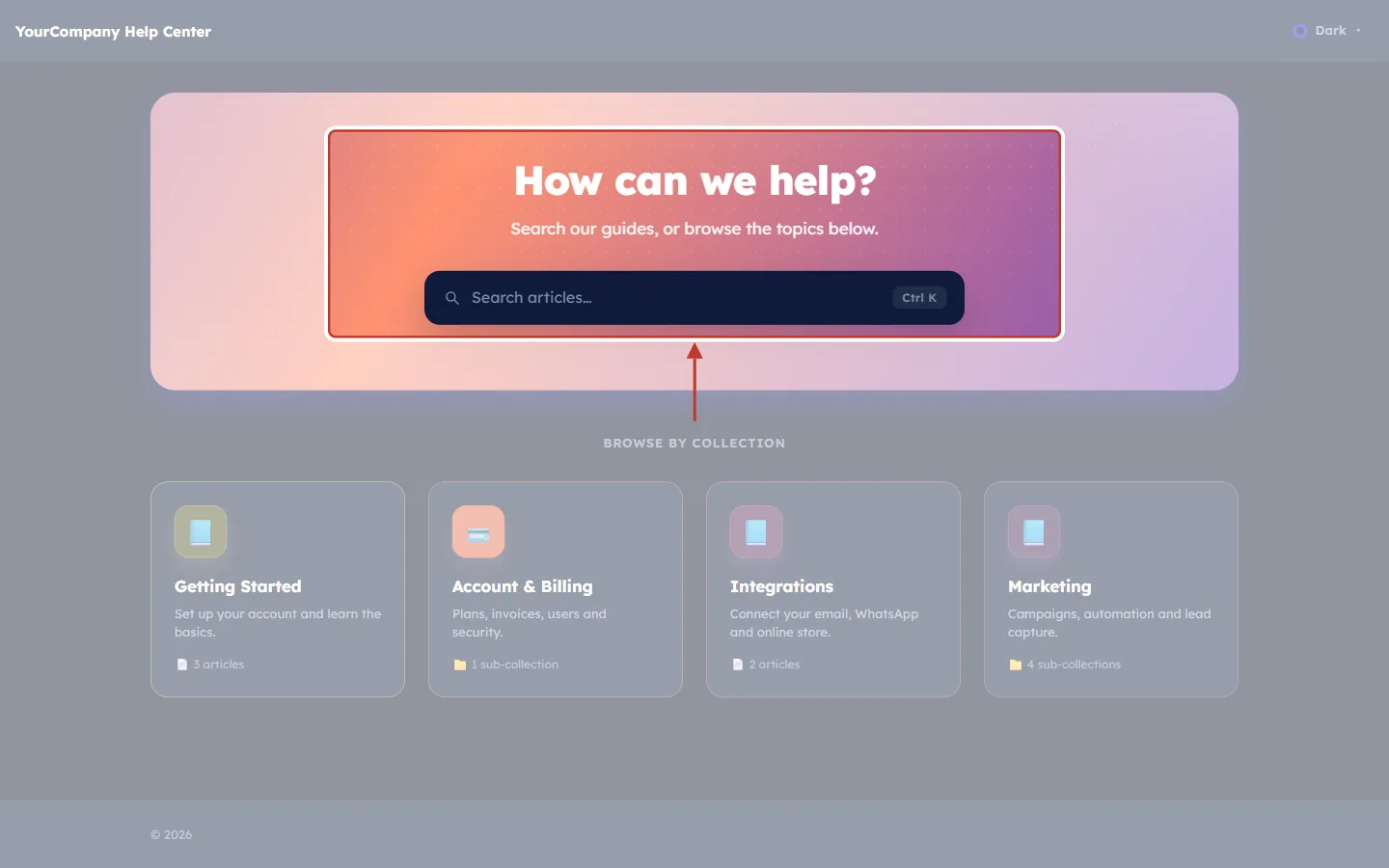
What this screenshot shows. The hero area, ringed: How can we help?, the subheading and the search box.
How can we help?: your Hero Heading.
Search our guides, or browse the topics below.: your Hero Subheading.
Search articles…: your Search placeholder. Customers can also press Ctrl K to jump straight into search.
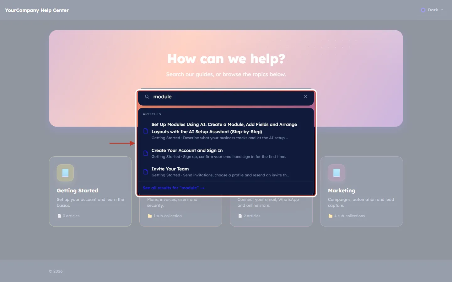
What this screenshot shows. A customer has typed “module”, and matching articles appear straight away under the search box (ringed).
ARTICLES: each match with its title and, below it, its collection and excerpt (for example “Getting Started · Sign up, confirm your email…”). This is why a clear excerpt matters.
Click a result to open the article.
See all results for “module” → opens a full results page.
The × in the box clears the search.
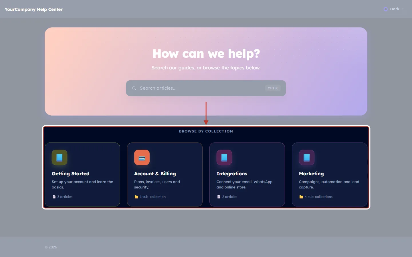
What this screenshot shows. The BROWSE BY COLLECTION heading and the four collection cards, ringed.
Each card shows the collection’s icon, name and description, exactly as you set them in the New Collection dialog.
The line at the bottom counts what is inside: a page icon with the number of articles (“3 articles”), or a folder icon with the number of sub-collections (“4 sub-collections”).
Only published collections appear, and only published articles are counted. The draft Product Updates collection is not shown.
The cards follow the order you set on the Collections page.
A collection page#
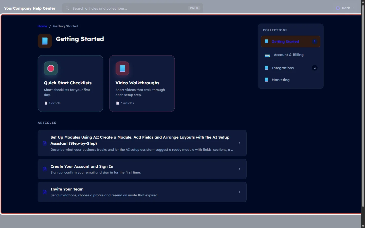
What this screenshot shows. The public page of the Getting Started collection.
Breadcrumb: Home / Getting Started. Customers click Home to go back.
Collection name with its icon at the top.
Sub-collection cards: if the collection holds sub-collections, they appear as cards first (here Quick Start Checklists and Video Walkthroughs).
ARTICLES: the collection’s published articles in your drag order, each with its title, excerpt and an arrow to open it.
COLLECTIONS on the right: all top-level collections, with the current one highlighted and article counts, so customers can jump to another topic.
The search box sits in the top bar on every page (“Search articles and collections…”).
An article page#
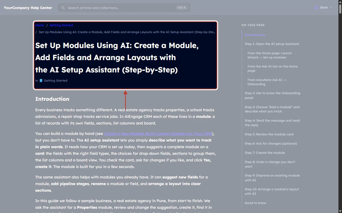
What this screenshot shows. The top of an article page, ringed: the breadcrumb, the title and the collection it belongs to.
Breadcrumb: Home / Getting Started / article title, so the customer always knows where they are.
Title: the article’s title in large text.
in 📘 Getting Started: the collection, which links back to the collection page.
The article content starts underneath, with your headings, images, tables and callouts.
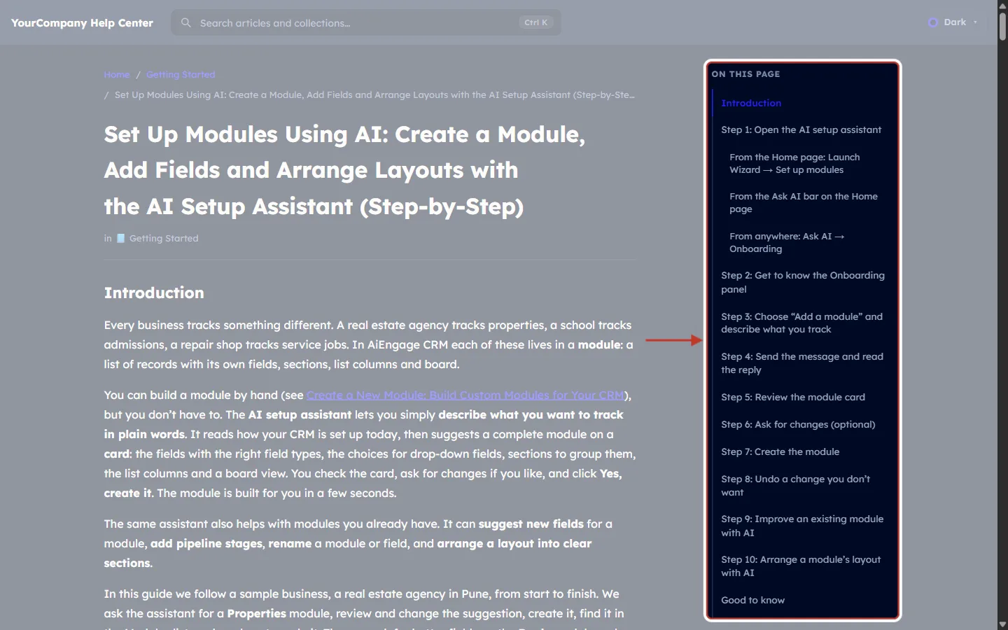
What this screenshot shows. The ON THIS PAGE outline on the right, ringed.
It lists the article’s headings, built automatically from the H2 and H3 headings you used in the editor. Smaller headings are indented under their section.
Customers click a heading to jump straight to that part of the article.
The section the reader is on is highlighted as they scroll.
Tip: write one H2 per step (“Step 1: …”) and this outline becomes a clickable step list.
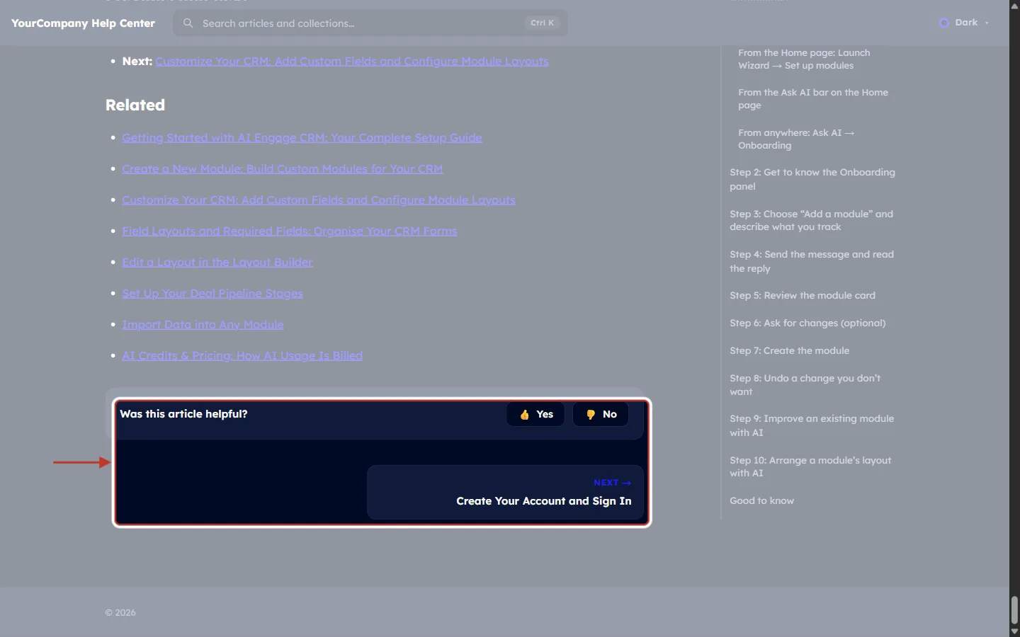
What this screenshot shows. The end of the article, ringed: Was this article helpful? and the NEXT article card.
Was this article helpful? with Yes and No: every vote is counted in the FEEDBACK column of your article list (Step 6).
NEXT → card: the next article (“Create Your Account and Sign In”). A PREVIOUS card appears on the left when there is a previous article. Both come from the Article navigation setting (Step 10).
When the article call-to-action is turned on in Settings, its banner (heading, body and button) appears beneath each article too.
Above the feedback box you can see the article’s own links, here a Related list.
Good to know#
Draft means hidden. Draft articles and draft collections never appear on the public site, in its search, or in the collection counts.
Uncategorized articles can still be published, but they don’t appear on any collection page. Put every article you publish into a collection.
Order matters twice. The drag order inside a collection is the order customers see, and it also sets the automatic Previous / Next links.
Views and feedback start counting once an article is published. Sort by Most viewed to find the articles that matter most.
Deleted is not gone. Deleted articles and collections wait in their Recycle Bin until you restore them or delete them forever.
Your preview address always works, even after you connect your own domain.
Troubleshooting#
I can’t see Knowledge Base in the navigation rail#
Why it happens: your profile doesn’t have the Knowledge Base permission. How to fix it: ask an admin to open Setup → Profiles, open your profile, and turn on Knowledge Base under Feature Permissions → Marketing. Then refresh the page.
My article isn’t on the help center#
Check its STATUS in the article list. If it says Draft, open the ⋮ menu and click Publish.
Check its COLLECTION. If it shows a dash (—), edit the article and choose a collection.
Check the collection itself on the Collections page. If the collection is a Draft, edit it and set it to Published.
Check Settings → Publish: Make my help center public must be on.
My custom domain doesn’t open the help center#
Why it happens: the DNS record is missing, has a typo, or hasn’t spread yet. How to fix it: copy the CNAME Name and Value again with the copy icons, check them at your DNS provider, wait a little, then click Re-check in Settings → Custom domain.
My imported articles don’t show up for customers#
Why it happens: every import creates Drafts. How to fix it: open the Drafts tab, review each imported article and publish it.
Frequently asked questions#
Do my customers need an account to read the help center?
No. Once Make my help center public is on, anyone with the address can read and search the published articles.
Can I prepare the whole help center before anyone sees it?
Yes. Keep the articles as drafts or keep the public switch off until you are ready.
How many levels of collections can I have?
Collections can be nested: pick a Parent collection when you create or edit one to make it a sub-collection.
Can I move my articles from another help-center tool?
Yes. Use Import → Import from website to crawl your current help center, or Import from file with a CSV or Excel export. Everything arrives as drafts.
Can customers switch to a dark or light page?
Yes. You choose the default theme in Settings → Branding, and customers can switch with the theme menu at the top right of the help center.
Previous and next#
Related#
Introduction to Customer & Support: How AiEngage CRM Turns Customer Requests into Tickets
Set Up the Website Chat Widget for Support: Live Chat, AI Agent, Handoff & Install
Create a Permission Profile Step by Step: Build, Edit, Clone, Deactivate & Delete
Profile Permissions Explained: What Every Module, Feature & Setup Setting Controls
Was this article helpful?
Ready to implement this?
OpenAI Engage and apply what you just learned to your own workspace.
Open AI Engage CRM