Loading…


KnowledgeBase
Organize Articles into Collections: Create, Nest, Reorder and Manage Help-Center Collections (Step by Step)
Introduction#
When your help center has only a handful of articles, customers can scroll through them. Once you have twenty, fifty or a hundred, they need a way to find the right one quickly. Collections solve this. A collection is a folder for help articles, such as Getting Started, Billing & Plans or Troubleshooting, and your public help center shows each one as its own section with its own icon and description.
Collections can also hold sub-collections. For example, an Integrations collection can contain Email Integrations and WhatsApp, so related topics stay together without one very long list.
In this article we walk through everything you can do with collections in the AiEngage CRM Knowledge Base, one screen at a time:
Open the Collections page and understand each part of it.
Create a new collection, with an icon, a colour, a description and a status.
Create a sub-collection inside another collection.
Edit a collection.
Change the order of your collections.
Put articles into a collection and set the order of those articles.
Delete a collection, find it in the Recycle Bin, and restore it or delete it forever.
Every screenshot is followed by a What this screenshot shows section that explains the whole screen, so you can compare it with what you see in your own account.
ℹ️
The screenshots use sample collections (Getting Started, Billing & Plans, Integrations and so on). Your own collection names, icons and article counts will be different, but every button and field is in the same place.
Before you begin#
You need access to the Knowledge Base. Administrators always have it. Other users need the Knowledge Base permission in their profile (Setup → Profiles → Feature Permissions → Marketing → Knowledge Base). If you can’t see the open-book icon in the left rail, ask your administrator to switch this on.
It helps to plan your structure first. Write down the 4 to 8 main topics your customers ask about. These become your top-level collections. Topics that sit under a main topic become sub-collections.
If you are new to the Knowledge Base, read Introduction to the Knowledge Base (Help Center) first. It gives a tour of the whole feature.
Key terms#
Collection: a group of help articles on one topic. It has a name, an icon, an optional description and a status.
Top-level collection: a collection that is not inside any other collection. Customers see these first on the help center home page.
Sub-collection: a collection placed inside another collection (its parent).
Slug: the short, web-friendly version of the name used in the help-center address, for example account-security.
Status: Published collections are visible on your help center. Draft collections are hidden while you prepare them.
Recycle Bin: where deleted collections go. You can restore them from there or delete them for good.
Part 1: Open the Collections page#
Step 1: Open Collections from the Knowledge Base side panel#
Click the Knowledge Base icon (the open book) in the left navigation rail. The Knowledge Base opens on the Articles page. In the Knowledge Base side panel next to the rail, click Collections.
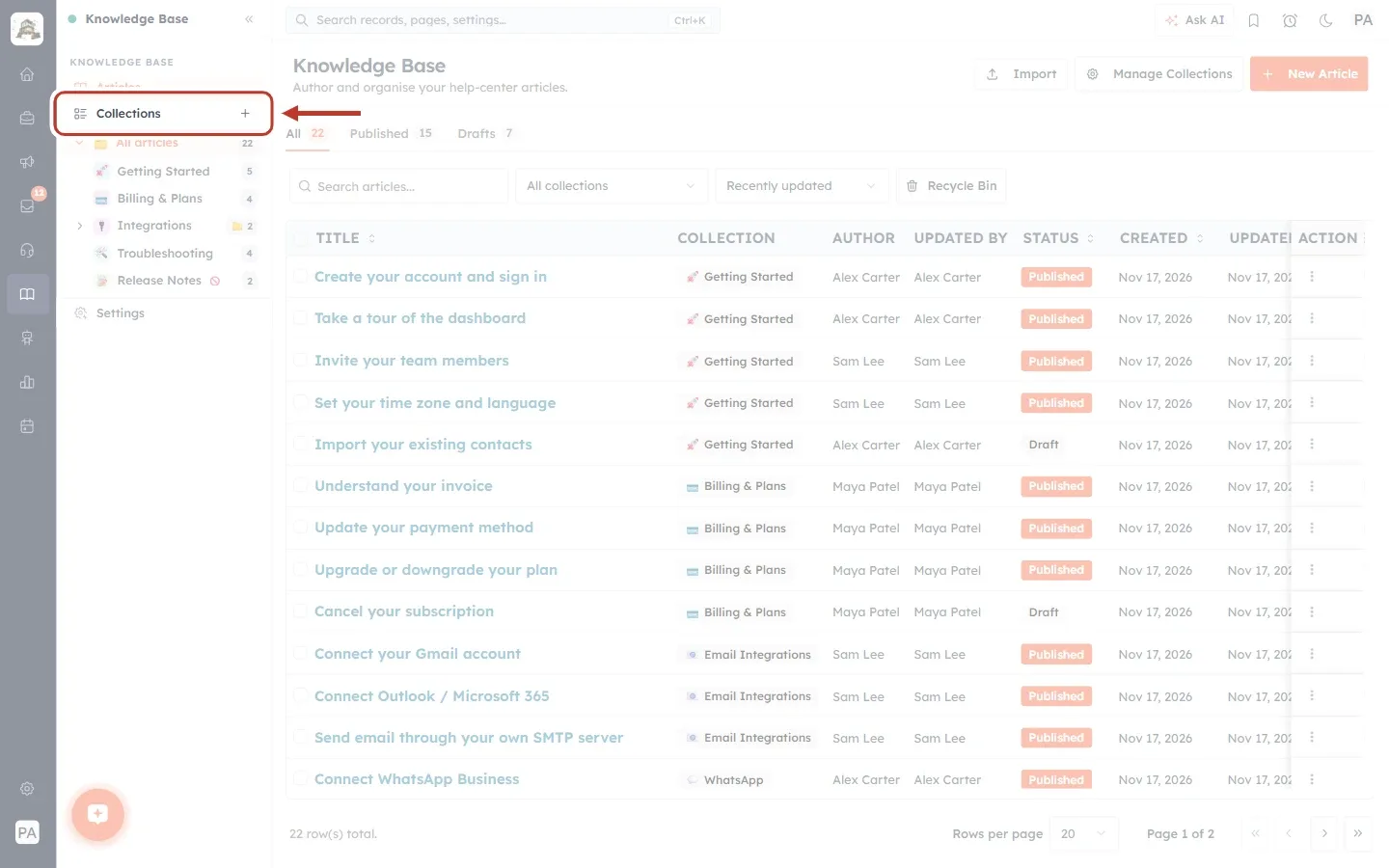
What this screenshot shows. The Knowledge Base Articles page, with Collections in the side panel ringed and an arrow pointing to it.
Collections (ringed): opens the Collections page, where you create and organise collections. The small + at the right end of this row opens the New Collection form straight away (we use it in Part 3).
Articles: the item just above it, which brings you back to the list of articles.
All articles and the tree below it: every collection with a count. A plain number is the number of articles in it. A folder icon with a number means the collection holds that many sub-collections (Integrations has 2).
A small red ⊘ next to a name (Release Notes here) marks a Draft collection, which is hidden from customers.
The main area shows the article list, with a Collection column that tells you which collection each article belongs to.
Step 2 (another way): use Manage Collections on the Articles page#
You can also reach the same page from the top of the Articles page by clicking Manage Collections.
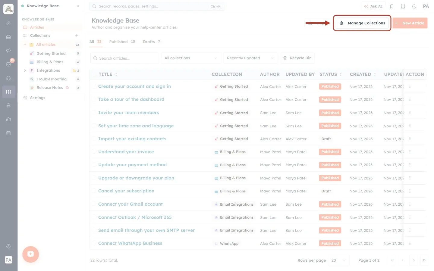
What this screenshot shows. The top-right buttons of the Articles page, with Manage Collections ringed.
Import: brings in articles from a website or a file (not covered here).
Manage Collections (ringed): opens the Collections page. It does exactly the same as the Collections item in the side panel.
New Article: starts a new article. In Part 6 we show how to choose its collection.
Step 3: Get to know the Collections page#
The Knowledge Base Collections page lists every collection as a card. Sub-collections are indented under their parent, so you can see your whole structure at a glance.
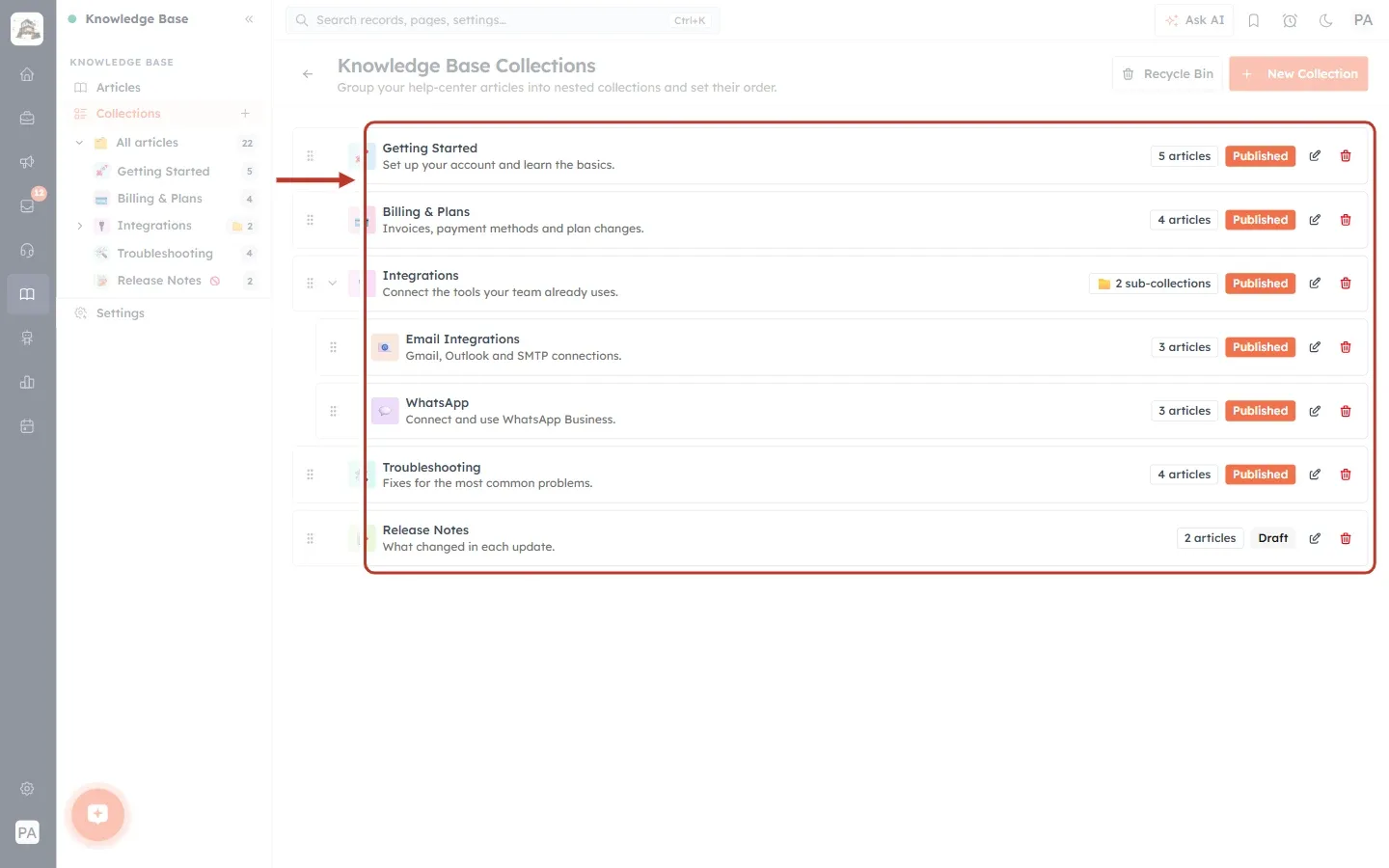
What this screenshot shows. The Collections page with the full list of collections ringed.
The heading Knowledge Base Collections and the line under it: “Group your help-center articles into nested collections and set their order.”
Each card is one collection. The top-level collections here are Getting Started, Billing & Plans, Integrations, Troubleshooting and Release Notes.
Email Integrations and WhatsApp are indented under Integrations. That indent shows they are sub-collections of Integrations.
The list is shown in the same order customers see on the help center. You change it by dragging (Part 5).
The back arrow (←) to the left of the heading takes you back to the Articles page.
Step 4: The buttons at the top of the page#
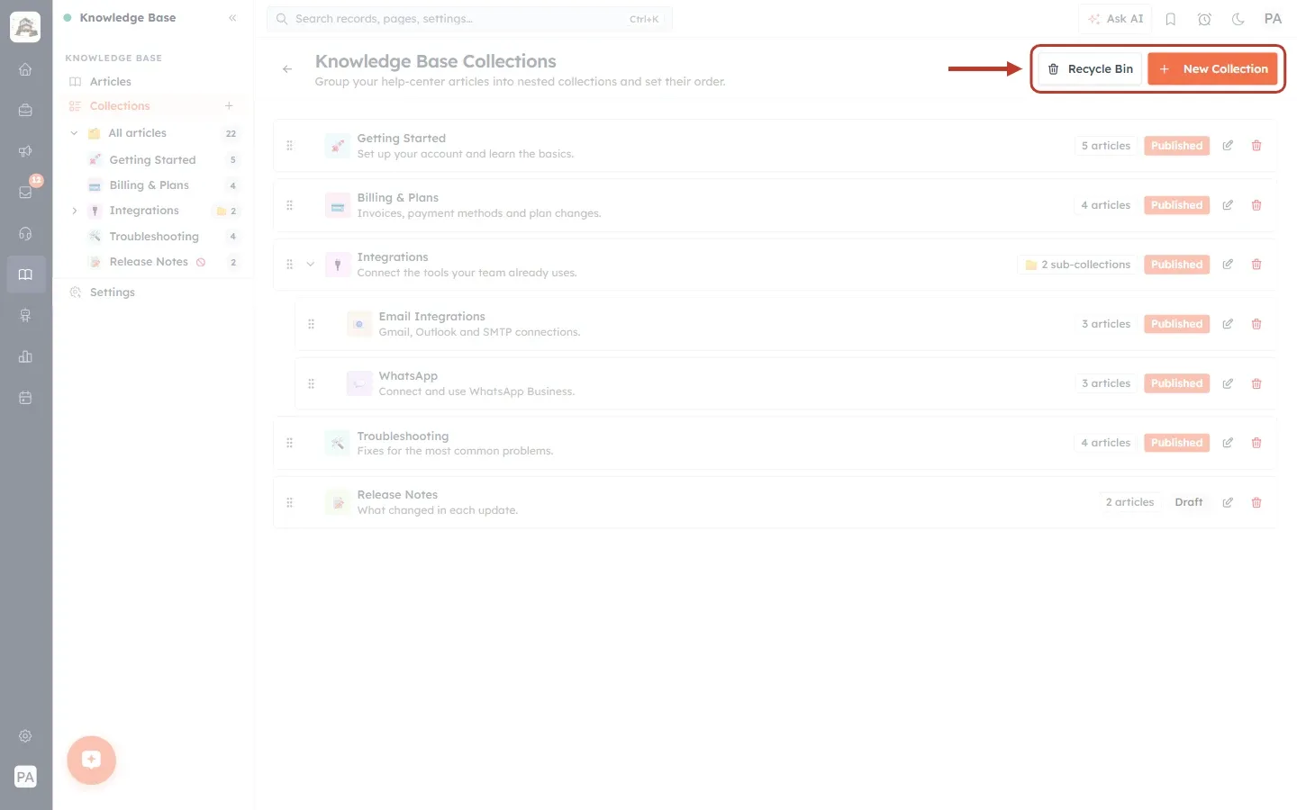
What this screenshot shows. The two buttons at the top right of the Collections page, ringed together.
Recycle Bin: switches the page to show deleted collections, so you can restore them or delete them forever (Part 7). Click it again to go back to the normal list.
New Collection (orange): opens the form to create a collection (Part 2).
Step 5: Understand one collection card#
Every card shows the same information and controls. Here is the Integrations card, which has sub-collections.
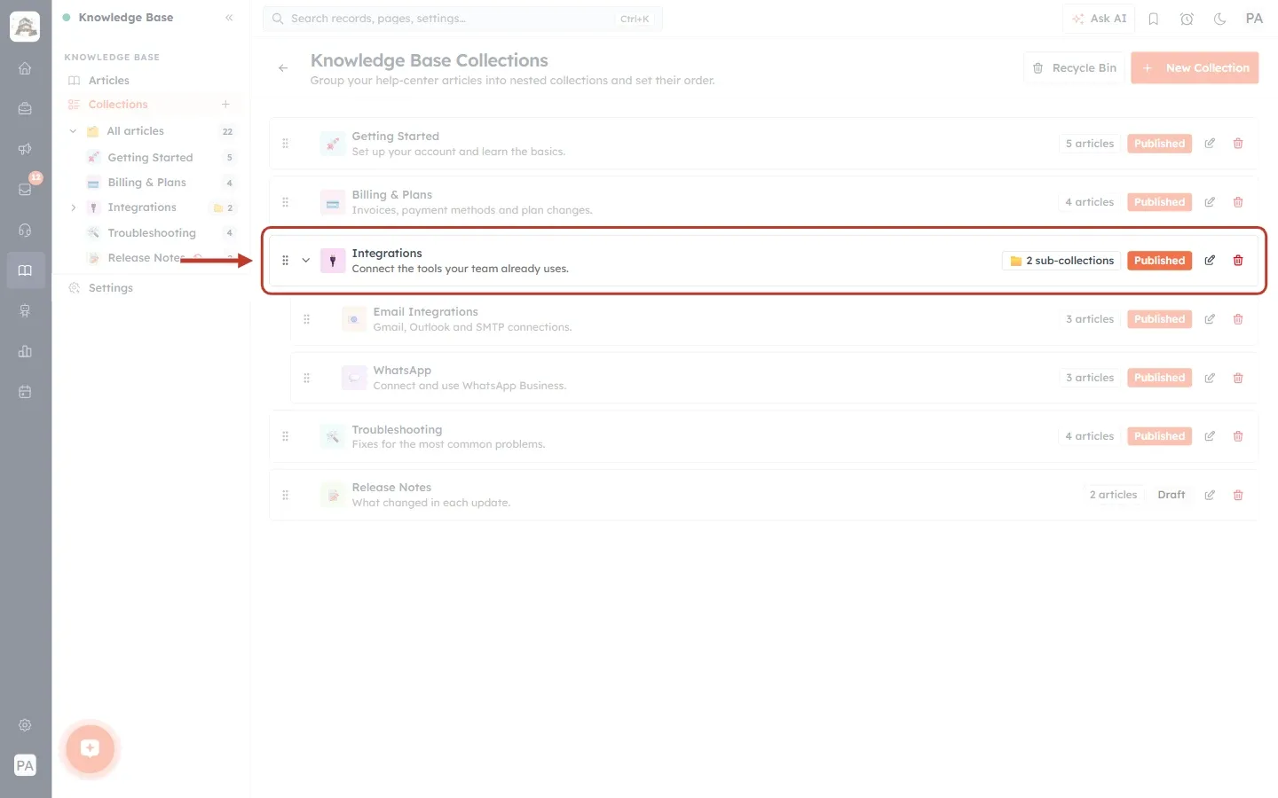
What this screenshot shows. The Integrations card ringed, from the drag handle on the left to the delete icon on the right.
⋮⋮ Drag handle (far left): hold and drag it to move the collection up or down within its group.
˅ Arrow: appears only on collections that have sub-collections. Click it to hide or show the sub-collections underneath.
Icon: the emoji or image you chose, on its background colour.
Name and description: “Integrations” and “Connect the tools your team already uses.”
Count: “2 sub-collections” (with a folder icon) for a parent collection, or “4 articles” for a collection that holds articles directly.
Status badge: orange Published, or grey Draft (as on Release Notes).
Pencil icon: edits the collection (Part 4).
Red bin icon: deletes the collection (Part 7).
Part 2: Create a new collection#
In this example we create a top-level collection called Account & Security for articles about passwords and safe sign-in.
Step 6: Click New Collection#
Click the orange New Collection button. The New Collection form opens over the page.
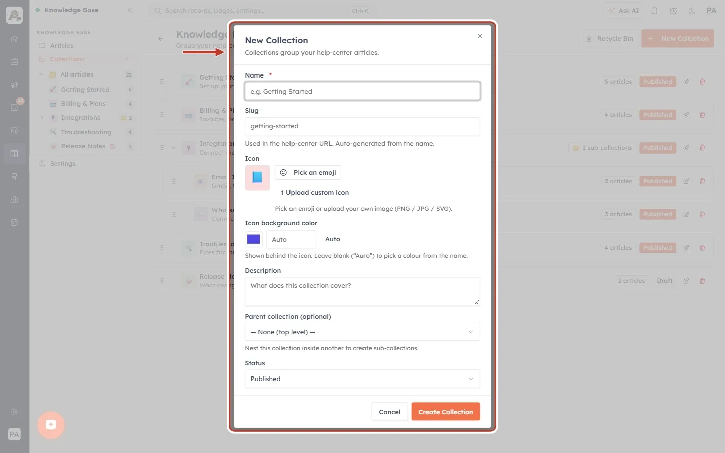
What this screenshot shows. The empty New Collection form, ringed.
The title New Collection and the line “Collections group your help-center articles.”
Name (required, marked with a red *) and Slug.
Icon: a preview tile, a Pick an emoji button and Upload custom icon.
Icon background color: a colour swatch, a text box that says Auto, and an Auto button.
Description: “What does this collection cover?”
Parent collection (optional): set to “— None (top level) —”.
Status: set to Published by default.
Cancel closes the form without saving. Create Collection saves it. The × at the top right also closes the form.
Step 7: Type a name and check the slug#
In Name, type the collection name as customers should see it. As you type, the Slug fills in by itself.
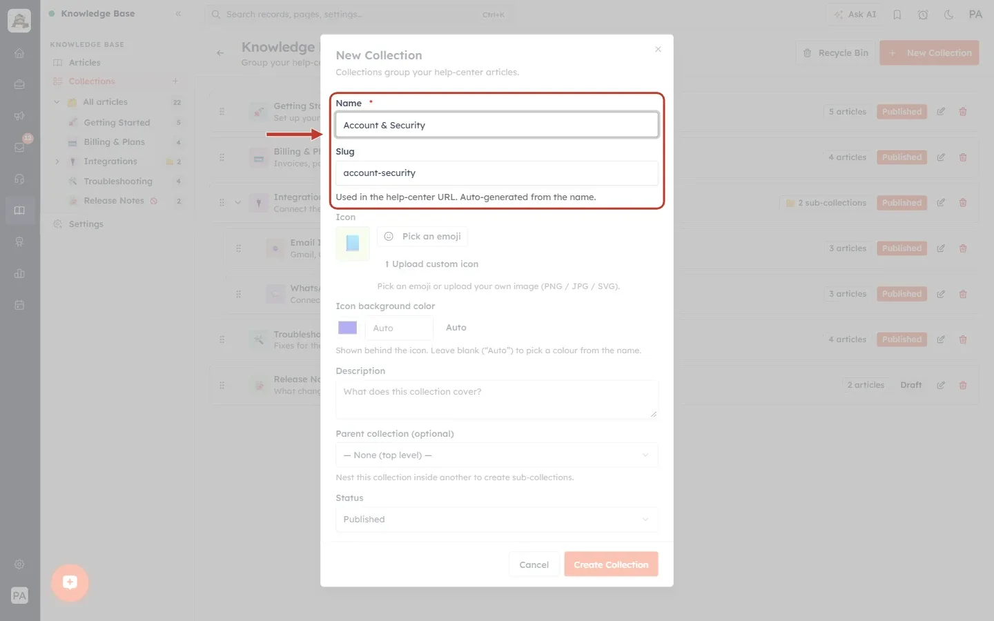
What this screenshot shows. The Name and Slug fields ringed after typing a name.
Name: “Account & Security”. The name can be up to 60 characters.
Slug: “account-security”, created automatically. Spaces become hyphens, and symbols such as & are dropped.
The note under the slug: “Used in the help-center URL. Auto-generated from the name.”
You can type your own slug instead. It may only contain lowercase letters, numbers and hyphens, up to 80 characters.
💡
Pick a short, clear slug and try not to change it later. The slug is part of the web address of the collection, so changing it changes links that customers or search engines may already use.
Step 8: Pick an icon#
Click Pick an emoji. An emoji picker opens. Type a word in the Search box to find an emoji quickly. We searched for “locked”.
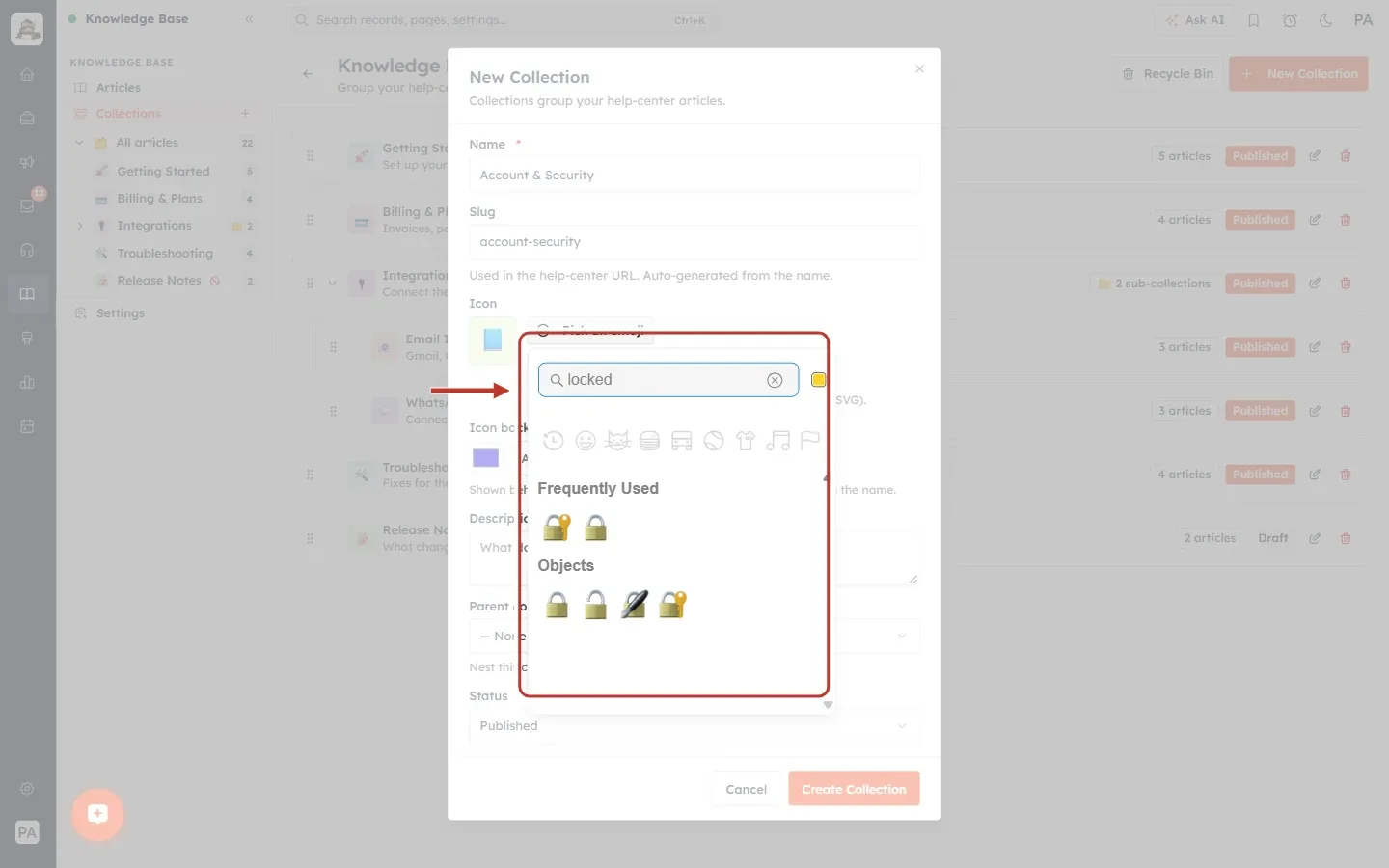
What this screenshot shows. The emoji picker ringed, open under the Pick an emoji button.
Search box at the top: we typed “locked”, so only matching emojis are shown.
The yellow square next to the search box changes the skin tone for people emojis.
The row of small icons are categories (recent, smileys, animals, food, travel, activities, objects, symbols, flags). Click one to jump to it.
Frequently Used: emojis you picked recently, for quick reuse.
Click any emoji to choose it. The picker closes and the emoji appears in the icon tile.
Step 9: Check the chosen icon#
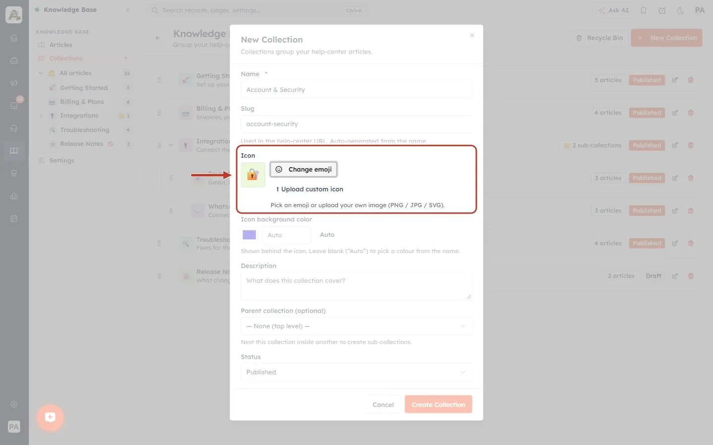
What this screenshot shows. The Icon section ringed after choosing an emoji.
The preview tile now shows the lock-with-key emoji 🔐.
The button now reads Change emoji. Click it to pick a different one.
Upload custom icon: use your own image instead of an emoji. The note says which files you can use: PNG, JPG or SVG.
You can use one emoji per collection.
Step 10: Choose an icon background colour (optional)#
The icon sits on a small coloured square. Leave it on Auto and the CRM picks a colour based on the collection name, or type your own colour code.
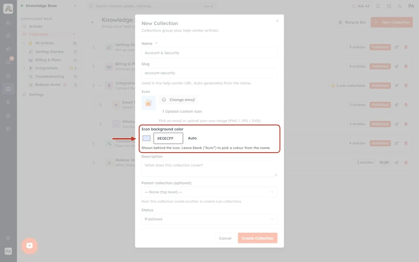
What this screenshot shows. The Icon background color row ringed.
The colour swatch on the left: click it to pick a colour with your computer’s colour picker.
The text box: we typed #E0ECFF, a light blue. Use the format #RRGGBB.
The Auto button: clears your colour and goes back to automatic.
The note: “Shown behind the icon. Leave blank (“Auto”) to pick a colour from the name.”
Step 11: Add a description#
Write one short sentence that tells customers what they will find in this collection. It appears under the collection name.
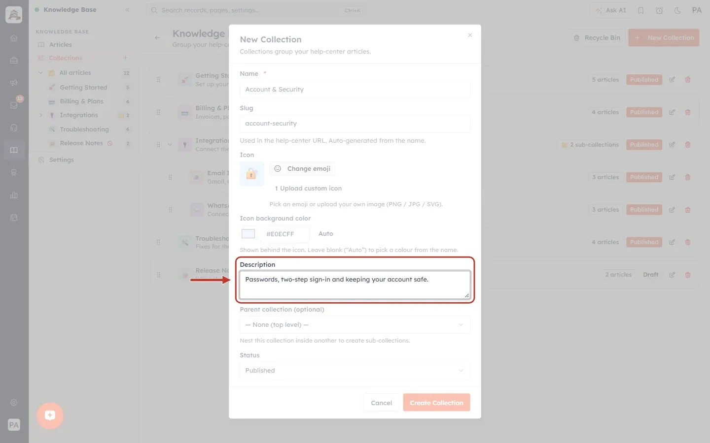
What this screenshot shows. The Description box ringed with our text: “Passwords, two-step sign-in and keeping your account safe.”
The description is optional, but it helps customers choose the right collection.
It can be up to 200 characters.
You can drag the small handle at the bottom-right corner of the box to make it taller while you type.
Step 12: Choose where it goes and its status#
Leave Parent collection on — None (top level) — to create a main collection. (In Part 3 we choose a parent to make a sub-collection.) Then check the Status.
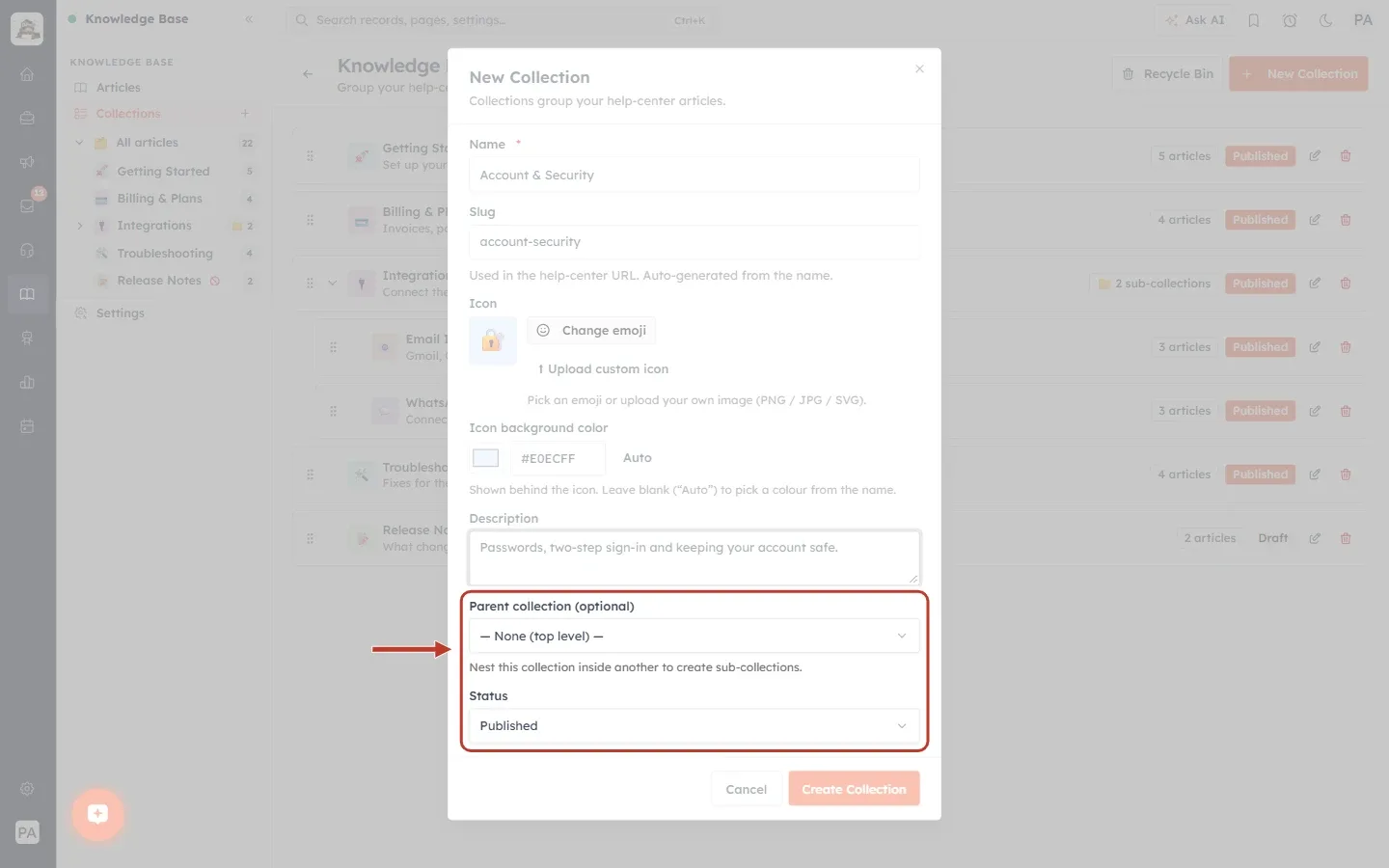
What this screenshot shows. The Parent collection (optional) and Status fields ringed together.
Parent collection: “— None (top level) —” means this will be a top-level collection.
The note: “Nest this collection inside another to create sub-collections.”
Status: currently Published.
Step 13: Pick Published or Draft#
Click the Status box to see the two choices.
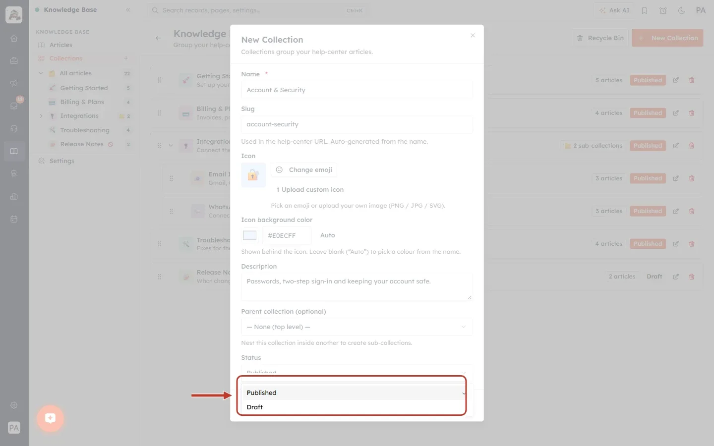
What this screenshot shows. The Status list open and ringed.
Published (ticked): the collection appears on your public help center as soon as you save it, together with its published articles.
Draft: the collection is saved but stays hidden from customers. Use this while you are still writing its articles. In the side panel, a draft collection shows a small red ⊘ marked “Draft (hidden)”.
We keep Published.
Step 14: Save the collection#
Check the form once more, then click Create Collection.
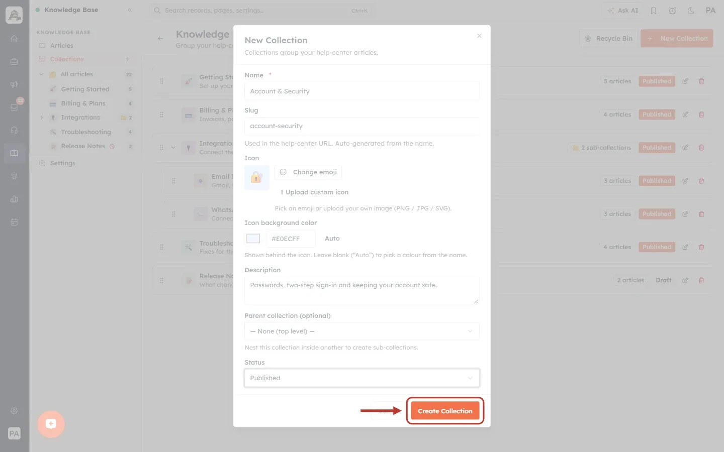
What this screenshot shows. The completed form, with the Create Collection button ringed.
Every field is filled in: Name “Account & Security”, slug “account-security”, the 🔐 icon, background #E0ECFF, the description, top level, Published.
If a field has a problem (for example, the name is empty or the slug has a capital letter), a red message appears under that field and the collection is not saved until you fix it.
Cancel throws the form away.
Step 15: Find your new collection in the list#
The form closes, a short “saved” message appears, and the new collection is added at the end of the list.
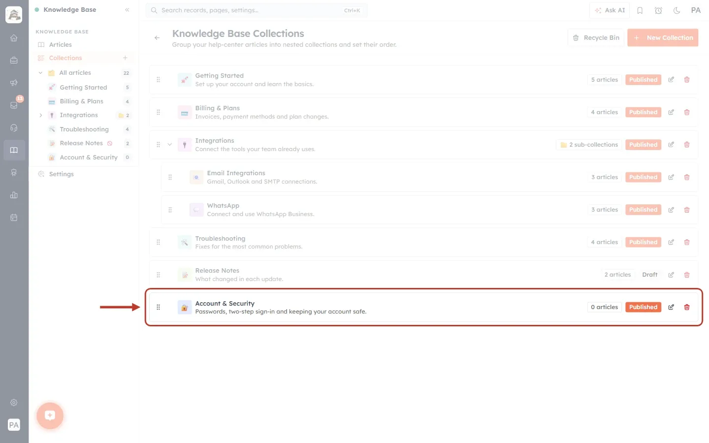
What this screenshot shows. The Collections page after saving, with the new Account & Security card ringed.
The card shows the 🔐 icon on its light-blue background, the name and the description.
0 articles: the collection is empty for now. We add articles to it in Part 6.
Published: the status we chose.
The side panel on the left also lists Account & Security now.
New collections are added at the end. In Part 5 we drag it higher up.
Part 3: Create a sub-collection#
A sub-collection is simply a collection with a parent. Here we create Team Members & Roles inside Account & Security.
Step 16: Open the New Collection form from the side panel#
You can use the orange New Collection button again, or use the shortcut in the side panel: click the small + at the right end of the Collections row.
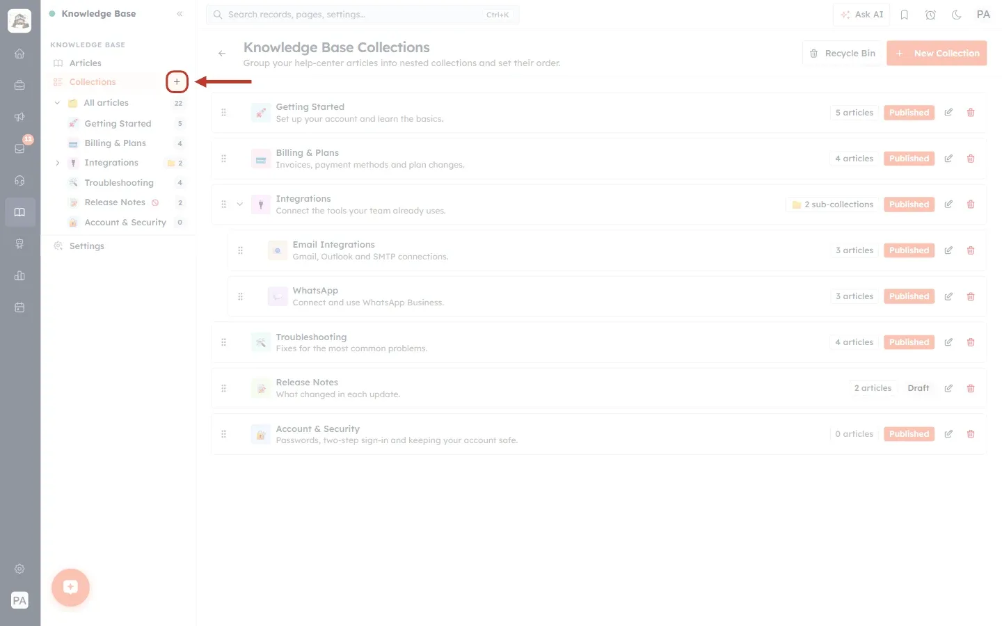
What this screenshot shows. The Knowledge Base side panel, with the + next to Collections ringed.
The + opens the same New Collection form from any Knowledge Base page, so you don’t need to open the Collections page first.
In the side panel, Account & Security now appears with 0 articles.
Step 17: Fill in the form and choose a parent#
Type the name (Team Members & Roles), pick an icon (we chose 👥) and add a description. Then click the Parent collection box.
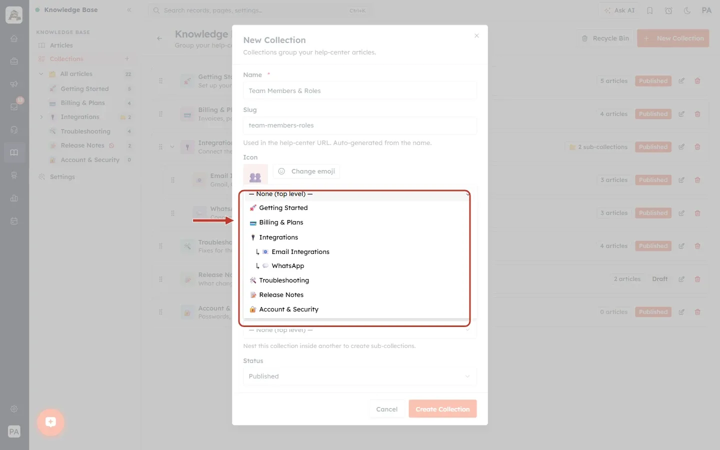
What this screenshot shows. The Parent collection list open and ringed.
At the top: — None (top level) —.
Below it, every existing collection with its icon. Sub-collections are shown with a small ↳ under their parent (Email Integrations and WhatsApp under Integrations).
Pick Account & Security, the collection we created in Part 2.
When you edit a collection, this list leaves out the collection itself and its own sub-collections, so you can never put a collection inside itself.
Step 18: Check the parent and save#
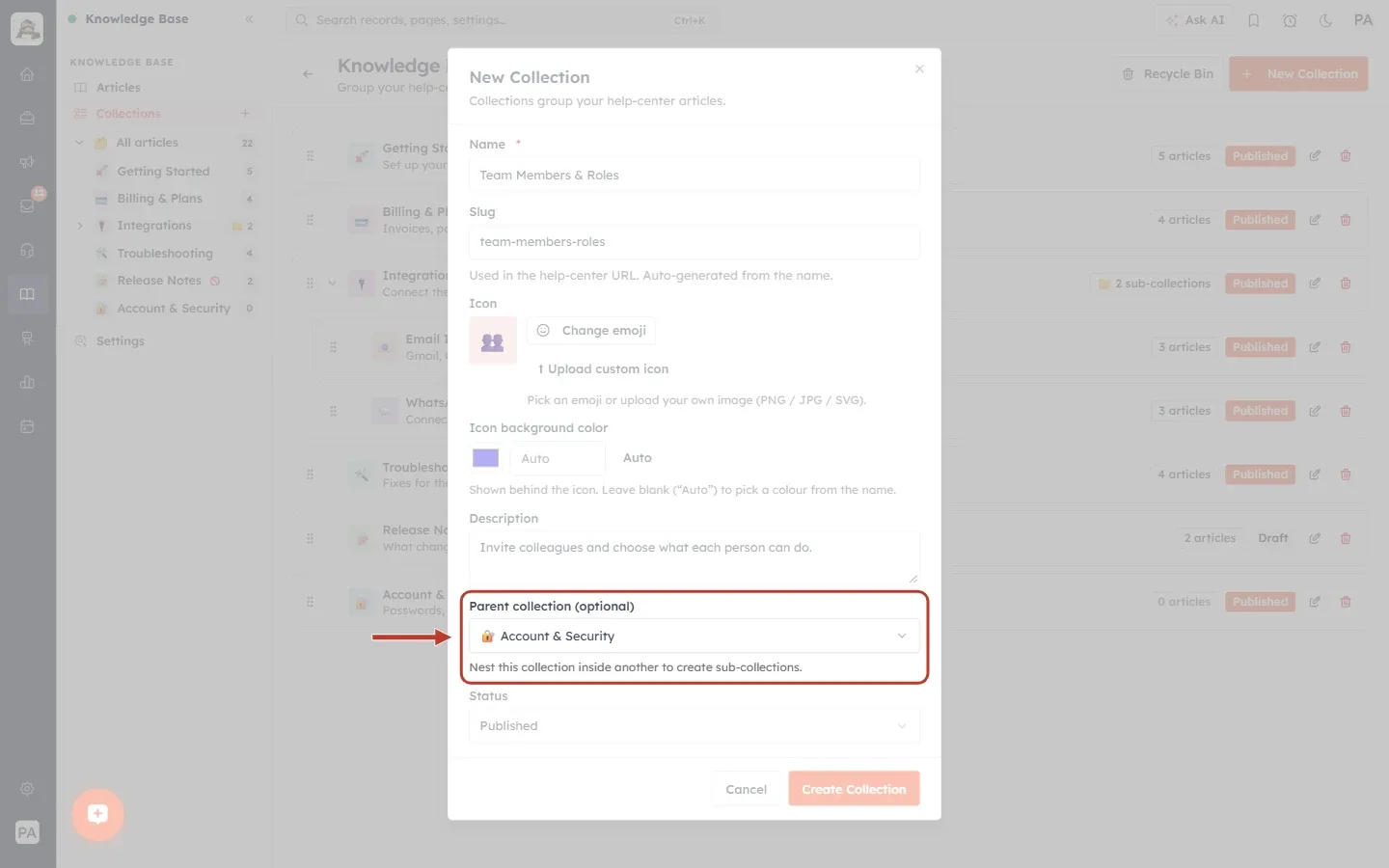
What this screenshot shows. The Parent collection field ringed, now showing Account & Security.
The new collection will be placed inside Account & Security.
Status stays Published.
Click Create Collection to save.
💡
When you create a collection from the side-panel + while the Collections page is open, the side panel updates at once but the main list may not. If you don’t see the new sub-collection in the main list, refresh the page.
Step 19: See the sub-collection in the list#
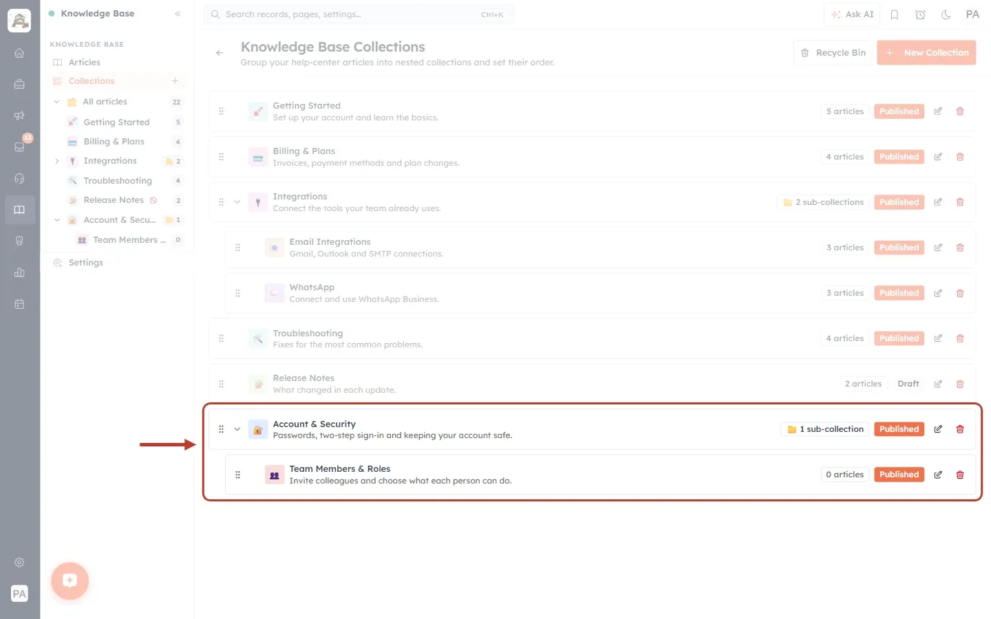
What this screenshot shows. Account & Security and its new sub-collection Team Members & Roles, ringed together.
Team Members & Roles is indented under Account & Security, which shows it is a sub-collection.
The parent card now says 1 sub-collection (with a folder icon) instead of “0 articles”.
A ˅ arrow has appeared in front of the parent’s icon.
Step 20: Hide or show sub-collections#
Click the arrow in front of a parent collection to fold its sub-collections away, and click it again to show them. This is handy when you have many collections.
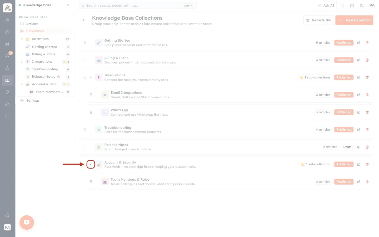
What this screenshot shows. The arrow in front of Account & Security ringed.
˅ (pointing down) means the sub-collections are showing. Click it to hide them.
› (pointing right) means they are hidden. Click it to show them again.
Hiding sub-collections only changes this screen. It does not change anything on your help center.
Step 21: Check the side panel tree#
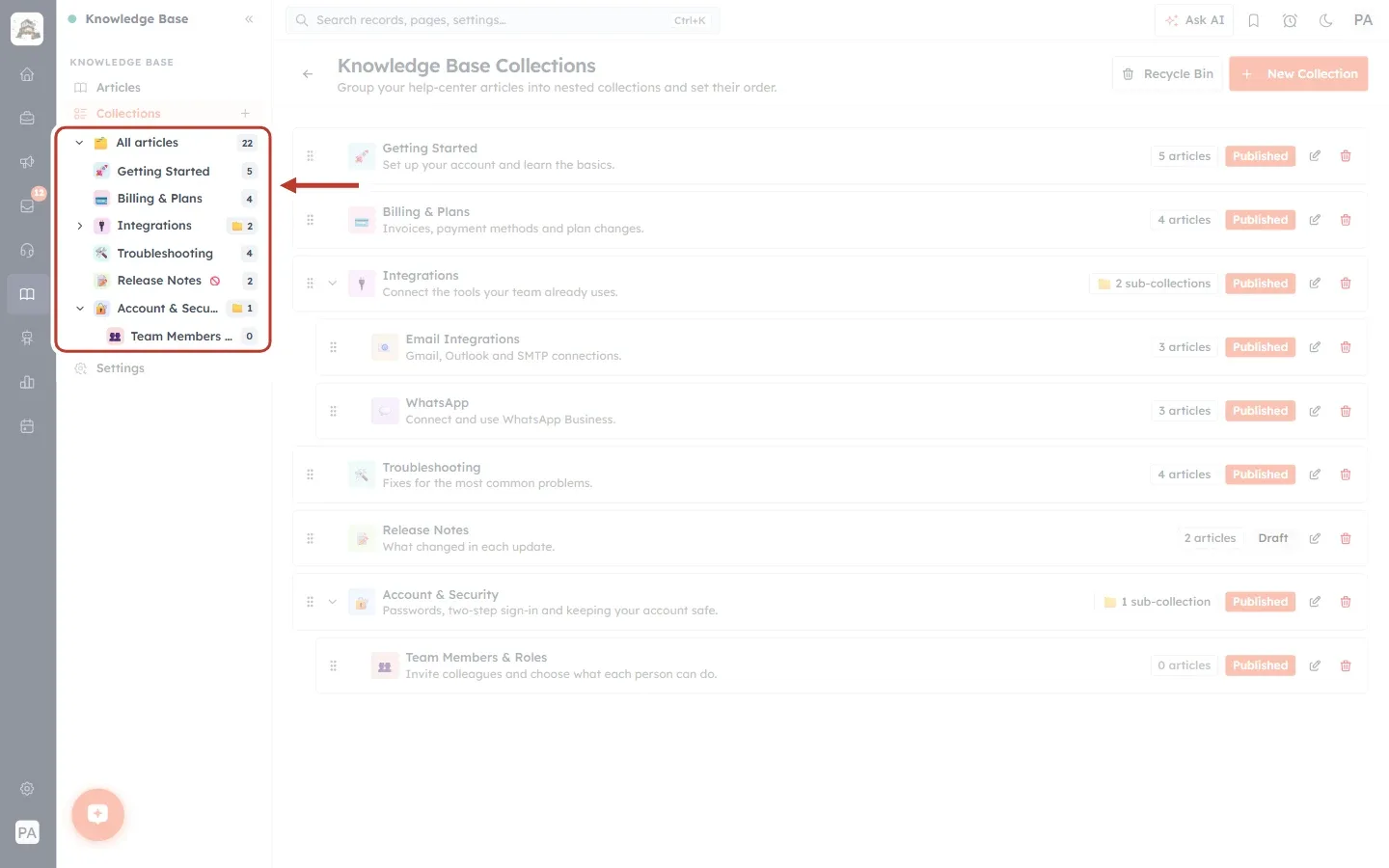
What this screenshot shows. The collection tree in the side panel ringed, from All articles down to the new sub-collection.
Account & Security shows a folder icon with 1: it has one sub-collection.
Open it with its arrow to see Team Members & Roles with 0 articles.
Click any collection in this tree to see the articles in it (Part 6).
Part 4: Edit a collection#
You can change a collection at any time: its name, slug, icon, colour, description, parent or status.
Step 22: Click the pencil icon#
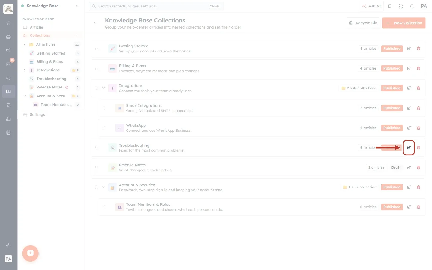
What this screenshot shows. The pencil icon on the Troubleshooting card ringed.
The pencil is shown on every card, just left of the red bin icon. Its tooltip says Edit collection.
Click it to open the edit form for that collection.
Step 23: Make your changes#
The Edit Collection form has the same fields as the New Collection form, already filled in. We changed the name to Troubleshooting & FAQs and wrote a new description.
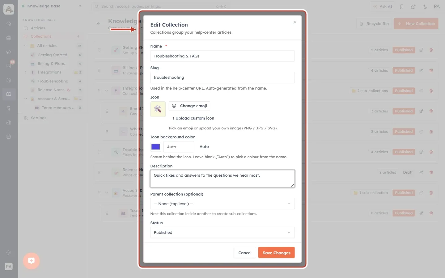
What this screenshot shows. The Edit Collection form ringed.
Name: changed to “Troubleshooting & FAQs”.
Slug: still “troubleshooting”. When you edit a collection, the slug keeps its old value, so existing links keep working. Change it yourself only if you really need a new address.
Icon: the button now reads Change emoji.
Description: “Quick fixes and answers to the questions we hear most.”
Parent collection: change this to move the collection inside another collection, or back to the top level.
Status: switch to Draft to hide the collection from customers for a while.
Click Save Changes to save, or Cancel to leave everything as it was.
Step 24: Check the updated card#
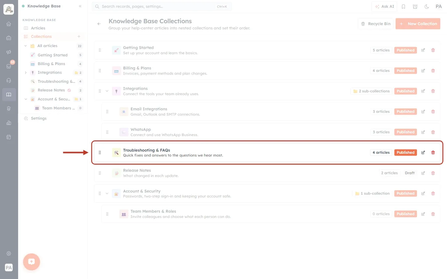
What this screenshot shows. The updated card ringed.
The card now shows the new name Troubleshooting & FAQs and the new description.
Its articles (4) stay in the collection. Editing a collection never removes its articles.
The side panel shows the new name too.
Part 5: Change the order of collections#
Your help center shows collections in the same order as this page. Put the most useful ones at the top.
Step 25: Find the drag handle#
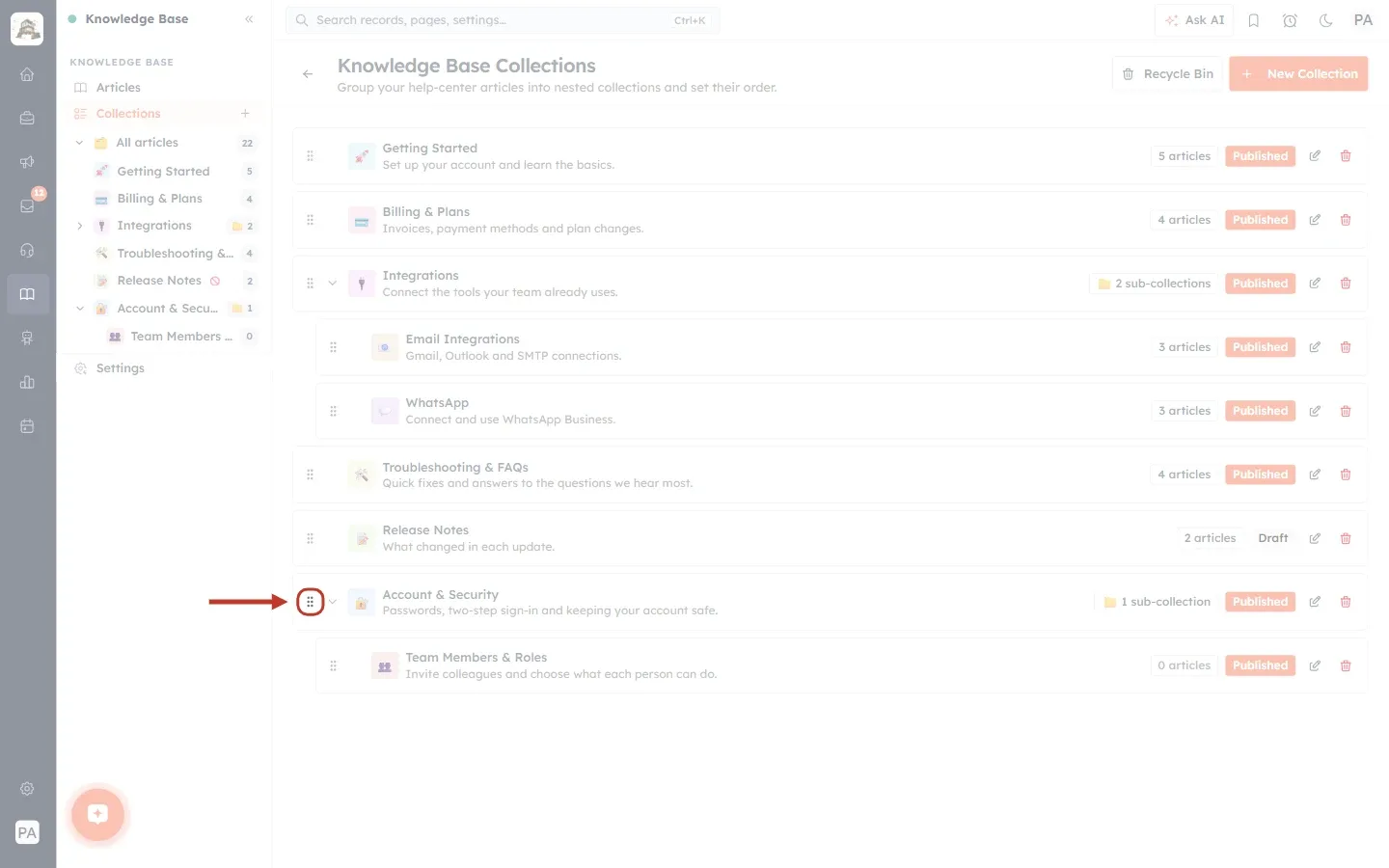
What this screenshot shows. The ⋮⋮ drag handle at the far left of the Account & Security card ringed.
Every card has this handle. Its tooltip says “Drag to reorder within this group”.
Your mouse pointer changes to a grabbing hand when you hold it.
Step 26: Drag the collection to its new place#
Hold down the mouse button on the handle, drag the card up or down, and let go where you want it. The new order is saved at once. There is no Save button to click.
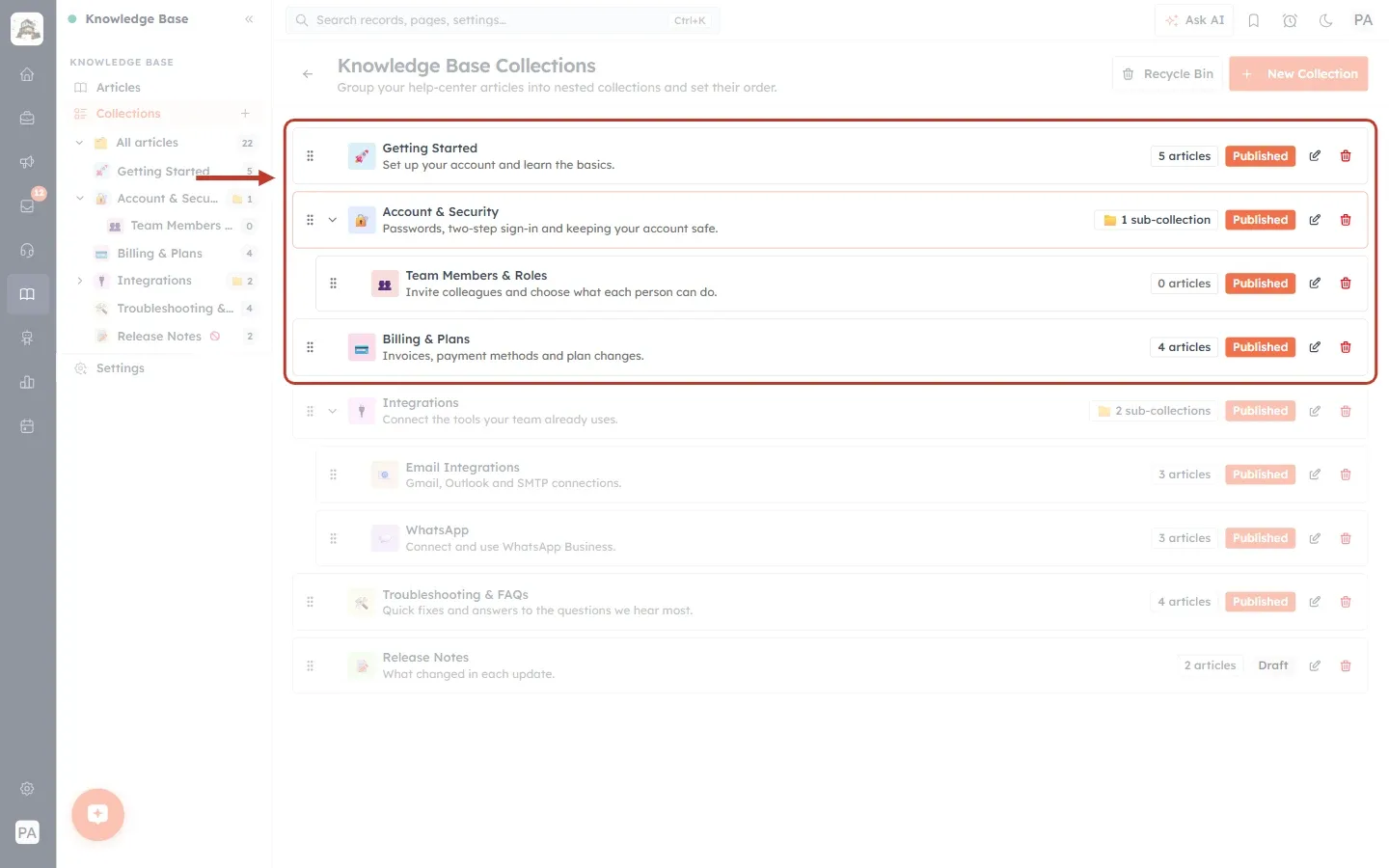
What this screenshot shows. The top of the list ringed after dragging Account & Security up.
The order is now: Getting Started, Account & Security (with its sub-collection Team Members & Roles), then Billing & Plans.
A collection always moves together with its sub-collections.
The side panel tree follows the same new order.
ℹ️
Dragging only works within the same group. You can move a top-level collection among the other top-level collections, and a sub-collection among the other sub-collections of the same parent.
To move a collection into a different parent (or out to the top level), use the pencil icon and change Parent collection instead. If you try to drop it in another group, the CRM shows: “Collections reorder within their own group. Use Edit → Parent to move one elsewhere.”
Part 6: Put articles into a collection#
Each article belongs to one collection (or to none). You choose the collection in the article itself.
Step 27: Choose the collection in the article editor#
Open an article, or click New Article on the Articles page. In the Article Details section, find the Collection field.
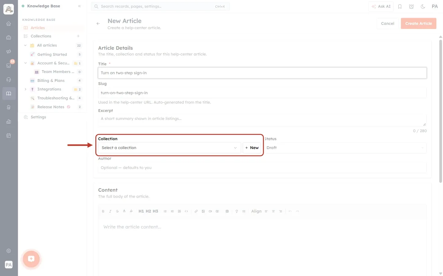
What this screenshot shows. The Collection field in the New Article editor ringed, next to the + New button.
At the top of the editor: Title (“Turn on two-step sign-in”), Slug and Excerpt.
Collection: shows “Select a collection” until you choose one. An article without a collection is listed as Uncategorized.
+ New: creates a new collection without leaving the article, using the same form as in Part 2.
Status (on the right) is the article’s own status, Draft or Published. It is separate from the collection’s status.
Step 28: Pick the collection#
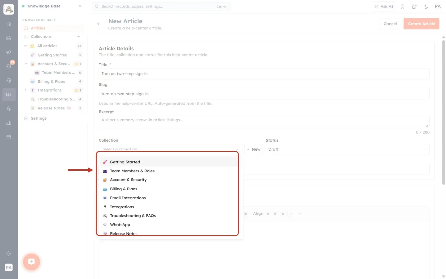
What this screenshot shows. The Collection list open and ringed.
Every collection and sub-collection is listed with its icon, including the new Account & Security and Team Members & Roles.
You can put an article in a top-level collection or straight into a sub-collection.
We choose Account & Security.
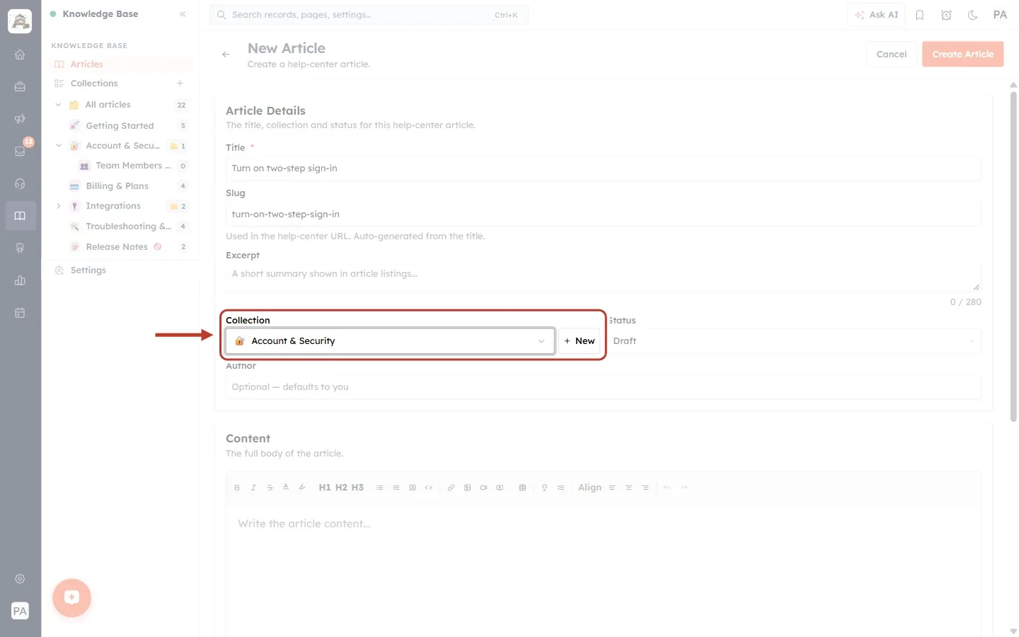
What this screenshot shows. The Collection field ringed, now showing 🔐 Account & Security.
When you click Create Article (or Save on an existing article), the article is placed in this collection.
To move an article to another collection later, open it and pick a different collection here.
💡
There is no bulk “move to collection” action. The bulk actions on the Articles page are Publish, Unpublish and Delete only, so move articles one by one from the editor.
Step 29: See the articles in one collection#
On the Articles page, click the All collections filter (or click a collection in the side panel tree).
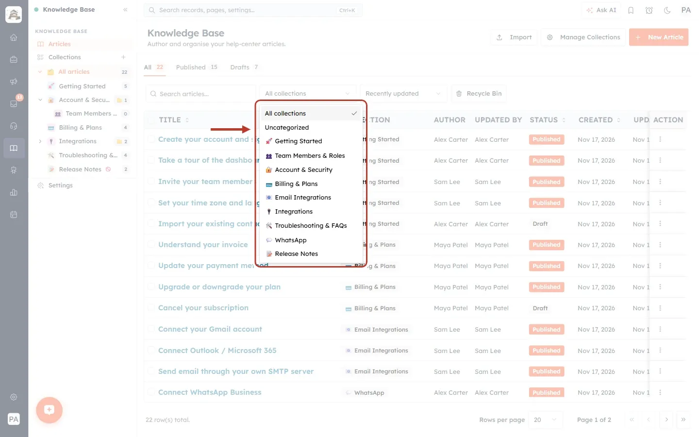
What this screenshot shows. The collection filter on the Articles page, open and ringed.
All collections (ticked): shows every article.
Uncategorized: shows only articles that are not in any collection, which is handy for finding articles you forgot to file.
Below: each collection and sub-collection. Pick one to see only its articles. We pick Getting Started.
Step 30: Set the order of articles inside the collection#
When you filter by a collection, the list changes to a simple list with a drag handle on each article.
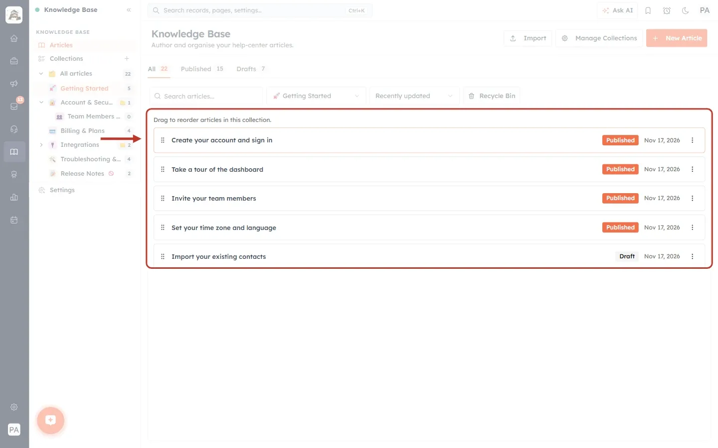
What this screenshot shows. The articles in Getting Started ringed, under the message “Drag to reorder articles in this collection.”
Each row shows a ⋮⋮ drag handle, the article title, its status (Published or Draft), the date it was last updated, and a ⋮ menu with more actions.
The order here is the order customers see inside this collection on the help center.
The filter box at the top now says Getting Started, and Getting Started is highlighted in the side panel.
Drag an article by its handle and drop it in its new place. The order is saved at once.
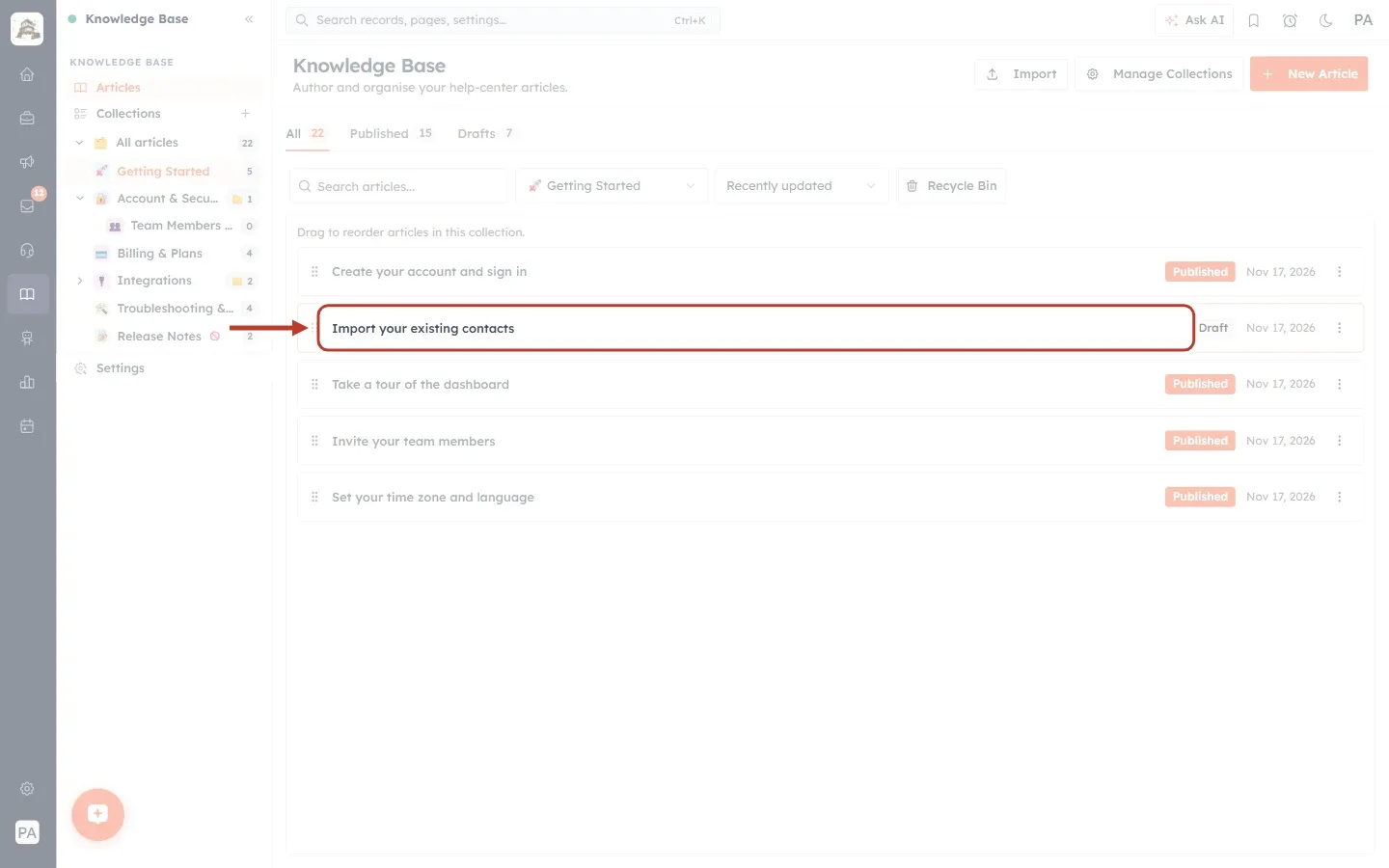
What this screenshot shows. The article Import your existing contacts ringed after dragging it from last place to second place.
The other articles have moved down by one place.
This order also controls the automatic Previous and Next links at the bottom of each article (when the article’s navigation is set to Automatic — by order in the collection). The first article has no Previous link and the last has no Next link.
Part 7: Delete, restore or permanently remove a collection#
Step 31: Click the bin icon#
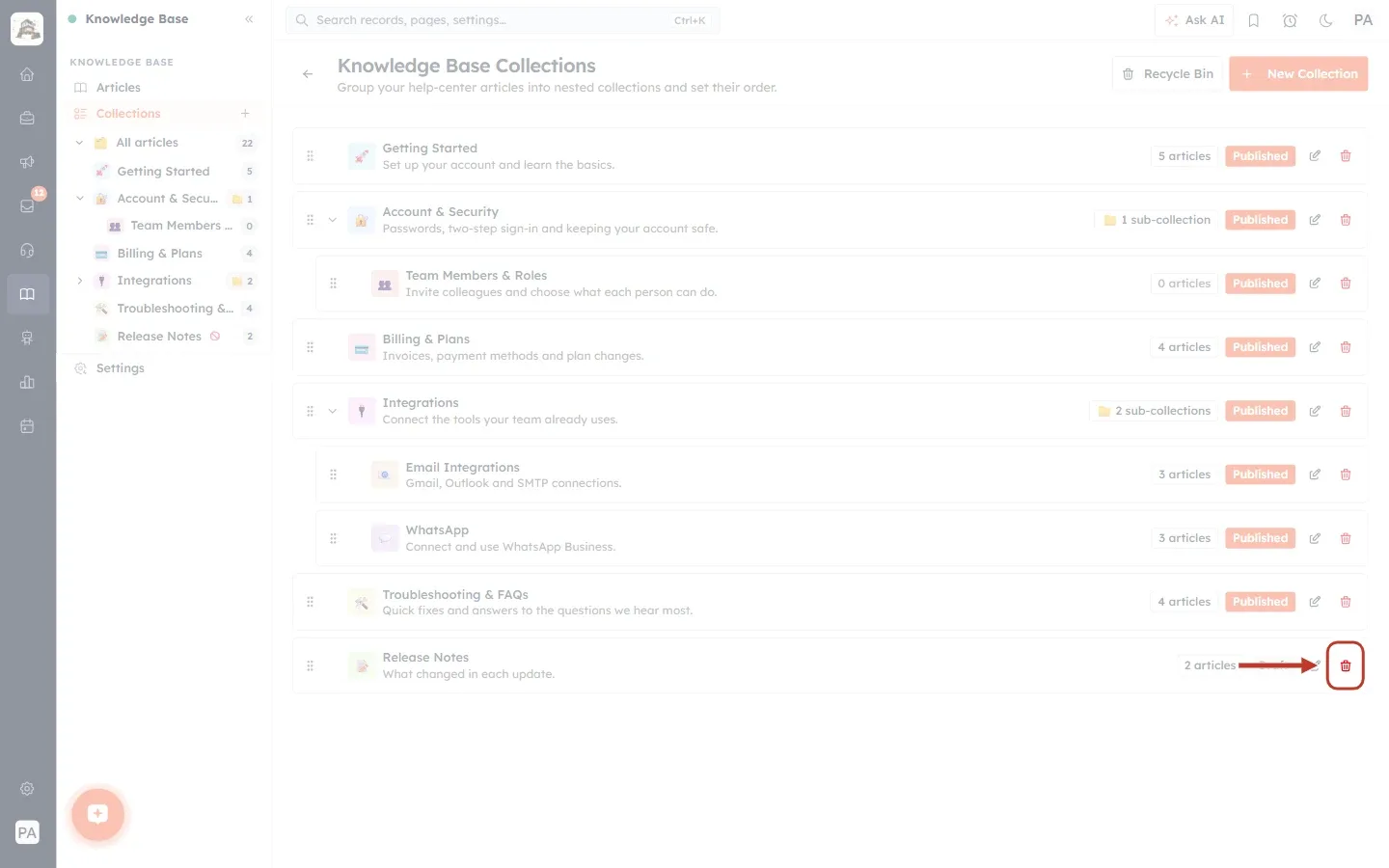
What this screenshot shows. The red bin icon on the Release Notes card ringed.
Its tooltip says Delete collection.
Release Notes is a Draft collection with 2 articles.
Step 32: Confirm the delete#
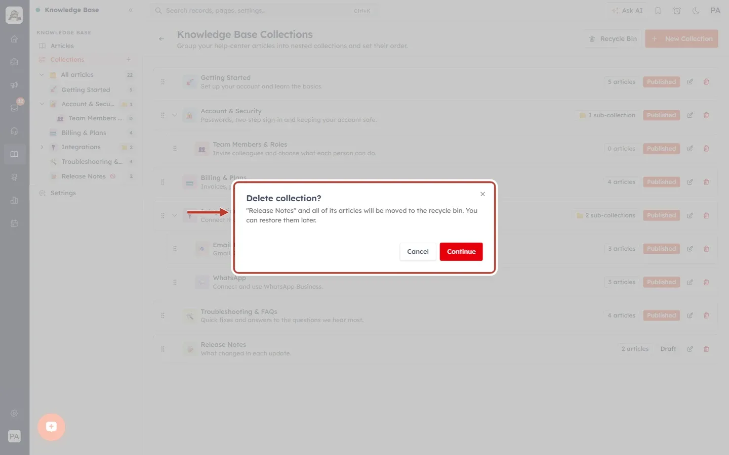
What this screenshot shows. The Delete collection? confirmation ringed.
The message: ““Release Notes” and all of its articles will be moved to the recycle bin. You can restore them later.”
If the collection has sub-collections, the message says “and all of its sub-collections and their articles”. They all go to the Recycle Bin together.
Continue deletes the collection. Cancel keeps it.
⚠️
Deleting a collection also takes its articles (and its sub-collections and their articles) off your help center. If you only want to remove the collection but keep the articles, first move those articles to another collection in the editor (Part 6), then delete the empty collection.
Step 33: Open the Recycle Bin#
Click Recycle Bin at the top of the Collections page to see what has been deleted.
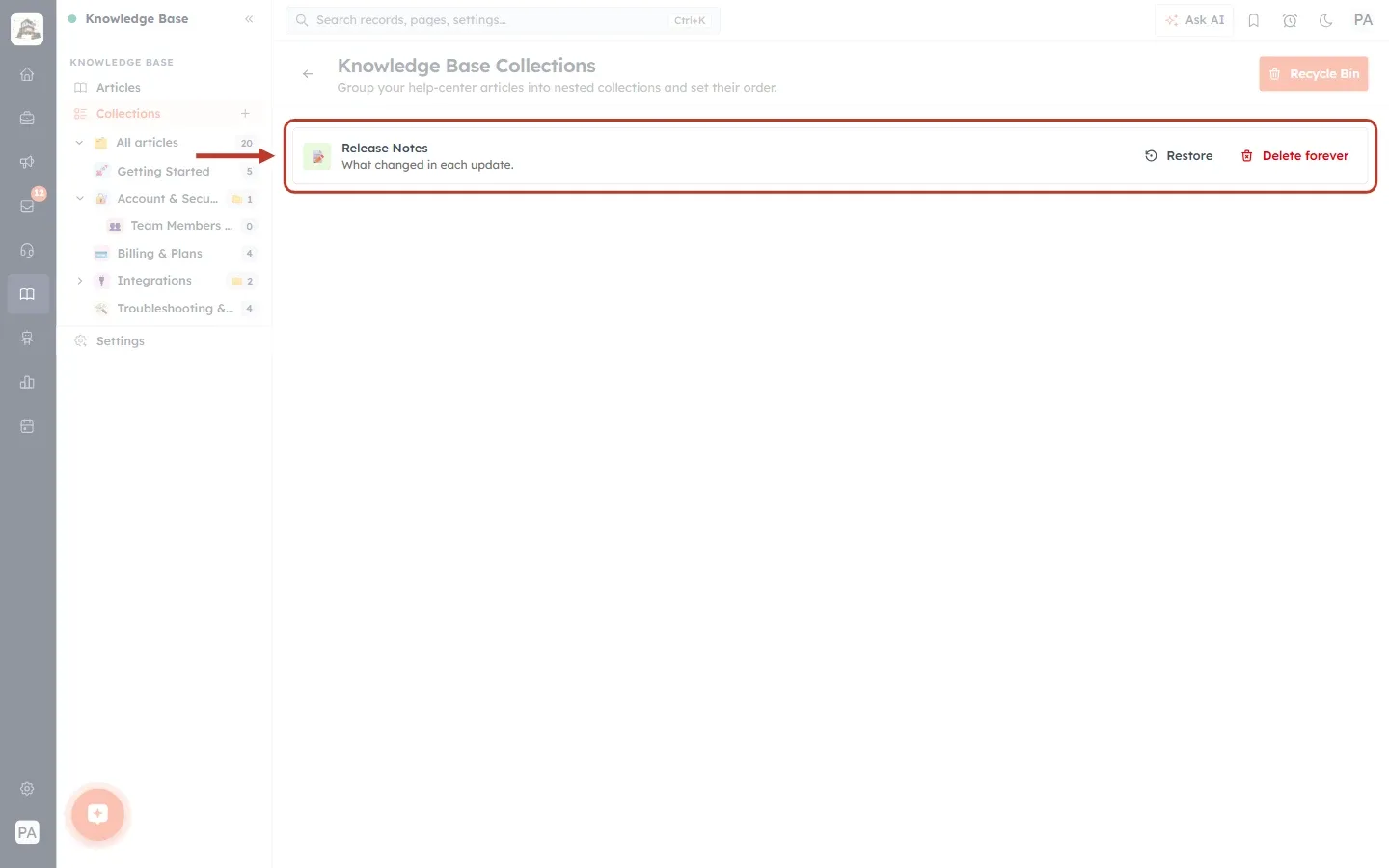
What this screenshot shows. The Recycle Bin view with the deleted Release Notes collection ringed.
The Recycle Bin button at the top right is now highlighted, which shows you are looking at deleted collections. Click it again to return to the normal list.
Each deleted collection has two buttons: Restore and Delete forever (in red).
In the side panel, Release Notes has disappeared from the tree.
Step 34: Delete forever (only if you are sure)#
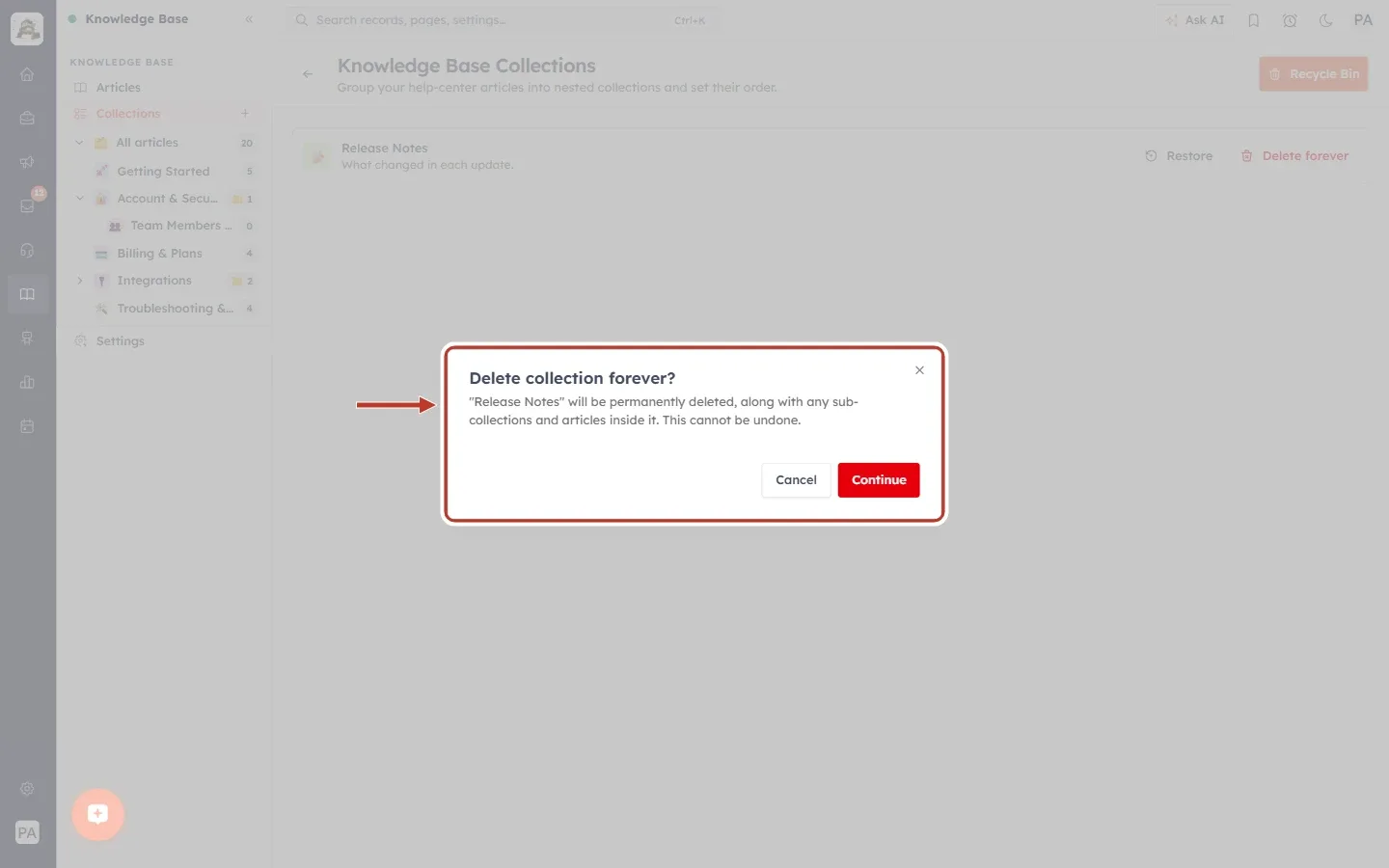
What this screenshot shows. The Delete collection forever? confirmation ringed.
The message: ““Release Notes” will be permanently deleted, along with any sub-collections and articles inside it. This cannot be undone.”
Continue removes it for good. Cancel leaves it in the Recycle Bin.
We clicked Cancel, because we want to restore it instead.
Step 35: Restore the collection#
Click Restore next to the collection.
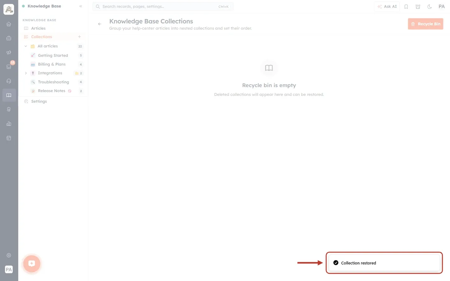
What this screenshot shows. The Collection restored message ringed at the bottom right.
The Recycle Bin is now empty: “Recycle bin is empty. Deleted collections will appear here and can be restored.”
Release Notes is back in the side panel with its 2 articles and its Draft status.
If the collection was a sub-collection and its parent is still deleted, restore the parent first. Otherwise the CRM shows an error about the parent collection.
Tips for a well-organised help center#
Keep it shallow. One level of sub-collections is usually enough. Customers find things faster when they don’t have to click through many levels.
Use customer words. Name collections the way customers describe their problem (“Billing & Plans”, not “Subscription management module”).
Write a description for every collection. One sentence is enough and helps customers decide where to click.
Put the most visited topics first. “Getting Started” and “Troubleshooting” are good candidates for the top of the list.
Use Draft while you build. Create a new collection as Draft, fill it with articles, then switch it to Published when it is ready.
Check “Uncategorized” now and then with the Articles page filter, and file any articles you find there.
Troubleshooting#
I can’t see the Knowledge Base or the Collections page. Your profile needs the Knowledge Base permission (Setup → Profiles → Feature Permissions → Marketing → Knowledge Base). Ask your administrator.
“Slug may only contain lowercase letters, numbers and hyphens.” Remove capitals, spaces and symbols from the slug, or clear it so it is created from the name again.
“Name cannot exceed 60 characters” / “Description cannot exceed 200 characters”. Shorten the text.
The drag doesn’t move my collection where I want. Dragging only reorders within the same group. Use the pencil icon and change Parent collection to move it to another group.
My new collection isn’t on the help center. Check that both the collection and its articles are Published. A Draft collection, or a collection with only draft articles, does not show useful content to customers.
A new sub-collection doesn’t appear in the main list. Refresh the page. This can happen when you create it from the side-panel + while the Collections page is open.
Restore fails with a message about the parent. The parent collection is still in the Recycle Bin. Restore the parent first, then the sub-collection.
Frequently asked questions#
Can one article be in two collections?
No. Each article belongs to one collection, or to none (Uncategorized). If an article fits two topics, put it where most customers will look and link to it from articles in the other collection.
Does deleting a collection delete its articles?
It moves them to the Recycle Bin with the collection. You can restore them all with Restore. Only Delete forever removes them for good.
Can I use my own image as a collection icon?
Yes. Click Upload custom icon in the collection form and choose a PNG, JPG or SVG file.
If I rename a collection, do its links change?
No. The slug keeps its old value when you edit a collection, so links keep working. The address changes only if you edit the slug yourself.
Do I need to click Save after dragging?
No. The new order of collections, and of articles inside a collection, is saved as soon as you drop the item.
Can I move many articles to a collection at once?
Not at the moment. Bulk actions are Publish, Unpublish and Delete. Change the collection in each article’s editor.
Previous and next#
Related#
Was this article helpful?
Ready to implement this?
OpenAI Engage and apply what you just learned to your own workspace.
Open AI Engage CRM