Loading…


KnowledgeBase
Format Article Content with the Rich Editor: Headings, Lists, Links, Images, Tables and Callouts
Introduction#
A help article is much easier to follow when it is well formatted. Clear headings let customers jump to the part they need, numbered steps show the order to work in, and a picture or a short table can explain in seconds what a paragraph cannot.
Every Knowledge Base article in AiEngage CRM is written in the rich editor, the Content box on the New Article and Edit Article pages. It works like a word processor: you select text and click a button in the toolbar. What you build here is exactly what customers see on your help center.
In this article we format a short sample article, Create your first collection, one feature at a time. By the end you will know what every button in the toolbar does:
Headings, bold, italic and strikethrough.
Text colour and highlight.
Bullet lists, numbered lists, quotes and code blocks.
Links.
Images, and how to resize and align them.
Videos and YouTube embeds.
Tables.
Callout boxes and collapsible sections.
Text alignment, undo and redo.
Every screenshot is followed by a What this screenshot shows section that explains the whole screen, so you can compare it with what you see in your own account.
ℹ️
This article is about formatting the content of an article. To learn how to create an article, fill in its title, collection and status, and publish it, read Create and Publish a Help-Center Article first.
Before you begin#
You need access to the Knowledge Base. Administrators always have it. Other users need the Knowledge Base permission in their profile (Setup → Profiles → Feature Permissions → Marketing → Knowledge Base).
Open an article. Go to Knowledge Base → Articles and click New Article, or open an existing article to edit it.
Write first, format second. It is often quickest to type or paste all your text, then go back and add headings, lists and pictures.
Part 1: Find the editor and its toolbar#
Step 1: Scroll to the Content section#
On the New Article page, the Article Details section (title, slug, excerpt, collection, status and author) comes first. Scroll down to the Content section. This is the rich editor.
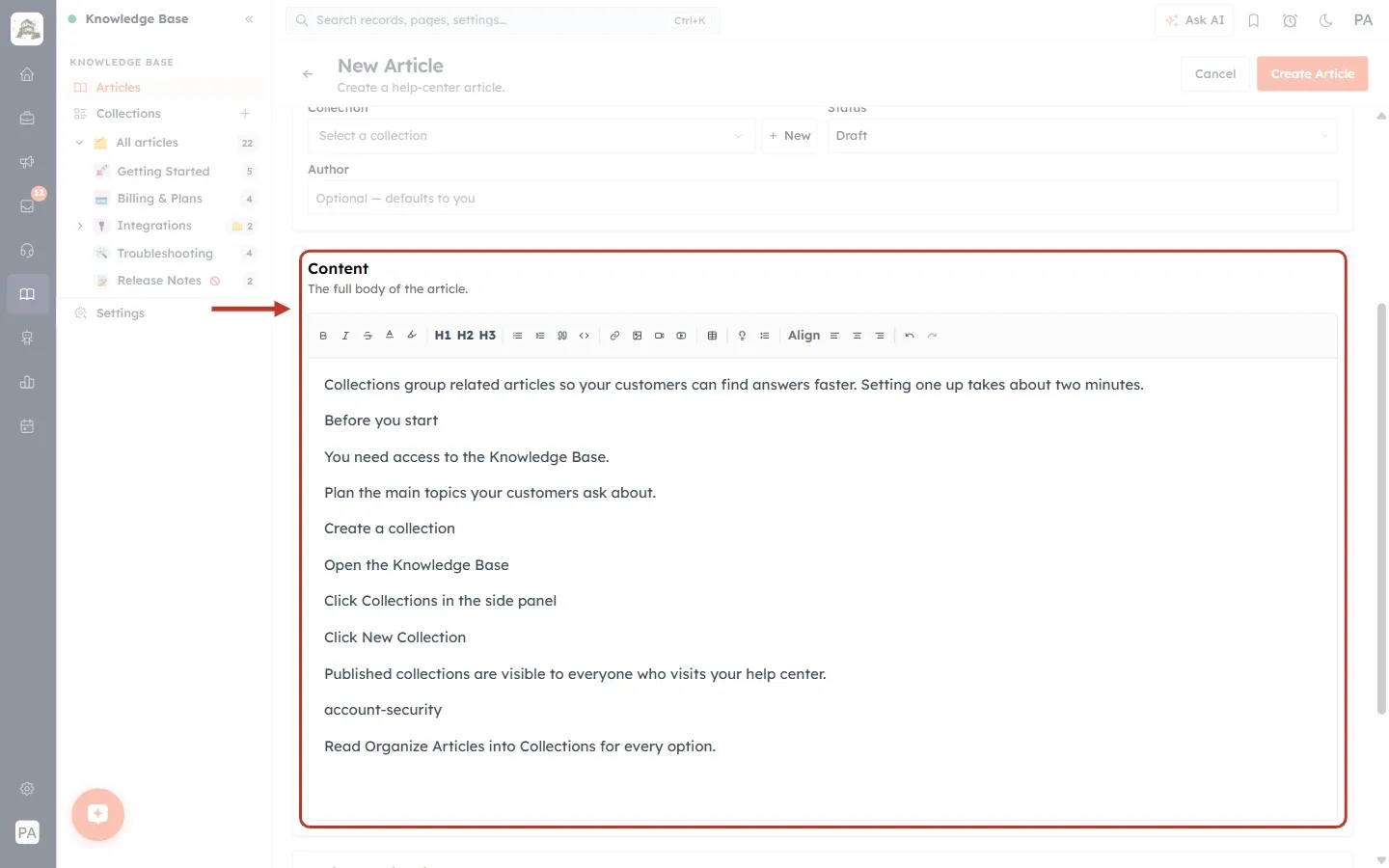
What this screenshot shows. The Content section of the New Article page ringed, with our sample text typed in.
The heading Content and the line “The full body of the article.”
The toolbar: the row of small buttons at the top of the box.
The writing area below the toolbar. Click anywhere in it and start typing, or paste text from another document.
Our sample article is still plain text: every line is a normal paragraph. In the next steps we turn it into a well-formatted article.
Above the Content section you can see the end of Article Details (Collection, Status and Author).
Step 2: Get to know the toolbar#
When you scroll down a long article, the toolbar stays at the top of the editor, so you never have to scroll back up to reach it. Point at any button to see its name.
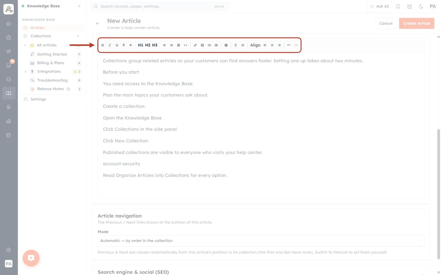
What this screenshot shows. The editor toolbar ringed. From left to right, the buttons are grouped like this:
Text style: B Bold, I Italic,
SStrikethrough, A Text color and the marker pen Highlight text.Headings: H1, H2 and H3.
Blocks: Bullet list, Numbered list, Blockquote (the quotation marks) and Code block (
<>).Media: Add / edit link (the chain), Insert image, Insert video and Embed YouTube.
Layout: Insert table (the grid), Callout box (the light bulb) and Collapsible section.
Align: Align left, Align center and Align right.
History: Undo and Redo (the curved arrows).
Part 2: Headings and text style#
Step 3: Turn a line into a heading#
Headings split your article into sections. Click in the line you want to turn into a heading, or select it, and click H2. We did this for “Before you start” and “Create a collection”.
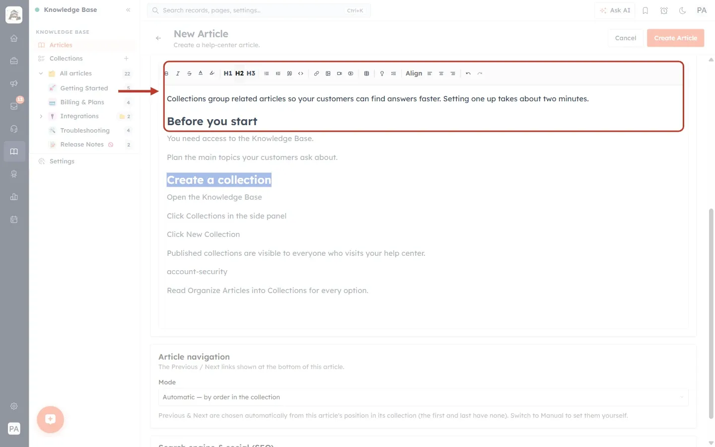
What this screenshot shows. The H1 H2 H3 buttons and the first lines of the article ringed.
“Before you start” is now a large, bold Heading 2.
“Create a collection”, further down, is also a Heading 2 (still selected, so it shows in blue).
H1 is the biggest heading, H3 the smallest. Click the same button again to turn the heading back into normal text.
Headings are what customers use to scan a page, so give every main section one.
💡
Use H2 for main sections and H3 for steps or sub-sections inside them. The article title is already shown as the biggest heading at the top of the page, so you rarely need H1 in the content.
Step 4: Make words bold or italic#
Select the words, then click B (Bold) or I (Italic). Click the button again to remove the style. You can also use the usual keyboard shortcuts, Ctrl + B and Ctrl + I (⌘ + B and ⌘ + I on a Mac).
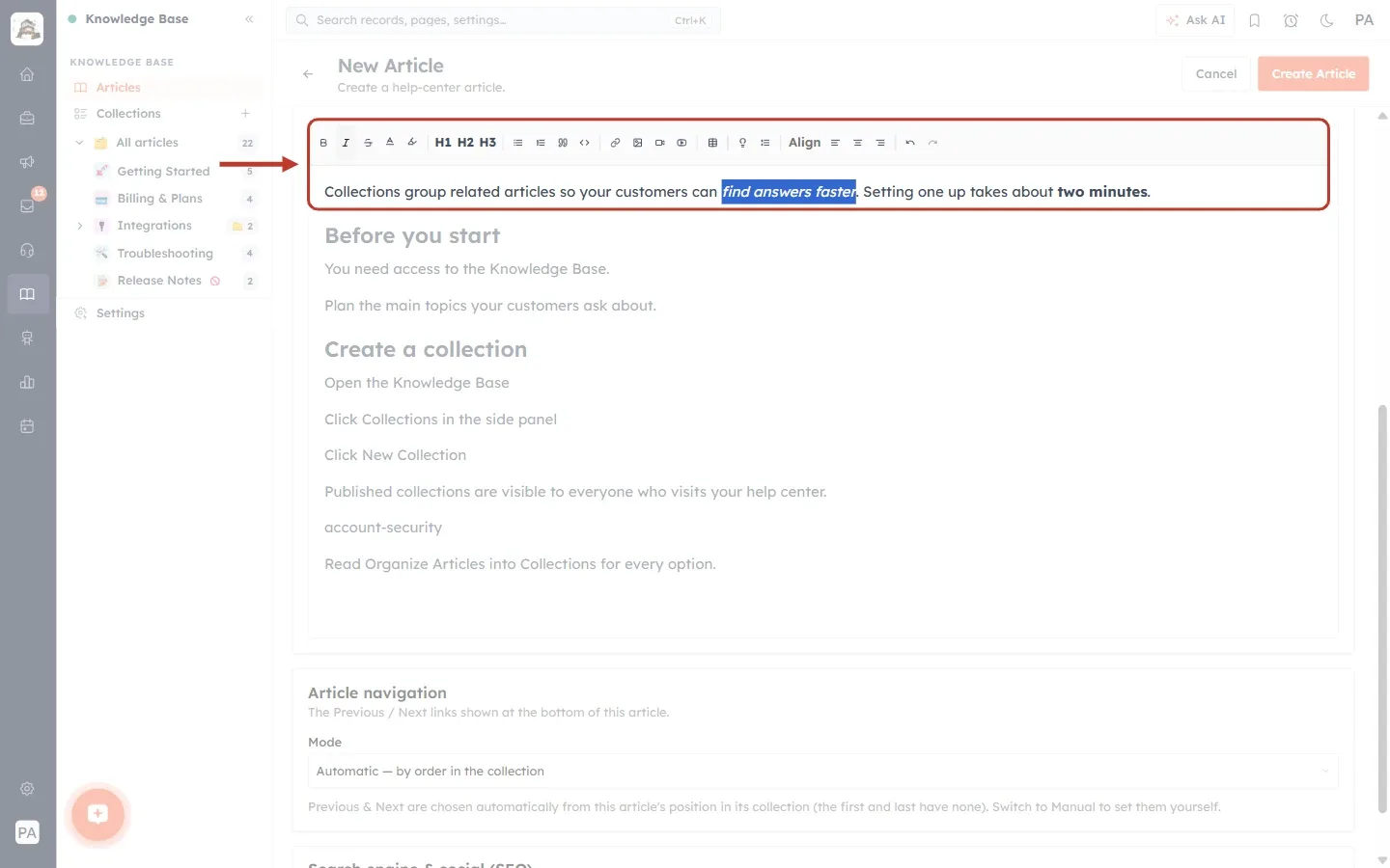
What this screenshot shows. The B, I and S buttons and the first paragraph ringed.
“two minutes” at the end of the paragraph is now bold.
“find answers faster” is italic. It is still selected, so it shows with a blue background, and the I button is highlighted.
S(Strikethrough) draws a line through text, which is useful to show an old value next to a new one.Use bold for the names of buttons and fields customers must click, such as New Collection. It makes steps much easier to follow.
Step 5: Change the text colour#
Select the text and click the A (Text color) button. A palette of colours opens. We selected “visible to everyone”.
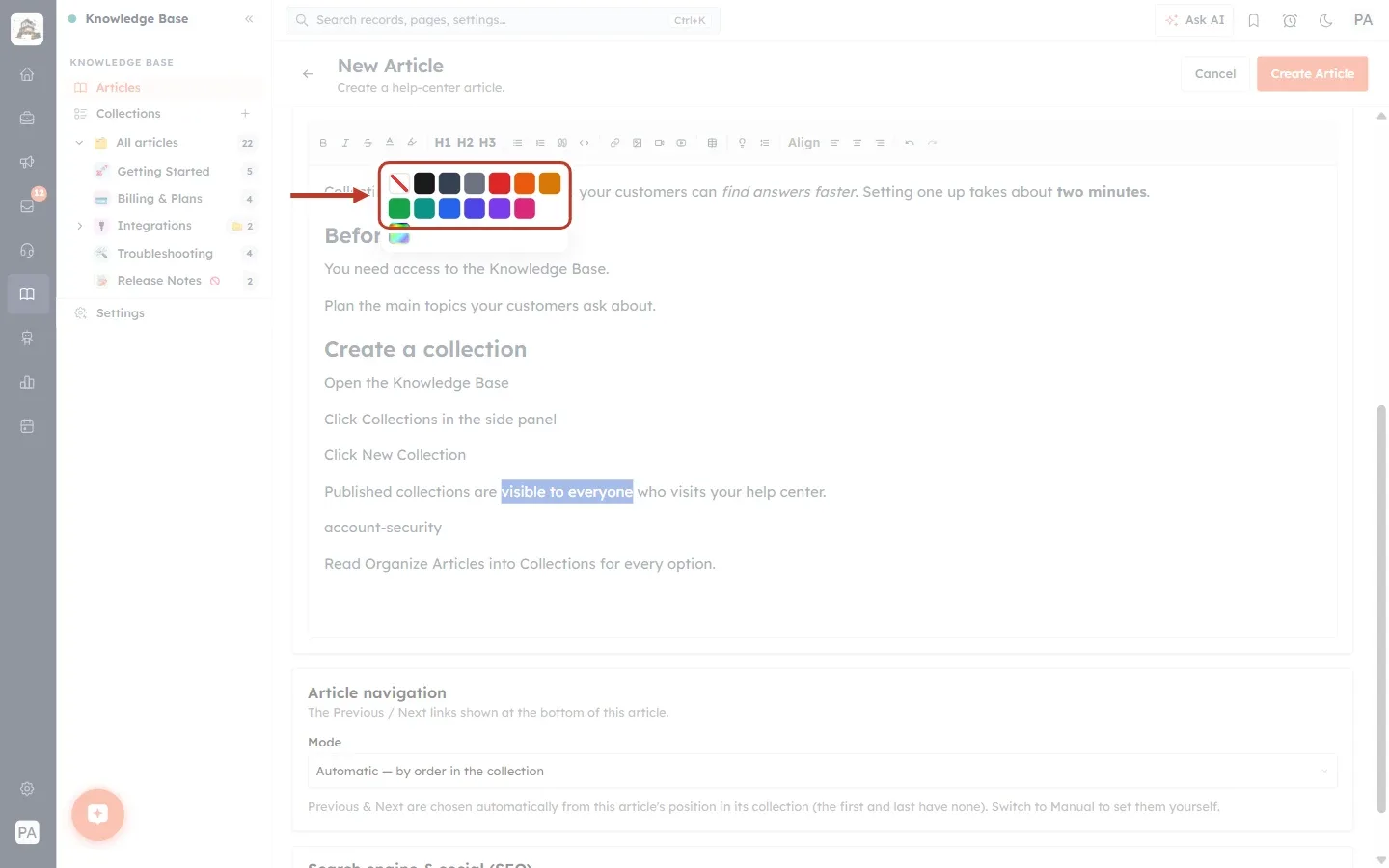
What this screenshot shows. The Text color palette ringed, open under the toolbar.
The first square, with a red diagonal line, is Remove color. It puts the text back to the normal colour.
Then 13 colours: Black, Dark Gray, Gray, Red, Orange, Amber, Green, Teal, Blue, Indigo, Purple, Pink and White. Point at a square to see its name.
The rainbow square at the bottom opens a colour picker for any custom colour.
Lower down, “visible to everyone” is selected (blue background). We clicked Red.
Step 6: Highlight text#
Highlighting works the same way, but colours the background behind the words, like a marker pen. Select the text and click the Highlight text button (next to A). We selected “Published collections”.
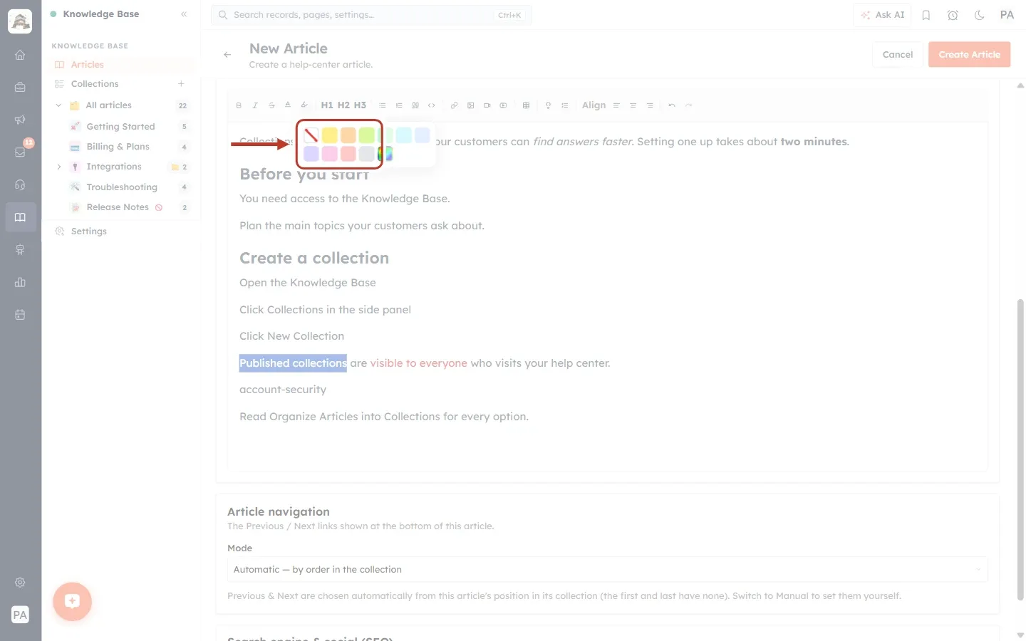
What this screenshot shows. The Highlight text palette ringed.
The first square is Remove highlight.
Then 10 soft colours: Yellow, Orange, Lime, Green, Cyan, Blue, Violet, Pink, Red and Silver.
The rainbow square opens a colour picker for a custom highlight.
We clicked Yellow.
Step 7: Check the result#
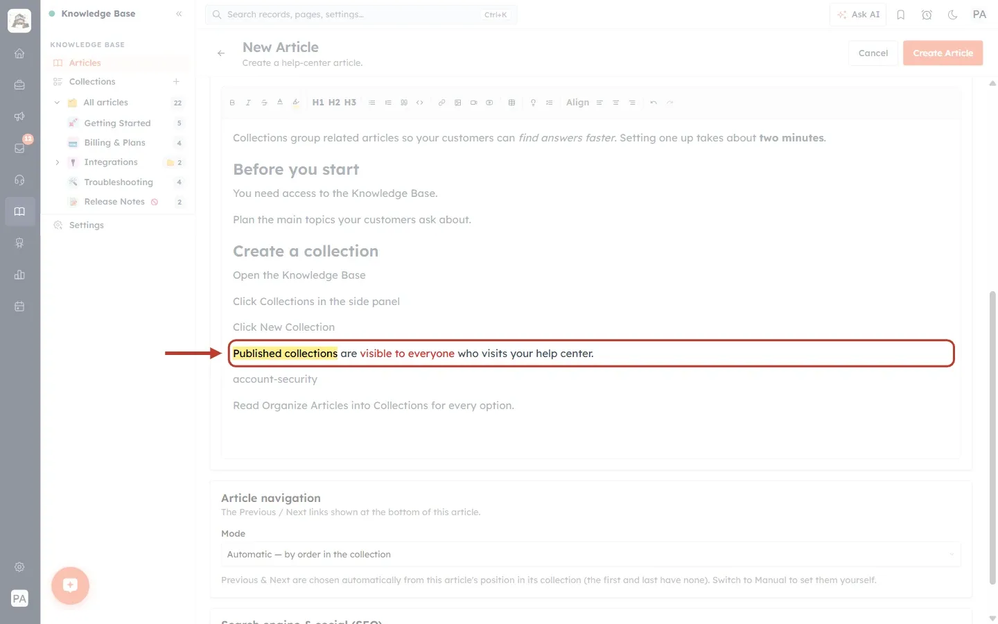
What this screenshot shows. The formatted sentence ringed.
“Published collections” now has a yellow highlight.
“visible to everyone” is now red.
Use colour sparingly, for one or two things per article that customers must not miss. If everything is coloured, nothing stands out.
Part 3: Lists, quotes and code#
Step 8: Make a bullet list#
Select the lines you want in the list and click Bullet list. Each line becomes one bullet point. To add another bullet, press Enter at the end of a bullet. Press Enter twice to end the list.
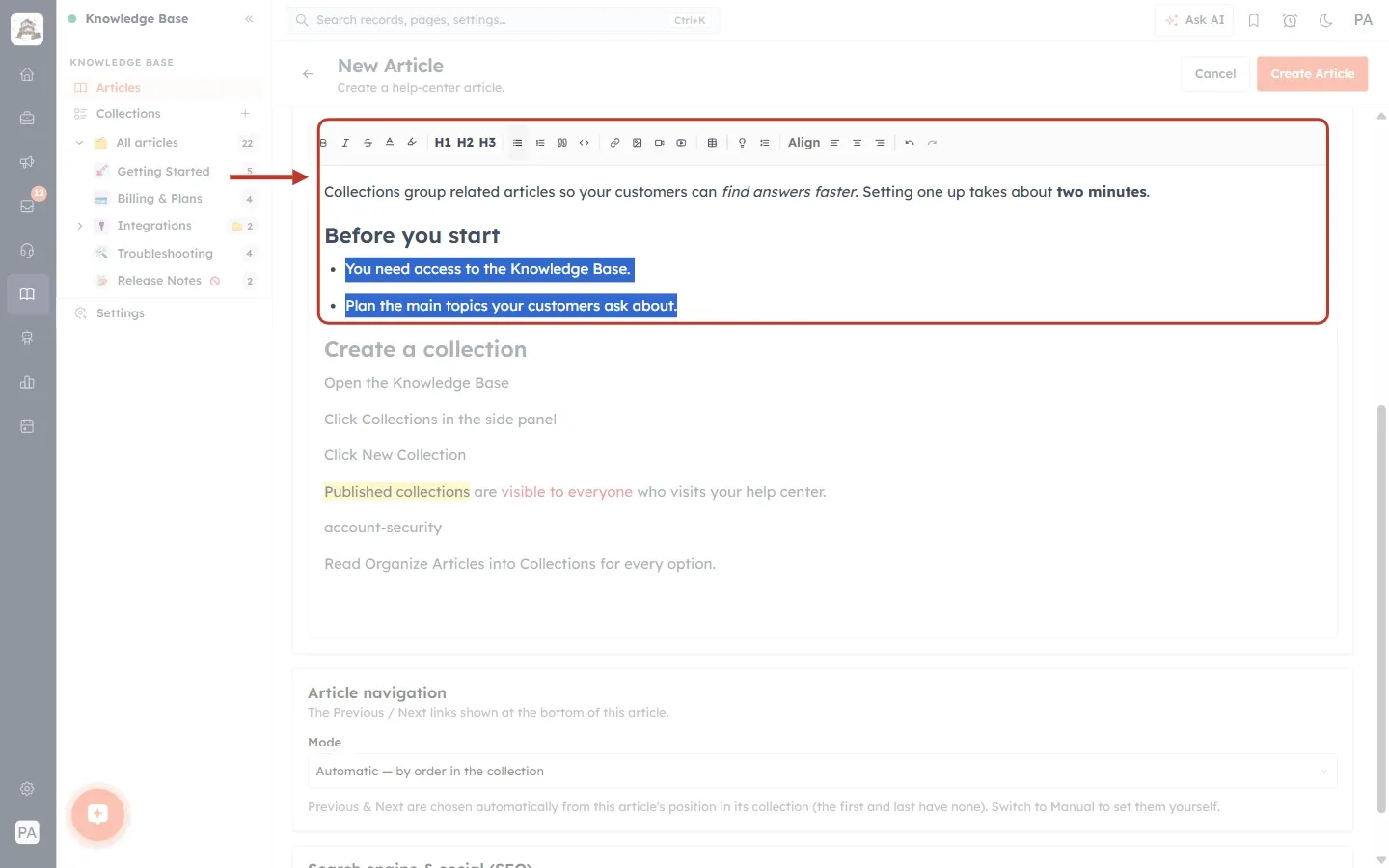
What this screenshot shows. The top of the article ringed, with the toolbar and the new bullet list.
The two lines under “Before you start” are now bullet points: “You need access to the Knowledge Base.” and “Plan the main topics your customers ask about.”
The Bullet list button in the toolbar is highlighted because the cursor is in the list.
Use bullet lists for things that have no fixed order, such as requirements or tips.
Step 9: Make a numbered list#
For steps that must be done in order, select the lines and click Numbered list. The numbers update by themselves when you add, remove or move a step.
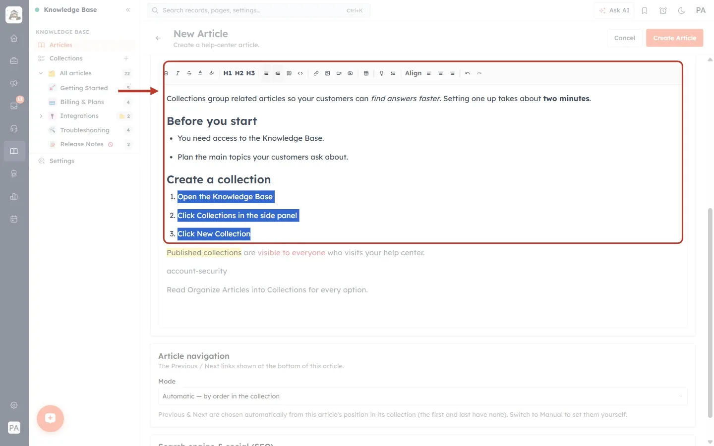
What this screenshot shows. The article ringed, with the three steps under “Create a collection” now numbered.
1. Open the Knowledge Base, 2. Click Collections in the side panel, 3. Click New Collection.
The Numbered list button (next to Bullet list) is highlighted.
Click the same button again to turn the list back into normal lines.
Step 10: Add a quote and a code block#
Click in a line and click Blockquote to set it apart as a quote or a key statement. Click in another line and click Code block to show it in a fixed-width font on a dark background. Use a code block for anything customers should copy exactly, such as a web address, a setting value or a piece of code.
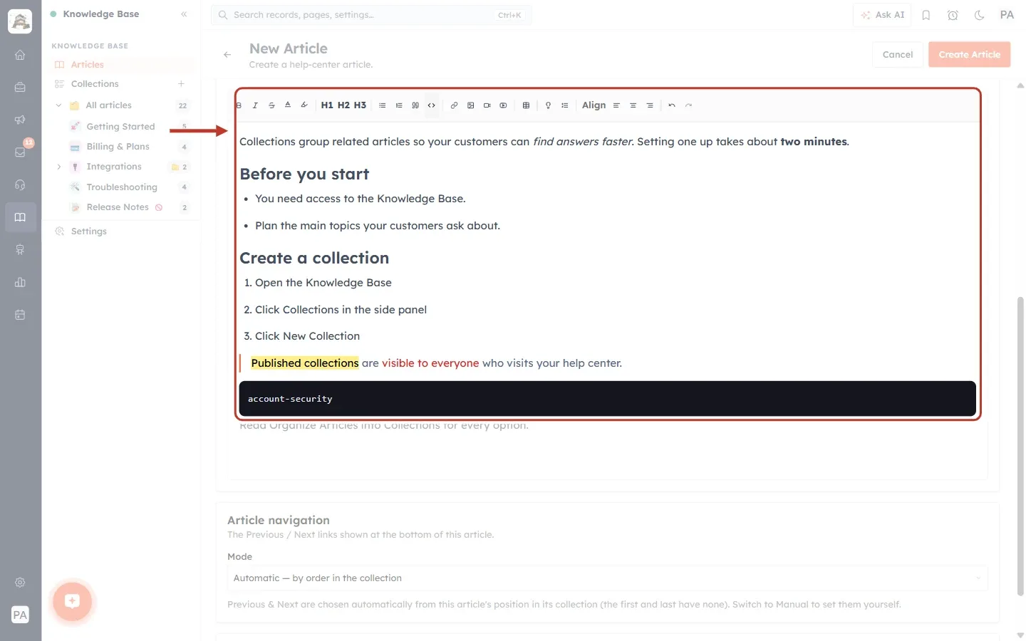
What this screenshot shows. The article ringed from the toolbar down to the new code block.
The sentence about published collections is now a blockquote: it is indented with a coloured bar on its left.
account-securityis now a code block: white fixed-width text on a dark background.In the toolbar, Blockquote is the quotation-mark button and Code block is the
<>button, just right of the list buttons.Click the same button again to turn the block back into a normal paragraph.
Part 4: Add a link#
Step 11: Select the words and open the link bar#
Select the words that should become the link (here “Organize Articles into Collections”) and click Add / edit link (the chain icon). A link bar opens under the toolbar. Paste the web address and click Apply.
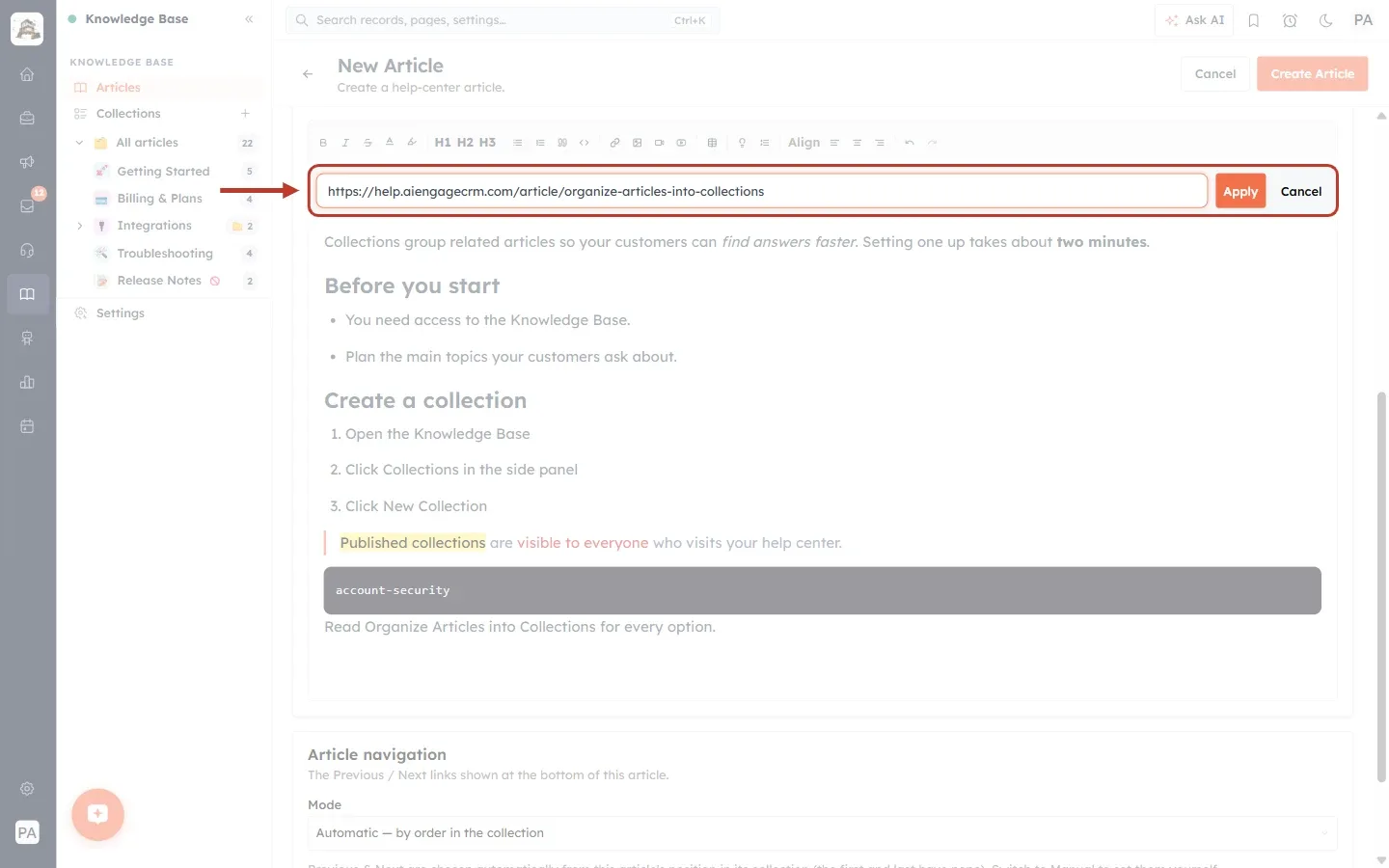
What this screenshot shows. The link bar ringed, open under the toolbar.
The address box: its grey hint reads “https://example.com (applies to selected text)”. We pasted the address of another help article.
Apply turns the selected words into a link.
Cancel closes the bar without adding a link.
Step 12: Check the link#
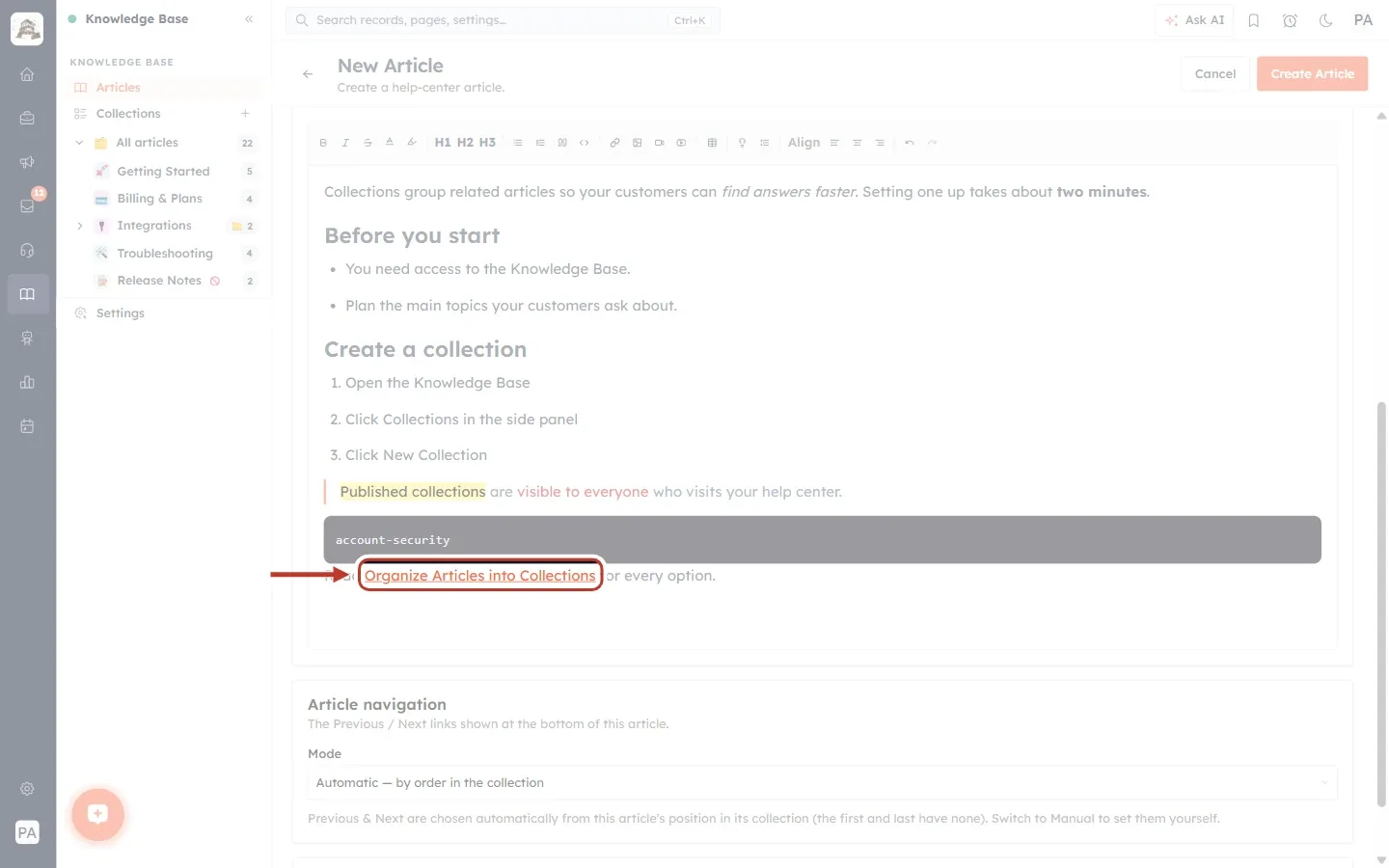
What this screenshot shows. The new link ringed.
“Organize Articles into Collections” is now underlined and coloured, which shows it is a link.
Links in your articles open in a new browser tab, so customers don’t lose their place in the help center.
To change or remove a link, click in it and click Add / edit link again.
💡
Link to your other help articles whenever you mention a related topic. It keeps each article short and helps customers find the next step on their own.
Part 5: Add and adjust an image#
Step 13: Insert an image#
Click where the picture should go (we clicked at the end of step 3 of our list), then click Insert image. A panel opens with two ways to add the picture.
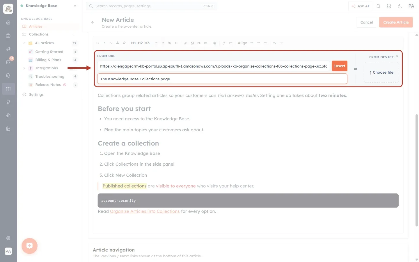
What this screenshot shows. The Insert image panel ringed, open under the toolbar.
FROM URL (left): paste the web address of an image that is already online, then click Insert. We pasted the address of a screenshot of the Collections page.
The box under it: Alt text (optional), “describes the image for accessibility”. Screen readers read this text out to people who can’t see the image, and it is shown if the image can’t load. We typed “The Knowledge Base Collections page”.
FROM DEVICE (right): click Choose file to upload a picture from your computer instead.
The small × at the top right closes the panel.
Step 14: Resize and align the image#
Click the image in the editor. A dark image toolbar appears above it. We clicked M to make the image half the width of the article.
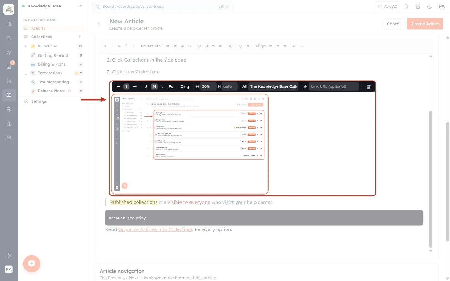
What this screenshot shows. The inserted image and its dark image toolbar ringed. From left to right, the image toolbar has:
Three alignment arrows: place the image on the left, in the center (the default) or on the right.
S, M, L, Full and Orig: quick sizes. S = 25%, M = 50% (selected here), L = 75% and Full = 100% of the article width. Orig shows the image at its own natural size.
W and H: type an exact width or height. “auto” keeps the image’s shape. After clicking M, W shows 50%.
Alt: the image description you typed when inserting it. You can change it here.
Link URL (optional): add a web address to make the image clickable.
Bin icon (far right): removes the image from the article.
Below the image you can see the quote, the code block and the link from the earlier steps.
ℹ️
Screenshots of a whole screen usually read best at L or Full. Small pictures, such as a single button or icon, look better at S or M.
Part 6: Align text#
Step 15: Center a paragraph#
Click in a paragraph and click one of the three Align buttons. We centred the last line, “Read Organize Articles into Collections for every option.”
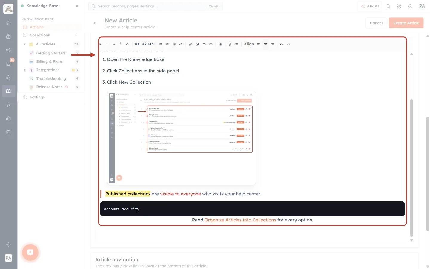
What this screenshot shows. The editor ringed, with the Align buttons in the toolbar and the centred line at the bottom.
Align left: the normal setting for paragraphs.
Align center: used here. The line “Read Organize Articles into Collections for every option.” is now in the middle of the page.
Align right: lines the text up on the right.
Keep most text left-aligned. It is the easiest to read. Centre only short lines, such as a closing note.
Part 7: Add videos#
Step 16: Choose how to add a video#
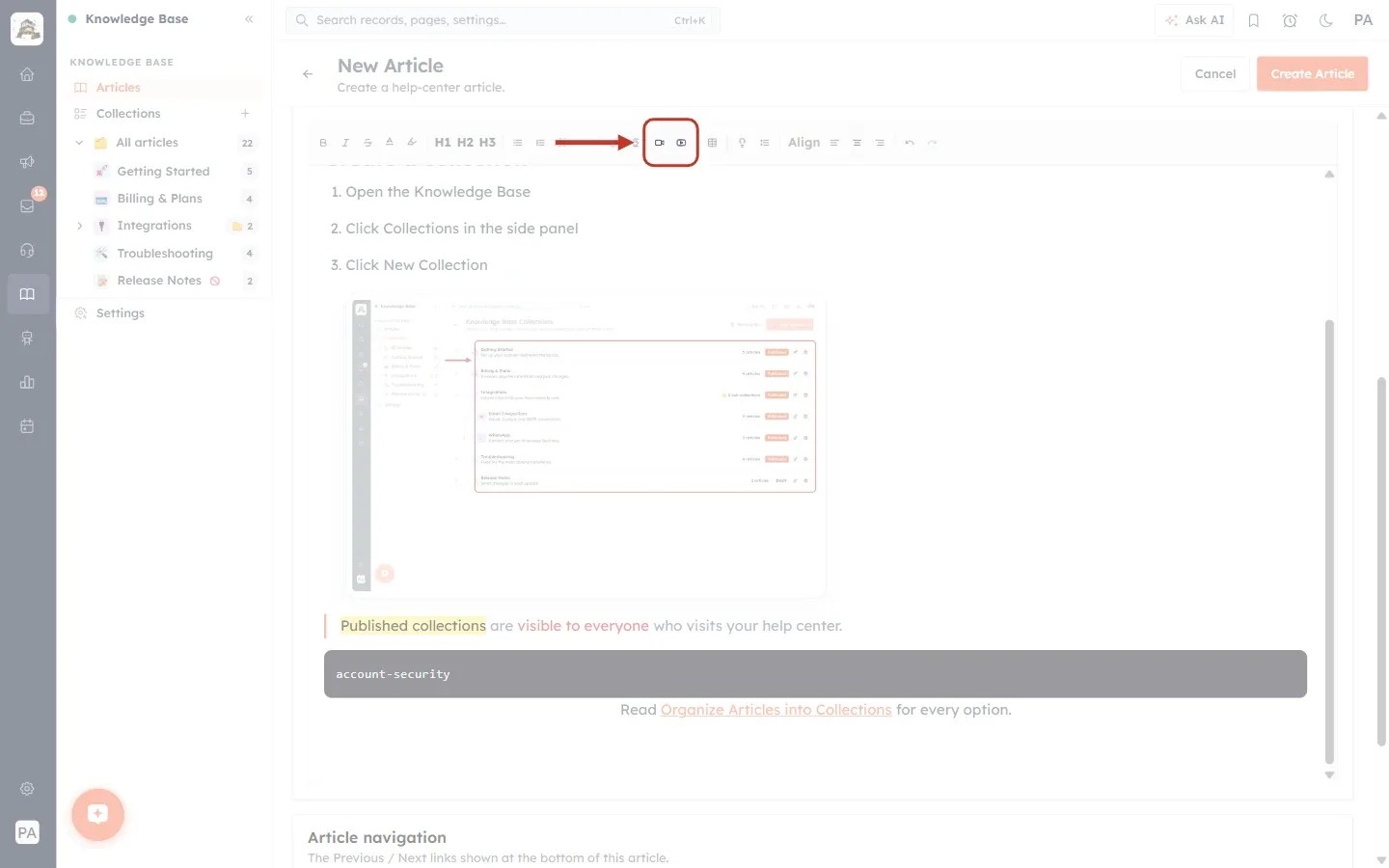
What this screenshot shows. The two video buttons in the toolbar ringed.
Insert video (left): opens your computer’s file window so you can upload a video file and play it directly in the article.
Embed YouTube (right): shows a YouTube video in the article. The video stays on YouTube, and customers play it on your help-center page.
Step 17: Embed a YouTube video#
Click where the video should go and click Embed YouTube. Paste the video’s address and click Embed.
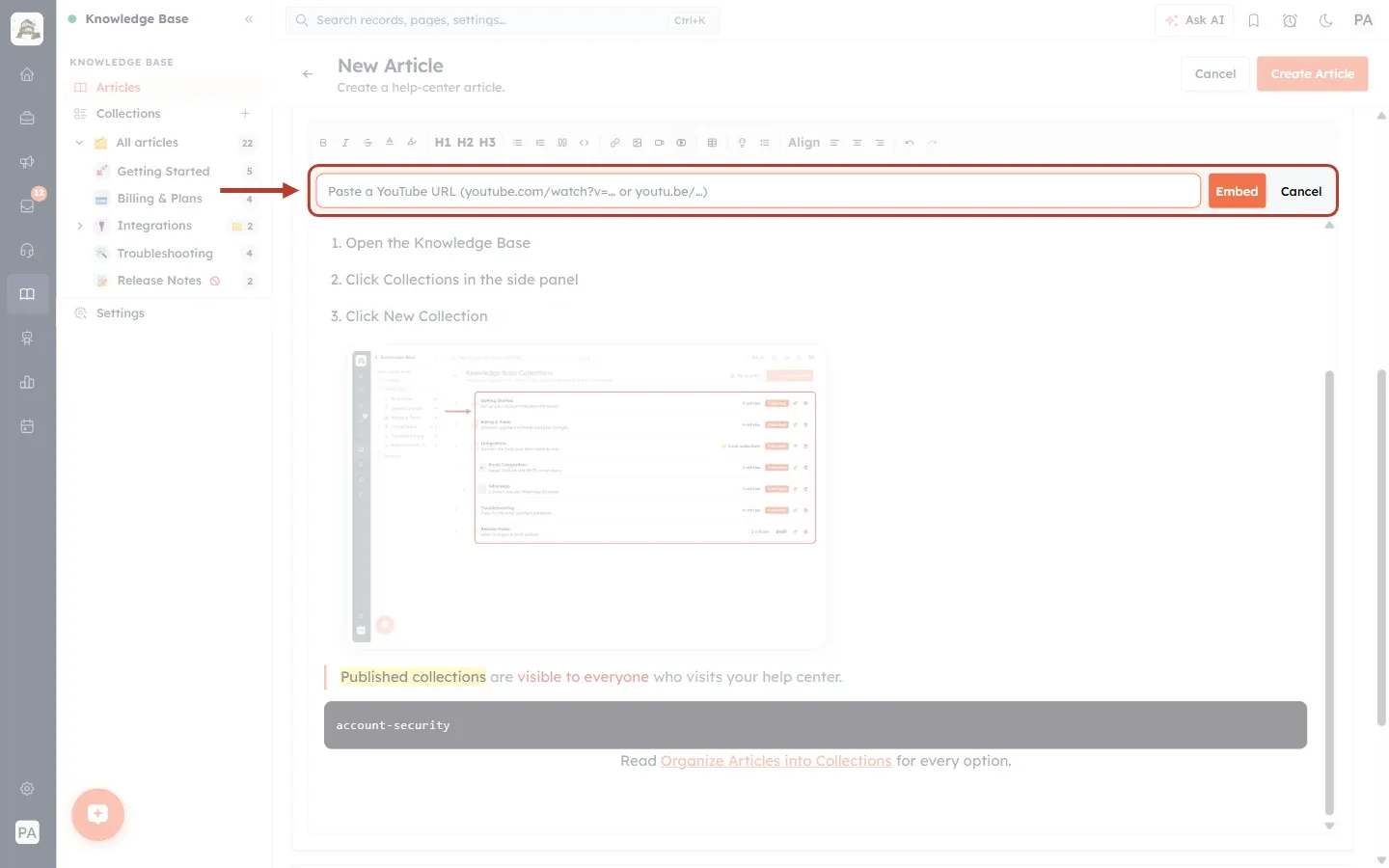
What this screenshot shows. The YouTube bar ringed, open under the toolbar.
The box reads “Paste a YouTube URL (youtube.com/watch?v=… or youtu.be/…)”. Both kinds of YouTube address work. Copy the address from your browser or from YouTube’s Share button.
Embed adds the video player to the article.
Cancel closes the bar.
Part 8: Add a table#
Step 18: Choose the table size#
Click where the table should go and click Insert table. A grid appears. Move your mouse over it to choose how many columns and rows you want, then click.
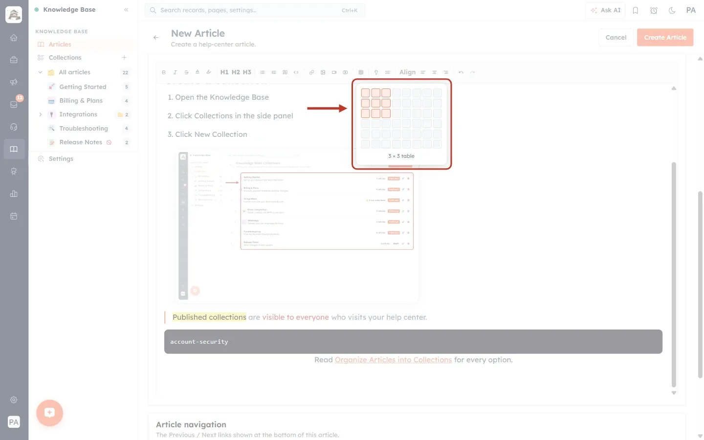
What this screenshot shows. The table size picker ringed.
The grid is 8 columns wide and 6 rows high, so you can insert a table of up to 8 × 6 straight away. You can add more rows and columns later.
We pointed at the third square of the third row. The 3 × 3 area is shaded orange.
The text under the grid shows the size you will get: “3 × 3 table”. Before you point at the grid, it reads “Hover to choose size”.
Click to insert the table.
Step 19: Fill in the table and use the table toolbar#
Click in a cell and type. Press Tab to jump to the next cell. Pressing Tab in the very last cell adds a new row. While your cursor is in a table, a table toolbar appears under the main toolbar.
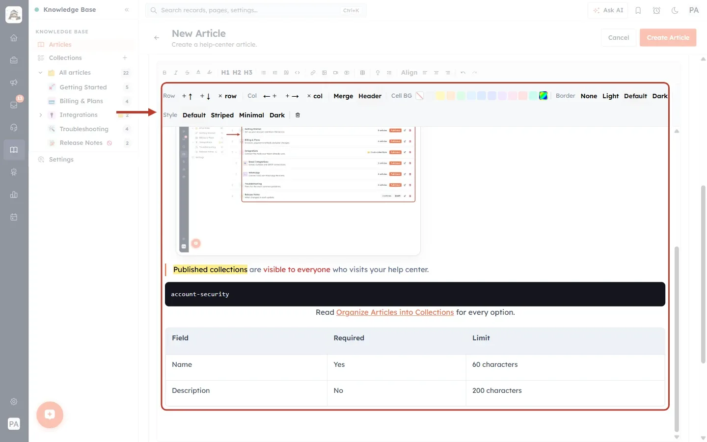
What this screenshot shows. The table toolbar and the new table ringed.
The table: the first row (Field, Required, Limit) is a header row, shown in bold on a grey background. The rows below hold the values.
Row: +↑ adds a row above, +↓ adds a row below, × row deletes the row the cursor is in.
Col: ←+ adds a column on the left, +→ adds a column on the right, × col deletes the column.
Merge: select several cells (drag across them) and click Merge to join them into one cell. Click it again on a merged cell to split it.
Header: turns the header row on or off.
Cell BG: colours the background of the selected cells (Light Gray, Yellow, Orange, Green, Sky, Blue, Indigo, Purple, Pink, Red, Teal or a custom colour). The first square clears it.
Border: None, Light, Default or Dark lines between cells.
Style: Default, Striped (alternate rows shaded), Minimal or Dark.
The bin at the end of the second row deletes the whole table.
Part 9: Callout boxes and collapsible sections#
Step 20: Add a callout box#
A callout is a coloured box with an icon, perfect for tips, warnings and important notes. Click where it should go, click Callout box (the light bulb), and type your text inside it.
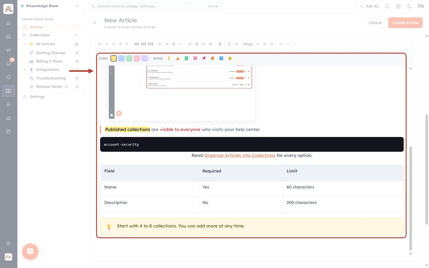
What this screenshot shows. The callout bar and the new callout ringed.
The new callout at the bottom: a yellow box with a 💡 light bulb and our text, “Start with 4 to 8 collections. You can add more at any time.”
While the cursor is in a callout, a bar appears under the toolbar with two choices.
Color: yellow (selected), blue, green, red and purple.
Emoji: 💡 tip, ⚠️ warning, ✅ done, ❌ don’t, 📌 note, 🔥 important, ℹ️ information and ⭐ highlight.
Step 21: Change the callout colour and icon#
Click a colour and an emoji in the callout bar. We chose blue and ℹ️ for an information note.
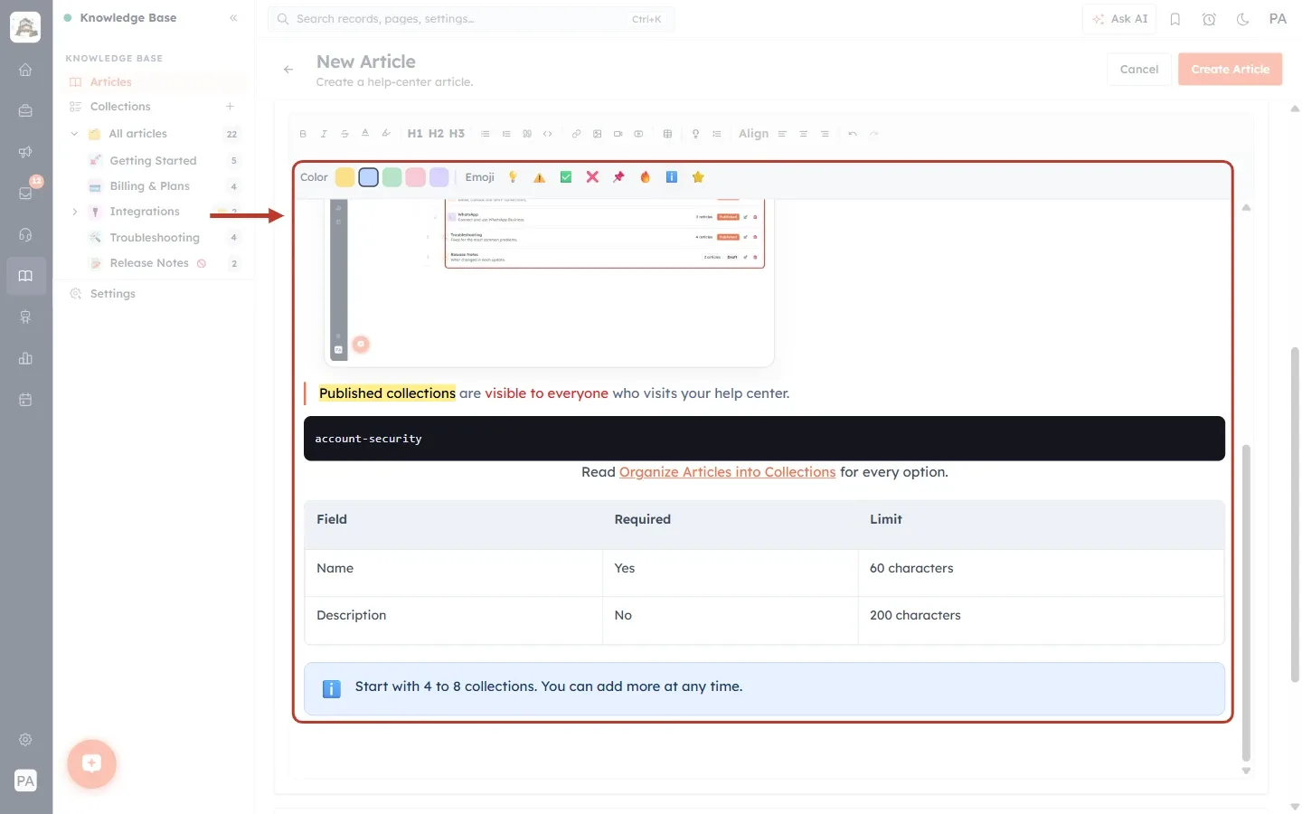
What this screenshot shows. The same callout ringed after the change.
The box is now blue, with the ℹ️ information icon.
In the bar, the blue square is now selected.
A simple rule that customers quickly learn: yellow 💡 for tips, blue ℹ️ for information, red ⚠️ for warnings and green ✅ for “you’re done”.
Step 22: Add a collapsible section#
A collapsible section shows only a title until the customer clicks it, and then opens to show the rest. Use it for extra detail or FAQs that not everyone needs. Click Collapsible section, type the title in the Section title bar, and type the hidden text inside the box.
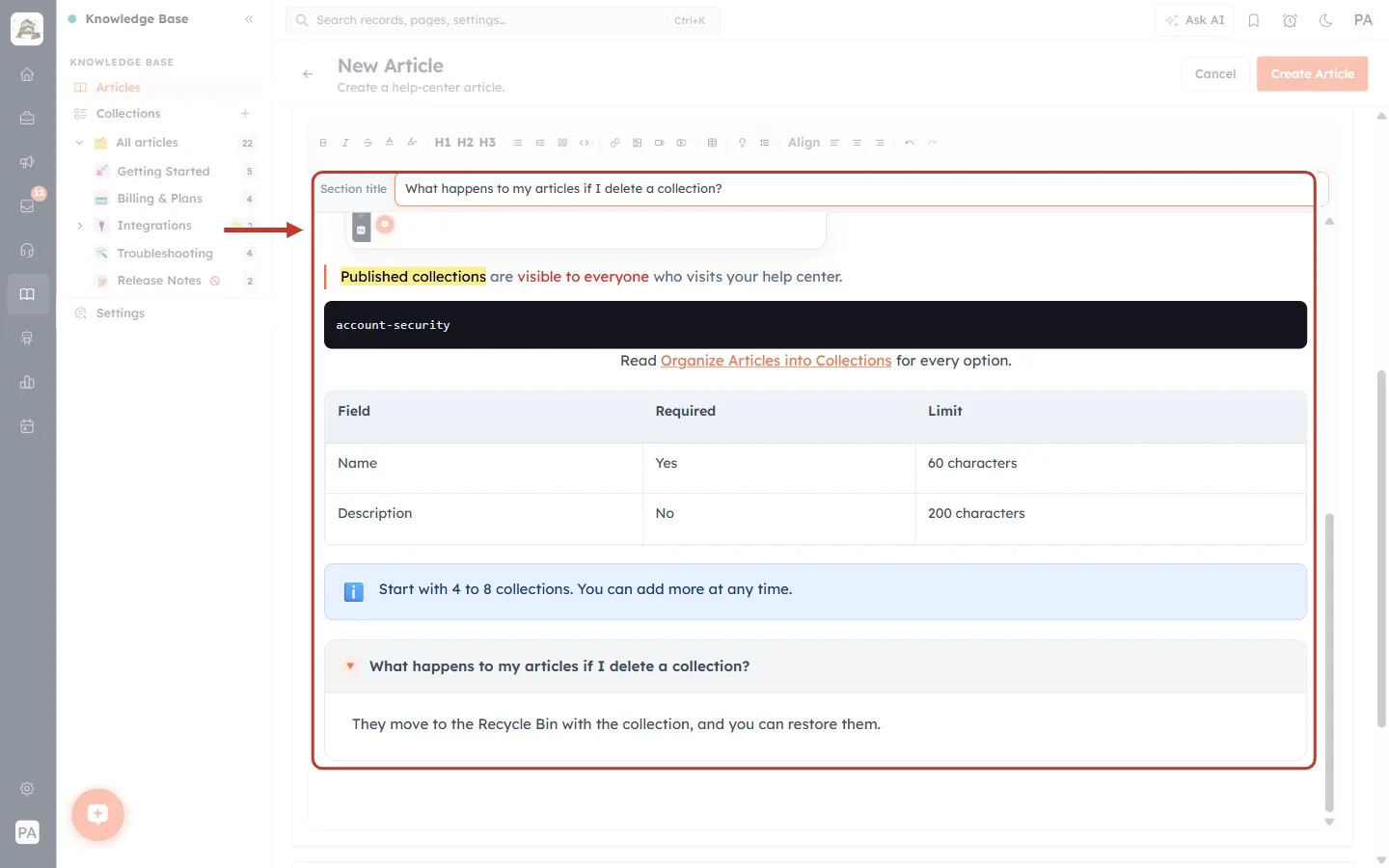
What this screenshot shows. The Section title bar and the new collapsible section ringed.
Section title (the bar under the toolbar): the text customers see before they open the section. A new section starts with “Click to expand”. We typed “What happens to my articles if I delete a collection?”
The collapsible section at the bottom: the title with a small ▾ arrow, and below it the hidden text, “They move to the Recycle Bin with the collection, and you can restore them.”
In the editor the section is shown open so you can edit it. On the help center it starts closed.
Above it you can see the blue callout and the table from the earlier steps.
Part 10: Undo, review and save#
Step 23: Undo or redo a change#
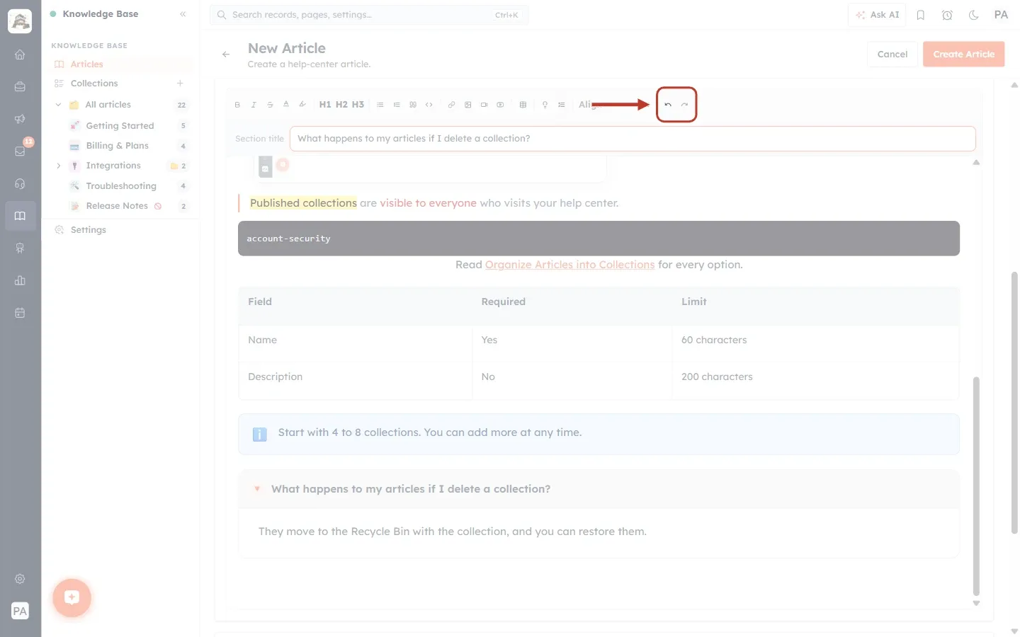
What this screenshot shows. The Undo and Redo buttons at the right end of the toolbar ringed.
Undo (the arrow curving left) takes back your last change. Click it several times to go further back.
Redo (the arrow curving right) brings back a change you undid.
You can also press Ctrl + Z to undo (⌘ + Z on a Mac).
Step 24: Review the whole article#
Scroll through the editor and read the article as a customer would. Here is our finished sample, in two parts.
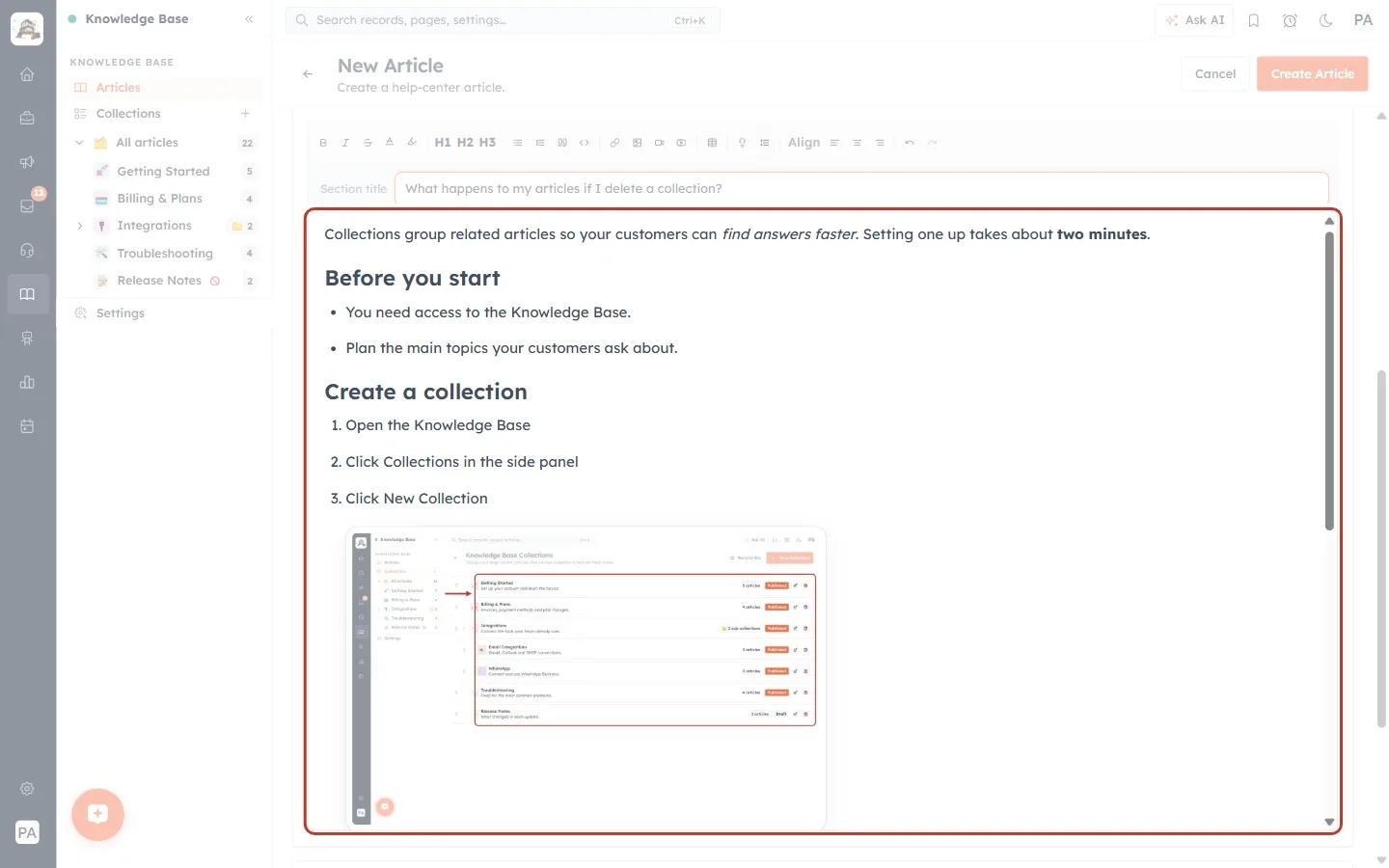
What this screenshot shows. The top of the formatted article (the whole writing area is ringed).
A normal opening paragraph with italic and bold words.
The Before you start heading with a bullet list.
The Create a collection heading with three numbered steps.
The screenshot of the Collections page under step 3, at medium size and centred.
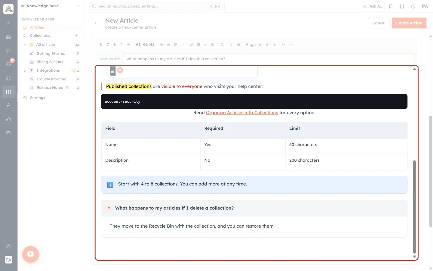
What this screenshot shows. The bottom of the formatted article.
The highlighted and coloured sentence inside a blockquote.
The
account-securitycode block.The centred line with the link.
The table with its header row.
The blue ℹ️ callout.
The collapsible question and its answer.
Step 25: Save the article#
When you are happy with the content, click Create Article (for a new article) or Save Changes (when editing). Your formatting is saved with the article.
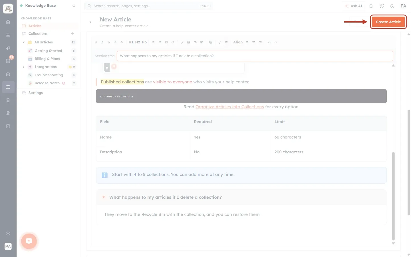
What this screenshot shows. The Create Article button at the top right of the page ringed.
Create Article saves the new article with everything in the Article Details and Content sections.
Cancel, to its left, leaves the page without saving.
Whether customers can see the article depends on its Status (Draft or Published) in Article Details, not on the editor.
⚠️
Leaving the page with Cancel or the back arrow throws away changes you have not saved. Save regularly while you work on a long article.
Tips for well-formatted help articles#
One idea per paragraph. Short paragraphs of two or three sentences are much easier to read on screen.
Number every step. If customers must do things in order, use a numbered list, with one action per step.
Show, don’t just tell. Add a screenshot after an important step and give it alt text.
Bold the names of buttons and fields exactly as they appear on screen.
Use callouts for the things people miss. Keep to one or two per article so they stay noticeable.
Hide the extras. Put rare cases and long explanations in collapsible sections, so the main steps stay short.
Troubleshooting#
A toolbar button does nothing. Most text buttons (Bold, colour, link) only work on selected text. Select the words first, then click the button.
The link bar opens but nothing is linked. The link “applies to selected text”. Close the bar, select the words, and try again.
My image doesn’t appear from a URL. Check that the address opens the image itself in a browser (it often ends in .png, .jpg or .webp) and that the image is public. Or download it and use Choose file instead.
The YouTube video won’t embed. Use the full video address (youtube.com/watch?v=… or youtu.be/…), not a channel or playlist page.
I can’t see the table, callout or section title bar. These bars only appear while your cursor is inside a table, callout or collapsible section. Click inside it.
I made a mistake. Click Undo, or press Ctrl + Z, as many times as you need.
Frequently asked questions#
Can I paste text from Word or Google Docs?
Yes. Paste it into the writing area, then check the result and tidy up headings and lists with the toolbar.
What size should my images be?
Use clear screenshots and pick a size in the image toolbar: L or Full for whole screens, S or M for small details.
Do customers see the formatting exactly as in the editor?
Yes, with one difference: collapsible sections are open in the editor so you can edit them, but closed on the help center until a customer clicks them.
Can I make a picture clickable?
Yes. Click the image and type an address in Link URL (optional) in the image toolbar.
How do I remove a table, image or callout?
For a table, click inside it and click the bin in the table toolbar. For an image, click it and click the bin in the image toolbar. For a callout or other block, select its contents and press Delete or Backspace.
Previous and next#
Previous: Create and Publish a Help-Center Article: Write, Format, Save as Draft and Go Live (Step-by-Step)
Related#
Was this article helpful?
Ready to implement this?
OpenAI Engage and apply what you just learned to your own workspace.
Open AI Engage CRM