Loading…


KnowledgeBase
Target Meter: Track Progress Towards a Goal
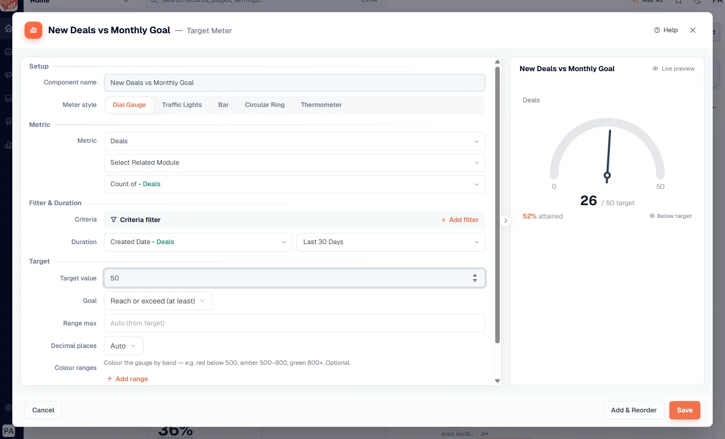
A Target Meter is a dashboard tile that shows one number against the goal you set for it. A KPI card tells you that you created 26 deals this month. A Target Meter tells you that 26 is 52% of the 50 you were aiming for, and that you are still below target.
Use one wherever there is a number your team is working towards — a monthly deal count, a revenue goal, a call quota — or a number you are trying to keep down, like average response time.
💡
A Target Meter is built from the same ingredients as a KPI card — a module, a measure, a date range — plus one extra thing: the target itself.
Add one to a dashboard#
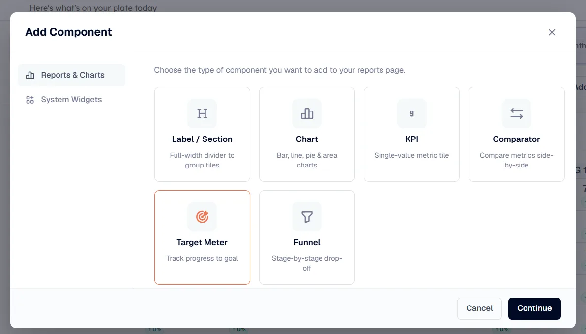
Open the dashboard you want it on and click Add Component. The picker opens on the Reports & Charts tab. Choose Target Meter (“Track progress to goal”), then click Continue.
Step 1 — Choose a meter style#
Next you land on Choose Target Meter Style. Each card is a live preview drawing the same sample figure — 72 against a target of 100 — so you can see exactly how each one reads before you commit.
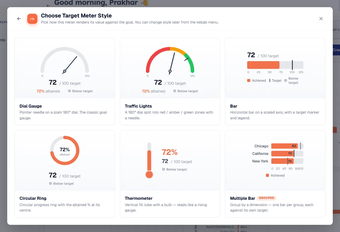
Style | What it looks like | Good for |
|---|---|---|
Dial Gauge | Pointer needle on a plain 180° dial | The classic goal gauge — a safe default |
Traffic Lights | A 180° dial split into red / amber / green zones with a needle | When “are we in trouble?” matters more than the exact number |
Bar | Horizontal bar on a scaled axis, with a target marker and legend | Overshoot — it keeps drawing past the target |
Circular Ring | Circular progress ring with the attained % at its centre | Compact tiles where the percentage is the headline |
Thermometer | Vertical fill tube with a bulb | Narrow, tall spots on the dashboard |
Multiple Bar (grouped) | One bar per group, each against its own target | Per-rep or per-region goals — see below |
💡
The chooser says it plainly: “You can change style later from the kebab menu.” Pick one and move on — you are not locked in.
Step 2 — Build the meter#
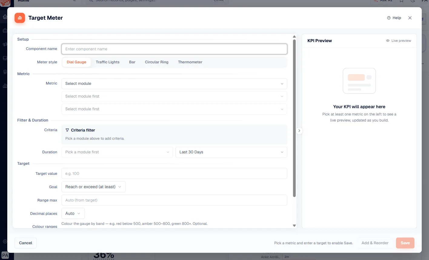
The builder opens with the form on the left and a Live preview on the right that redraws as you go.
Setup#
Component name — the heading on the finished tile. Name it after the goal, not the metric: “New Deals vs Monthly Goal” beats “Deal count”.
Meter style — the five single-value styles are tabs here, so you can flip between Dial Gauge, Traffic Lights, Bar, Circular Ring and Thermometer without losing anything you have filled in.
Metric#
Pick the Module the number comes from — Contacts, Companies, Deals, Calls, Meetings, Tasks, Quotes, Invoices, Products, or any custom module you have built. The measure below it defaults to a straight count (Count of – Deals); change it if you want a sum or an average of a field instead. Select Related Module is optional, for counting a directly related module instead.
Filter & Duration
Criteria — click Add filter to narrow what counts. A goal for won deals needs a stage filter here, otherwise every deal counts towards it.
Duration — a date field plus a period, defaulting to Created Date and Last 30 Days. This is the window the target applies to, so make it match how you set the goal: a monthly target needs a monthly window.
Target#
This is the section that makes it a Target Meter rather than a KPI.
Field | What it does |
|---|---|
Target value | The number you are aiming for. Required — the meter cannot run without it. |
Goal | Reach or exceed (at least) for numbers you want to grow, or Stay at or under (at most) for numbers you want to keep down. |
Range max | Where the far end of the gauge sits. Leave it on Auto (from target) unless you routinely overshoot and want headroom on the dial. |
Decimal places | Auto, or force 0–4 places. |
Colour ranges | Optional bands, added with Add range. The builder’s own example: red below 500, amber 500–800, green 800+. |
⚠️
Stay at or under is the one people forget. On an average-response-time or cost-per-lead meter, leaving the default Reach or exceed makes a bad result look like a win.
Display#
One switch: Shorten large numbers, which renders 1,200,000 as 1.2M so a big figure still fits the tile.
Save#
Until the meter has both a metric and a target, Save stays disabled and the footer tells you what is missing — “Pick a metric and enter a target to enable Save”, then “Enter a target value to enable Save”. Once the preview draws, click Save to drop the tile onto the dashboard, or Add & Reorder to place it and go straight into arranging the layout.
Reading the tile#
Whichever style you pick, every meter reports the same four things:
The value — what the metric currently is.
/ target — the goal you set, always shown next to it.
% attained — how far along you are.
Below target or met — a plain-English verdict, so nobody has to do the arithmetic.
One bar per person: Multiple Bar#
The other five styles track a single number. Multiple Bar splits the meter into one bar per group, each measured against a target — the shape you want for individual quotas.
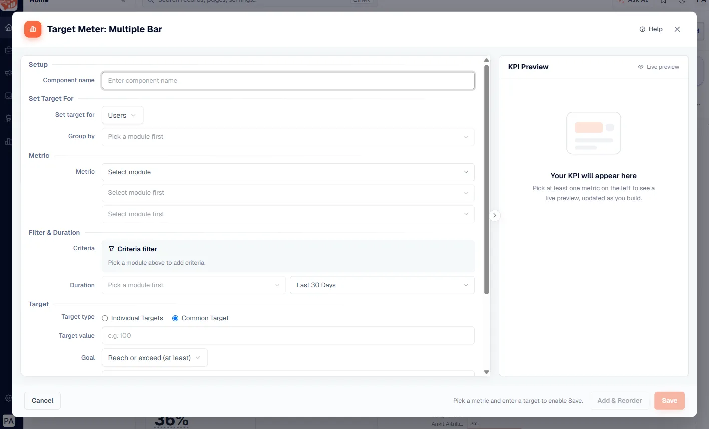
Picking it opens a builder titled Target Meter: Multiple Bar, with two extra controls:
Set target for — choose Users, Teams, or Picklist Values, then pick the exact field under Group by. Users gives you one bar per rep; Picklist Values gives you one per region, source, or any other picklist.
Target type — Common Target applies the same number to everyone, while Individual Targets lets you type a different goal per group. Use Common when the quota is uniform and Individual when it is not.
💡
Everything else — module, measure, criteria, duration, colour ranges — works exactly as it does for a single-value meter.
Common questions#
How is this different from a KPI card?
A KPI card reports a number, optionally against the previous period. A Target Meter reports it against a goal you set, and tells you the percentage attained and whether you have met it. Same setup, different question: “how are we doing compared to last month?” versus “are we going to hit the number?”
Can I change the style after saving?
Yes. Use the ⋮ menu in the tile's top-right corner and choose Edit... and switch between the five single-value styles there. Note that Multiple Bar is a grouped mode rather than a style — you cannot flip a single-value meter into a grouped one in place.
Why is Save greyed out?
A meter needs both a metric and a target value before it can run. The message under the buttons tells you which one is still missing. On a Multiple Bar with Individual Targets, at least one per-group target has to be filled in.
Does the dashboard’s date filter affect it?
Yes, on the same terms as every other tile: a global date filter applies to components built on the module it names. See Global Date Filter for how to set one up.
Who can see the meter?
Whoever the dashboard is shared with — and the number each person sees still respects their own record access. Two people looking at the same meter can correctly see different values.
Was this article helpful?
Ready to implement this?
OpenAI Engage and apply what you just learned to your own workspace.
Open AI Engage CRM