Loading…


KnowledgeBase
Report Types: KPI, Comparator, Matrix & Funnel
Beyond tables and pivots#
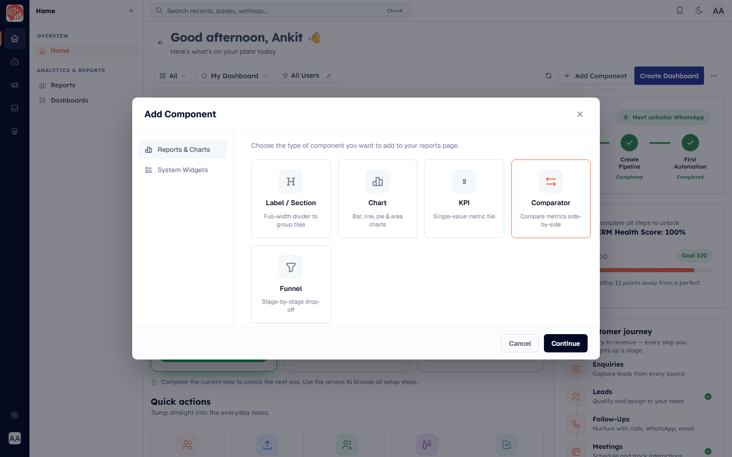
Tabular and pivot reports are built on the Reports page. The richer visual components — KPI, Chart, Comparator, and Funnel — are added straight onto a dashboard. Open Dashboards, then click Add Component and choose a type.
KPI — a single headline number#
A KPI shows one metric (a count or a sum/average of a field) as a large tile, optionally compared to the previous period. When you add one you pick a style — Standard (value with a change vs last period), Growth Index, Basic (just the number), Scorecard (a small breakdown table), or Rankings (top-N by a measure).
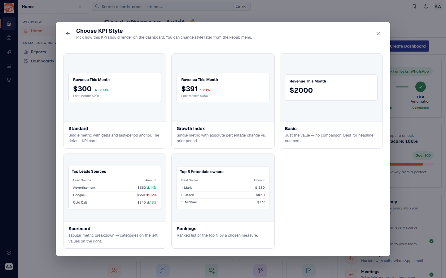
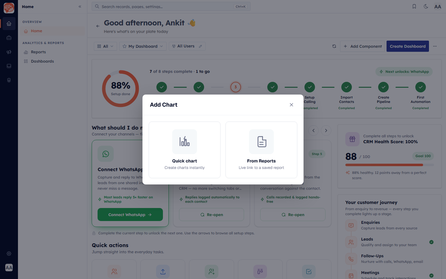
Chart — visualize a measure#
A Chart plots a measure as a column, bar, line, or pie. You can build one instantly (Quick chart) or link it live to a report you already saved (From Reports). Group by a date field to see a trend, or by a category to compare values. Charts currently support a single grouping and a single measure (stacked/grouped multi-series is on the roadmap).
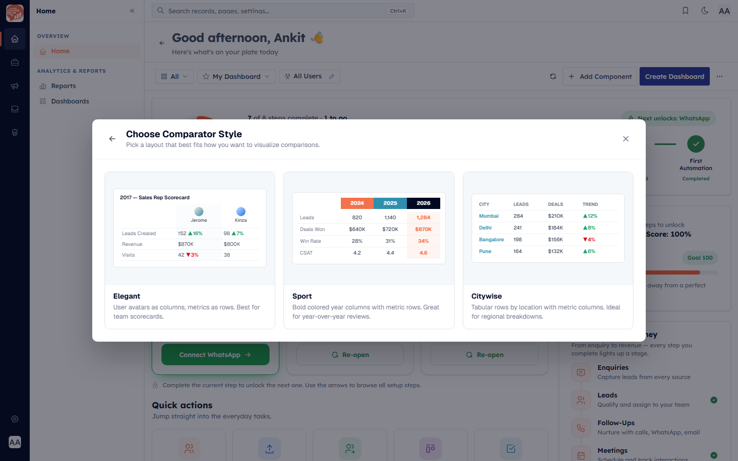
Comparator — side-by-side metrics#
A Comparator puts the same metric next to itself across a dimension — compare users, time periods, or picklist values — so you can see who or what is ahead at a glance.
Funnel — stages and drop-off#
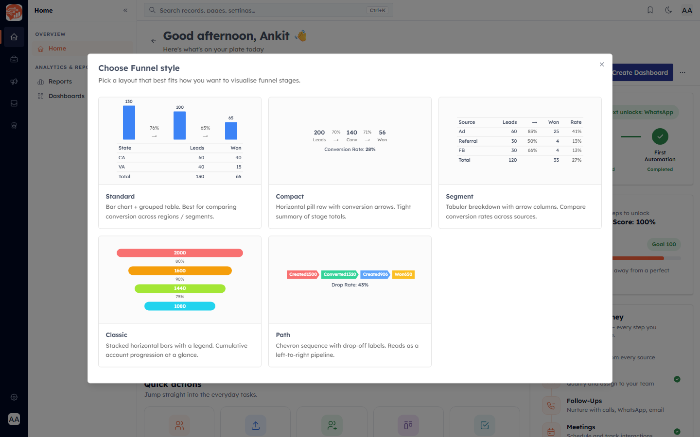
A Funnel shows an ordered set of stages and the drop-off between them — ideal for a sales pipeline or a lead-to-customer journey. Define two or more stages (each with its own filter), and optionally split every stage by a dimension with Classify By.
Matrix — metrics over time#
A Matrix report lays out metrics down the rows and time buckets (such as months) across the columns — a compact way to track several numbers month over month.
💡
KPI, Chart, Comparator and Funnel components live on a dashboard. See Dashboards & Report Components to build the dashboard that holds them.
Was this article helpful?
Ready to implement this?
OpenAI Engage and apply what you just learned to your own workspace.
Open AI Engage CRM